IT.COM

REQ-LOGO $100 PRIZE for e-commerce logo design (Bonus $50 if first submission of winner is before Saturday)

Spaceship Spaceship
Watch
Status
Not open for further replies.

Mr. Bargains

Established Member
Impact
1
Type of Contest : Logo Design

Prize : Winner will receive $100 via paypal, in exchange for full and exclusive rights to the logo designed
[update] Bonus $50 if the winner submits first entry before Saturday. I would ideally like to wrap this contest up before Monday.

Contest End Date & Time : Jan. 29 9:00 PM EST

Size Requirements : 450 x 250px (but ability to scale to different sizes would be preferred).

Color Requirements : Playful but professional.

General Requirements : We are an e-commerce reseller of new electronics (Apple, Samsung, Sony, etc…). The domain is, Mr(.)Bargains and we will use the solo template from Shopify, with a similar color scheme( https://themes.shopify.com/themes/solo/styles/solo/preview). I’m looking for a fun and professional company logo which incorpotates the domain name and a cartoonish character to represent Mr. Bargains. I will provide frequent, and solid feedback on designs. I look forward to seeing everyones ideas!

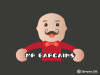
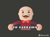
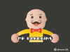
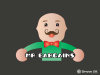
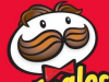
EDIT: After some discussion, we want to go in the direction of a character similar to Mr. Pringle, except named Mr. Bargains obviously. link: https://upload.wikimedia.org/wikipedia/en/thumb/7/71/Pringles.svg/220px-Pringles.svg.png


2 ideas:

1) A logo with a round, jovial, cartoon like face that they did with Mr. Pringle, with the text "Mr. Bargains" below his face.

2) Instead of just the face, can make a full-bodied cartoon Mr. Pringle, with the "Mr. Bargains" text below his body.


I lean toward #1 personally, but I am open to ideas.
 

Attachments

  • Screen Shot 2016-01-21 at 5.36.15 PM.png
    Screen Shot 2016-01-21 at 5.36.15 PM.png
    203.8 KB · Views: 45
  • Screen Shot 2016-01-21 at 5.38.23 PM.png
    Screen Shot 2016-01-21 at 5.38.23 PM.png
    356.2 KB · Views: 47
  • Screen Shot 2016-01-21 at 5.36.53 PM.png
    Screen Shot 2016-01-21 at 5.36.53 PM.png
    63.1 KB · Views: 46
Last edited:
1
•••
The views expressed on this page by users and staff are their own, not those of NamePros.
Please find my entries attached to this post :)
All designs include free unlimited modifications, color changes, etc.

Thank you!
I really like the first attached variant. Can you integrate the upper body of the attached image into Mr.Bargains Head and have the text falls between his arms? Also can I see your design with a larger-cursive type font . Thanks!!!
 

Attachments

  • Screen Shot 2016-01-24 at 9.03.44 PM.png
    Screen Shot 2016-01-24 at 9.03.44 PM.png
    99.7 KB · Views: 23
0
•••
Hi mr bargains! Thank for your feedback, i will do it :) wait for my entry.

Regards,
Tiago
 
0
•••
mr-bargains2ex.png


Updated face to a more rounded, happy shape.
Changed color scheme to red/black and black/red.
Changed type to a strong cursive, direct and characterful.

mr-bargains2ex2.png
 
0
•••
..
 
Last edited:
0
•••
Thank you for the feedback. Please let me know if you have any more suggestions.

MR.B_v31.png
 
Last edited:
0
•••
0
•••
My Revised Entry.
All colors can be changed :)
 

Attachments

  • opt1.png
    opt1.png
    56.7 KB · Views: 21
  • opt2.png
    opt2.png
    58.6 KB · Views: 17
  • opt3.png
    opt3.png
    59.6 KB · Views: 17
  • opt4.png
    opt4.png
    58.9 KB · Views: 20
0
•••
..... ENTRY Withdrawal ......
 
Last edited:
0
•••
Thank you for the feedback. Please let me know if you have any more suggestions.

Show attachment 22797
Hi NameFu,

Can you try the following suggestions?
1) Make his face/moustache slightly more smiley
2) Make all the dotted lines solid
3) Make the "Mr Bargains" text in a cursive, bubbly font
4) Align the "Mr Bargains" text to where his hand is pointing

Thanks, it's one we are seriously considering.
 
0
•••
Hi ATKT,

Can you try the following suggestions?
1) Make his tuxedo black, w a brighter red color bow tie
2) Make his eyes nicer and moustache pointed up so it appears more smiley
3) Could you play w/ the eyebrows' shape to be more softer
4) Can you make the "Mr Bargains" text in a sign, instead of just white space
5) Can you play with some different color variants so we have some different selections to choose from?

Thanks, it's one we are seriously considering.
 
0
•••
Hi Sobi,

Can you try the following suggestions?
1) Make his face/moustache slightly more smiley (some comments we got were that his face was a little sullen looking)
2) Bring the text a little higher so it's closer to his hands
3) Can you change his hairstyle? So it looks a little less like Mr Pringles (we just like the inspiration of it but don't want it looking exactly like him)
4) Are the lines and edges sharp in your vector image? They look a little bit jagged/rough in my rendering.

Thanks, it's one we are seriously considering.
 
0
•••
My Revised Entry.
All colors can be changed :)
Hi Tiago,

I discussed your submission with my business partner. He is looking for something a little different. If you have time to submit something else, we would love to see it. A cartoon figure with cursive-type font, see our description and other entrants for feedback. Thanks!
 
0
•••
Updated design based on feedback.
bargains_upd3.jpg
 
0
•••
....
 
Last edited:
0
•••
 
Last edited:
0
•••
Hi namefu,
I like this a lot. The head, body, and colors of the guy are perfect. Can you remove the cash from the picture, and change his posture to be more proudly pointing ppl to deals (either with one hand or two). Sort of like this guy
upload_2016-1-26_16-0-55.png
]

Can you try combining it with a few different fonts? My friend likes the old school barbershop type ones, like these three:
1) https://img1.etsystatic.com/046/0/9344411/il_570xN.728231363_n3g0.jpg
2) https://s-media-cache-ak0.pinimg.com/236x/47/43/13/4743132ca91cd063bd94d4fdc8f81f85.jpg
3) https://s-media-cache-ak0.pinimg.com/236x/f3/2b/dd/f32bdddd173235810c7f9b06238692a5.jpg

And move the "mr bargains" to the right of the guy, so that his hand or hands are pointing to the text.

Thanks!
 

Attachments

  • upload_2016-1-26_16-12-21.png
    upload_2016-1-26_16-12-21.png
    226.2 KB · Views: 15
  • upload_2016-1-26_16-13-30.png
    upload_2016-1-26_16-13-30.png
    45.5 KB · Views: 14
0
•••
 
Last edited:
0
•••
Here we go. Could you tell me if you like any of the font's presented by Mr. Bargains.

If you go to http://www.1001fonts.com/ you will see a form where you can type "Mr.Bargains" and it will show you what that text will look like in the fonts that you search for in the form at the very top of the site.

P.S. The hat is of course optional. I added it because it matches his suit and makes him look less like the Pringles guy.

Show attachment 22908
Hi NameFu,

Almost there, can you make the following changes
1. Can you make the guy lean in or point to the "Mr Bargains" text more? In this one, his hand is floating a bit, and it doesn't look like he is pointing to the sign in an inviting, assertive manner. The posture in the picture I sent in the previous post works, but doesn't have to be exactly like that.
2. Remove the hat.
3. We like the middle text font and it should be placed near his hand after the postural changes.

Thanks!!!
 
0
•••
Here we go! Because my illustration style is so different from your sample, I'm afraid that I'm limited in how similar I can make the poster of the body. I did manage to make him lean more though.

We've had a problem with new members hosting contests and disappearing, so I hope you don't mind the water mark. I've put a lot of work into this contest and you're a new member of NP. I hope you don't find this offensive! Thanks!

MR.B_v48.png
 
1
•••
Here we go! Because my illustration style is so different from your sample, I'm afraid that I'm limited in how similar I can make the poster of the body. I did manage to make him lean more though.

We've had a problem with new members hosting contests and disappearing, so I hope you don't mind the water mark. I've put a lot of work into this contest and you're a new member of NP. I hope you don't find this offensive! Thanks!

Show attachment 22940

Hi NameFu,

We like the old posture of Mr. Bargain better.
1. Can you change his posture back to the previous iteration.
2. Please bring his arm down slightly toward his body, and have his figures touching one another, similar to the attached picture from before.
3.The font is perfect, bring the text closer to this body and align the letters with the bottom of this feet.

Thank you.
 
0
•••
Hi NameFu,

We like the old posture of Mr. Bargain better.
1. Can you change his posture back to the previous iteration.
2. Please bring his arm down slightly toward his body, and have his figures touching one another, similar to the attached picture from before.
3.The font is perfect, bring the text closer to this body and align the letters with the bottom of this feet.

Thank you.
Hi NameFu,

I understand your concern's about new members dodging payment, I can see how that would be extremely frustrating to deal with. We strongly value talent and absolutely don't mind compensating for it . We are extremely grateful for everyones hard work. If you can attempt the following changes that would be great.

1. Could revert the posture back to him standing straight.
2. I am familiar with adobe illustrator, will I be able to move the text to a different position later on?

I think we basically decided to go with your design and that is why we stopped giving feedback to the other entrants. We didn't want to waste anymore of their time, although two of them had strong designs we were considering. Anyway, if you can make those changes we can formally close the contest. You can send us payment details once the changes are submitted. Thank you very much!
 
Last edited:
0
•••
withdrawn
 
Last edited:
0
•••
Deepest pologies. I've been very busy. I'm not sure what time it is where you are, but I' promise to submit the requested changes later today (in about 2 hours). Thanks!
 
0
•••
Deepest pologies. I've been very busy. I'm not sure what time it is where you are, but I' promise to submit the requested changes later today (in about 2 hours). Thanks!
Awesome, thanks!
 
0
•••
0
•••
Status
Not open for further replies.
  • The sidebar remains visible by scrolling at a speed relative to the page’s height.
Back