IT.COM

Free for-sale landers by NamePros

NameSilo
Watch

NamePros

NamePros.comEstablished Member
NamePros Staff
Impact
413
Happy April 1st!

We have exciting news to share with you. This year, our April 1st pranks and activities are changing exclusively to adding useful features each year.

For our first April of this new initiative, we're bringing you:

After a very successful closed beta with select PRO members, industry leaders, and Large Portfolio Holders, we're finally ready to share it with you for its public beta! Special thanks to @Future Sensors for going above and beyond in every way to help us test and improve during the closed beta.

Now it's your turn!


Goat GIF by MOODMAN


We hope you'll like what you see!

All feedback and suggestions are appreciated. :)


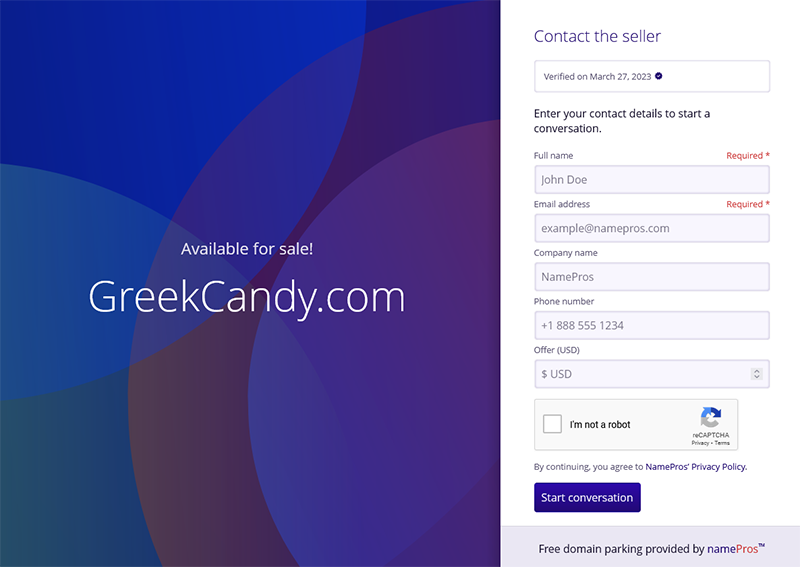
greekcandy.png

Source: DomainGang
 
90
•••
The views expressed on this page by users and staff are their own, not those of NamePros.
There is my test lander - http://brad.us/

On Desktop browser the footer is far less distracting than on mobile IMO.
I do think the footer is a bit large, at least on my mobile device.

Brad
It looks good, but the footer is too much for me. I wish nps would do away with that and find a reasonable fee/charge/percentage.
 
2
•••
It looks good, but the footer is too much for me. I wish nps would do away with that and find a reasonable fee/charge/percentage.
It's a start. I could see them adding features later.

I gave them a list of some ideas. I am sure others did as well.

Brad
 
6
•••
Footer should be relatively easy to fine-tune, even on mobile. Definitely don't want that to be the main focal point on a lander, or a distraction. That's why it's a footer. I've always found it an area for more "below the radar" navigation.
 
3
•••
You're absolutely right about the concern about that as a possibility.

The question is whether there is a way for Namepros to get additional income for their efforts, to help support the technology that powers this venture?

Any thoughts?

Overall, the link to Namepros may be very important. Someone landing on a webpage to be able to see the company behind it, to help confirm the legitimacy of the webpage.
The link to NamePros is pretty important - one way they can/could make a profit is if someone clicks their link, comes to NamePros and subscribes to a membership?......I don't begrudge that......
 
9
•••
Footer should be relatively easy to fine-tune, even on mobile. Definitely don't want that to be the main focal point on a lander, or a distraction. That's why it's a footer. I've always found it an area for more "below the radar" navigation.
That is the one thing that sticks out at first glance to me, especially on mobile.

Brad
 
4
•••
The link to NamePros is pretty important - one way they can/could make a profit is if someone clicks their link, comes to NamePros and subscribes to a membership?......I don't begrudge that......
I don't either, but you have "Free domain parking provided by namePros™".

That seems reasonable. But, below that there is a much larger section.
On desktop it isn't that much of an issue as it is below the lander part.

On mobile, at least on my device, that section is much larger in relation to the lander.

Brad
 
8
•••
I don't either, but you have "Free domain parking provided by namePros™".

That seems reasonable. But, below that there is a much larger section.
On desktop it isn't that much of an issue as it is below the lander part.

On mobile, at least on my device, that section is much larger in relation to the lander.

Brad
Looks like a minor tweak is needed?......I'm not an expert, but that should be pretty easy for them to sort out.

I even clicked on the NamePros link thinking it would take me to a lander 🙄
 
1
•••
Looks like a minor tweak is needed?......I'm not an expert, but that should be pretty easy for them to sort out.

I even clicked on the NamePros link thinking it would take me to a lander 🙄
This is what it looks like on my desktop. There is quite some separation between the lander part, and footer part. It is also small in relation to the lander.

brad_desktop.jpg


This is what it looks like on my mobile device.

brad_mobile.jpg


You can see how much larger the lander is on mobile vs desktop.

I think there are plenty of ways to streamline this though.

Brad
 
3
•••
That's brutal Brad. But funny too--- we'll look back on that...

**maybe that was the April Fools
 
Last edited:
0
•••
This is what it looks like on my desktop. There is quite some separation between the lander part, and footer part. It is also small in relation to the lander.

Show attachment 234950

This is what it looks like on my mobile device.

Show attachment 234951

You can see how much larger the lander is on mobile vs desktop.

I think there are plenty of ways to streamline this though.

Brad
Thanks for providing the example.

I see that it requires at least a $1 submission to be allowed to proceed. Having the minimum offer setting would likely be helpful to screen for unnecessary emailsl.

Do you think that having the email verification up front would be best as well, for those that prefer the extra level of screening? Or would that likely lose too many potential customers?
 
Last edited:
1
•••
Thanks for providing the example.

I see that it requires at least a $1 submission to be allowed to proceed. Having the minimum offer setting would likely be helpful to screen for unnecessary emailsl.
Yeah, that was one of my top suggestions - the ability to set minimum offers.

Brad
 
7
•••
@bmugford I'd really suggest the Light Theme for your lander. The dark theme is so gloomy ;)
 
5
•••
Last edited:
8
•••
Here are some of the initial suggestions I made, when it was in beta.
Several of these were already in the first release.

Pricing options -

- Ability to change min offer.
- Ability to use a "make offer" or BIN setting.
- Bulk change options, if possible.

Management -

- Some type of offer manager console, that shows all the offers in one area. So you don't have to click on each domain.

- Some type of import or file upload setting, so you can upload domains with settings.

Landers / Design-

- Other design options. The more the better.
- Ability to choose how a domain looks, AKA CamelCasing.
- Use a custom message instead of "Available for sale!"
- Ability to put other contact information directly on the lander.
- Option to link to your entire portfolio, if desired.
- Maybe an ability to add a custom logo to the page, like a company logo.

Sales -

- Down the road, maybe some way to guide the process via a service we decide like Escrow.com?
- Maybe an internal messaging system, instead of just email, if possible?
 
8
•••
it never ceases to amaze me how someone can make the absurd claim that this or that lander performs better or same or worse than another lander... when during that specific time and.for those specific.domains only one lander at a time can be tested. it is a complete illogical absurdity to draw such conclusions for these reasons.
It’s a straightforward process to measure how many inquiries your domains previously received per day and to compare that to after switching.
 
1
•••
Would it be possible to add TXT record verification so I can use my own nameservers to redirect to np/parked/domain ?
 
6
•••
Is there any posssibility that Escrow.com would be willing to provide a button for a buy now or a binding make offer feature on these landers?

And would folks be willing to pay some additional commission to both NP and Escrow.com for this feature. For example, I'd be fine with paying an additional 3-5%, split between Escrow and NP, to have this as an option.

How do other folks feel about this?
 
1
•••
This is what it looks like on my desktop. There is quite some separation between the lander part, and footer part. It is also small in relation to the lander.

Show attachment 234950

This is what it looks like on my mobile device.

Show attachment 234951

You can see how much larger the lander is on mobile vs desktop.

I think there are plenty of ways to streamline this though.

Brad
Thanks for showing both examples.

This should be quick to tweak once @Quebec Tech Team has a chance.

Minimum offers and asking prices are coming soon, along with many of the other suggestions in this thread.

Please keep them coming! :)
 
4
•••
Thanks for providing the example.

I see that it requires at least a $1 submission to be allowed to proceed. Having the minimum offer setting would likely be helpful to screen for unnecessary emailsl.

Do you think that having the email verification up front would be best as well, for those that prefer the extra level of screening? Or would that likely lose too many potential customers?
I would just rather let it flow. The recaptcha is there. Email verify for just an offer is a pain. Disingenuous offers will likely put forth their "spam" email anyways.
 
5
•••
Is there any posssibility that Escrow.com would be willing to provide a button for a buy now or a binding make offer feature on these landers?

And would folks be willing to pay some additional commission to both NP and Escrow.com for this feature. For example, I'd be fine with paying an additional 3-5%, split between Escrow and NP, to have this as an option.

How do other folks feel about this?
Can't you do that with Bodis for free?

I haven't used parking services in years but I remember Voodoo having a basic inquiry page but they're pretty much over and I think Bodis has one.

Maybe, somebody can do a blog focusing on free landing pages and how they differ from each other.
 
5
•••
Can't you do that with Bodis for free?

I haven't used parking services in years but I remember Voodoo having a basic inquiry page but they're pretty much over and I think Bodis has one.

Maybe, somebody can do a blog focusing on free landing pages and how they differ from each other.

@Bob Hawkes maybe?
 
5
•••
Would it be possible to add TXT record verification so I can use my own nameservers to redirect to np/parked/domain ?
This was almost ready in time for launch. It shouldn’t be much longer.

I would just rather let it flow. The recaptcha is there. Email verify for just an offer is a pain. Disingenuous offers will likely put forth their "spam" email anyways.
Soon, you’ll have access to unconfirmed inquiries, as well. It’s all logged with the intention of allowing you to choose whether you want to receive an email about them, or just review them on the website.
 
16
•••
Can't you do that with Bodis for free?

I haven't used parking services in years but I remember Voodoo having a basic inquiry page but they're pretty much over and I think Bodis has one.

Maybe, somebody can do a blog focusing on free landing pages and how they differ from each other.
Not the binding "make offer" submission that Escrow.com allows with their "buttons" currently. Last I checked with Bodis, they had no plans to have this additional feature integrated into their platform.
 
4
•••
It’s a straightforward process to measure how many inquiries your domains previously received per day and to compare that to after the switch.

i know but this has nothing to do with comparing number of inquiries it would get on different landers..at same time.. because it cannot be done

and yet this is.the only comparison that matters. in other words we can never say it got more offers on say no lander a day ago.because we can never know how many it would get on different lander. therefore it is absurd to claim more or less offers under any lander
or because of it
 
0
•••
It's on the top-right of the page that lists the inquiries. We probably need to improve that UX a bit.
Thanks. It is super obvious to me now and I successfully deleted the two names. Thanks.
-Bob
 
4
•••
  • The sidebar remains visible by scrolling at a speed relative to the page’s height.
Back