IT.COM

information Sedo Unveils a Radical New Design

Spaceship Spaceship
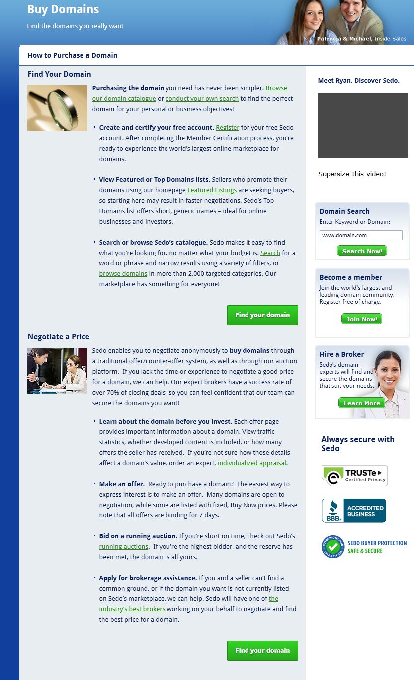
The popular domain name marketplace, Sedo, has unveiled a brand new, comprehensive redesign that marks the end of an era in terms of the company’s traditional blue and white colour scheme, with the new design opting for a colour scheme consisting primarily of grey and blue, with all pages being affected by the marketplace’s redesign.

The new design includes a brand new homepage that is far cleaner and more concise than its predecessor. The featured domain names take pride of place on the homepage, along with adverts for marketplace auctions and Sedo’s own auction events.

Screen Shot 2016-08-02 at 15.18.20.png

Sedo's New Home Page

Searching for domain names is as simple as ever with the new design, thanks to the ever present domain search bar at the top of the page, and easy access to a range of features once you’re on the domain search page. Sedo’s redesign also makes it easier to switch between languages, with 12 different language options available, including Chinese.

Sedo CEO Tobias Flaitz said “We’re very proud of the newly designed website going live. This crucial step upholds Sedo as THE most trusted and leading business partner for global premium domain trading. With this responsive design now available on all devices, the opportunities for success are increased and supported by value adding services and maximizing domain monetization.”

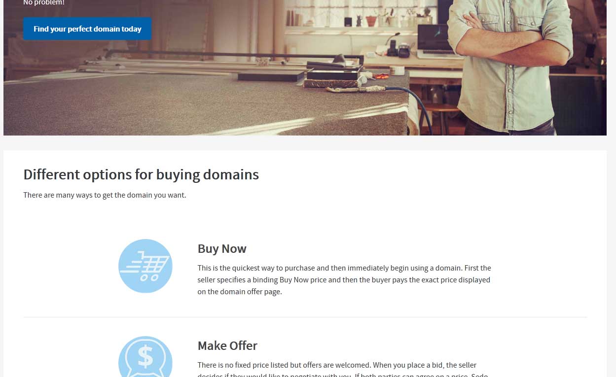
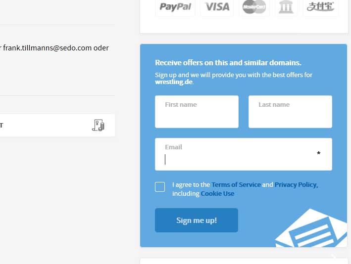
One change that all regular Sedo users will see is the enhanced domain landing page. While the design of Sedo’s parking pages are currently the same, the domain’s landing pages have had a complete redesign, with a central image and statistics. The domain landing pages are all mobile friendly, which, considering that the smartphone is now the most popular way to browse the Internet, is very good news.

The landing pages' "Buy Now" button has been moved to the right of the page on a desktop layout, but becomes centralised on the mobile version.

Early reactions to this redesign are mixed, with some investors calling the new interface "nice, elegant and more professional", while others are more critical.

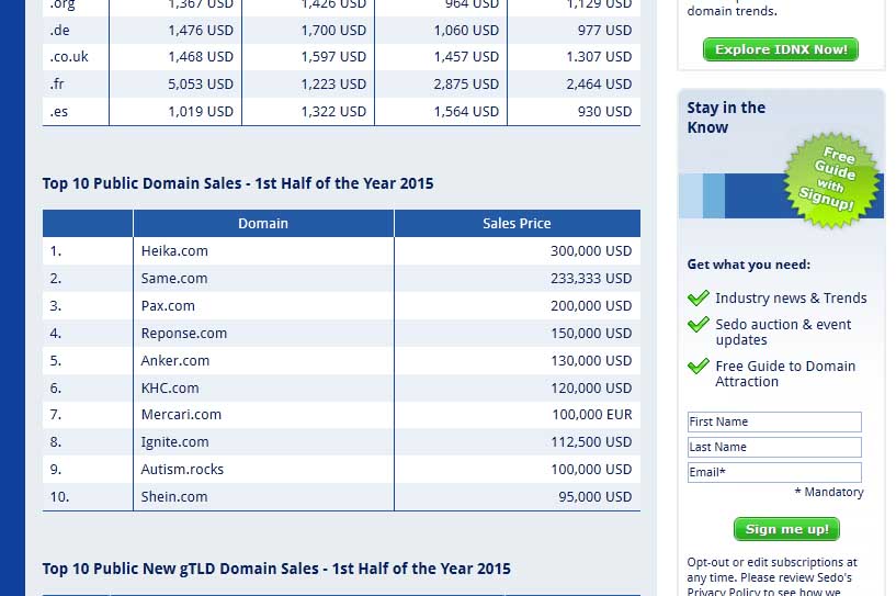
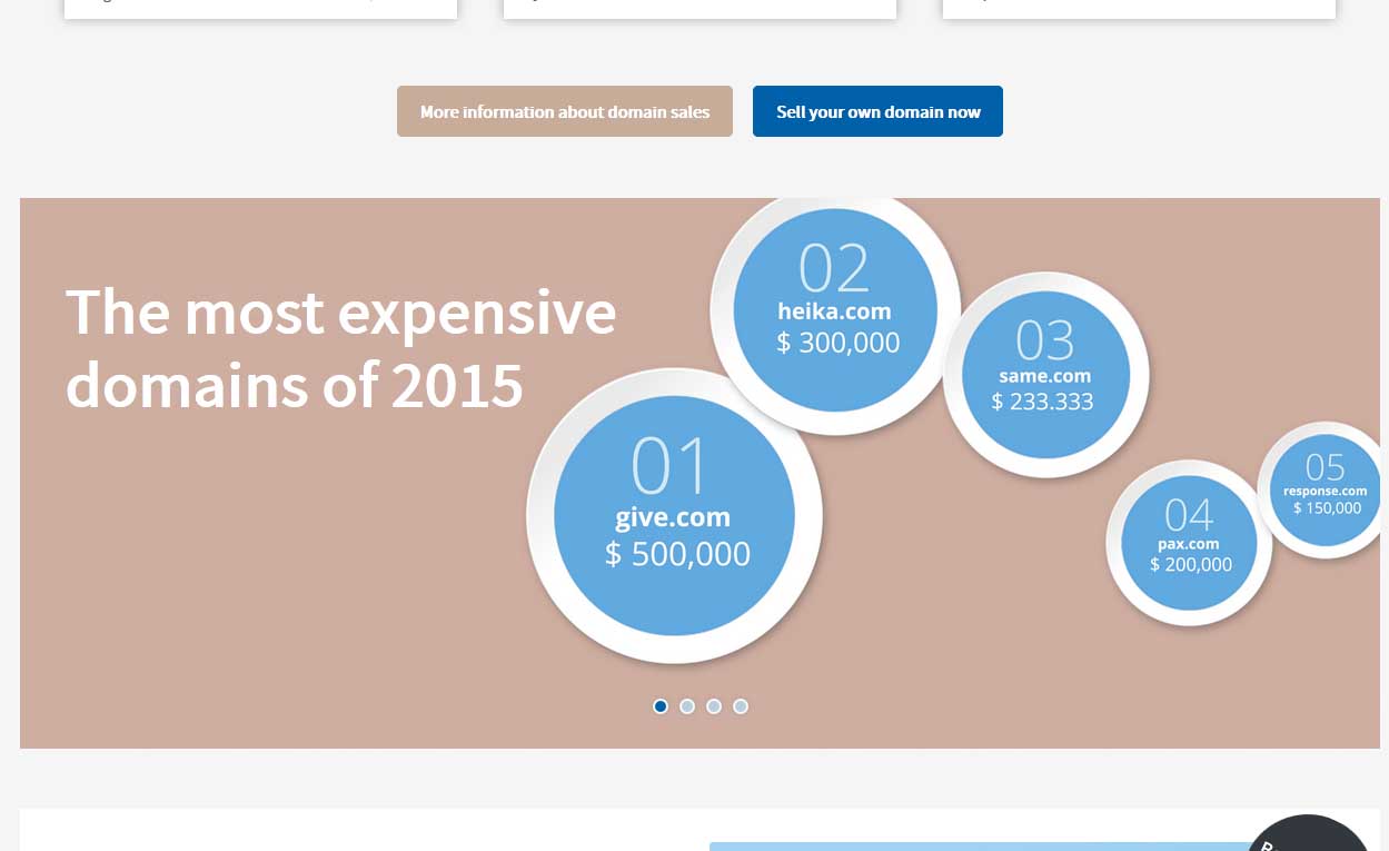
Sedo regularly published weekly sales figures totaling $1 million or more, so it will be interesting to see whether this new design has a positive or negative effect on those figures in the next few months.
 
Last edited:
18
•••
The views expressed on this page by users and staff are their own, not those of NamePros.
once again I confirm much of the work was to be done in the sellers back-end.....:xf.frown: making a new site is kind of useless without a new back-end interface.
 
0
•••
I am not impressed... Looks like its simple word-press theme.

Sedo listing is also showing wrong registration year for the most of my domains...
My some of the domains are registered in 2015, that too in mid of that year.. But, sedo is showing registration year as 2016. Similar for my older domains...

Check ur's..
 
0
•••
Same issue, I have domains registered in 1999 that show that are registered in 2016...
plus stats have some issues too. Very strange! O_o
 
0
•••
Identical color as Flippa........

Looks like but they failed miserably in copying. Flippa has much clean and intuitive design.
 
0
•••
Hi guys,

thanks for the valuable feedback and pointing out some things that are still missing!

First off, we want you to know that this facelift is just the first step and more and more optimizations are coming soon. We all know, (yes, even ourselves) that the websites behind the user login need to be updated and made responsive as well. This is going to come.

What else will be fixed:
  • Auction calendar will be back
  • The RSS feed box on the homepage and the market trends page will link to the corresponding auctions
  • The bubble on the offer details page will say "listed at Sedo" instead of "registered since". The registration dates of domain names can still be found in the fact sheet above.
We're continuing to collect and analyze feedback and will be making more changes. We'll also, very closely, monitor what is happening on the offer details pages / sales lander. We track what's happening on there and we'll make adjustments if necessary. We, too, want to make sure that interested buyers get the domain they want, which, ideally, is one of the domains that is up for sale by you.

If you have another minute to continue reading, let me quickly explain what the goal of this part of the redesign pages is:

  1. To work on mobile devices
    We've lacked having a mobile interface for so long, we needed to put something online that shows what we're doing and what the domain name industry is at first glance, working on every device. That way, new potential buyers for your domains will be more likely to stay on our side and buy your domains. We know the sites after the login have to work in such a way as well, and that will be tackled next.

  2. Make the page more enticing for newbies
    We so often meet people who have no clue that the secondary market exists and that haven't heard about purchasing "used" domains. With our previous page we weren't able to convince this group of people that sedo.com is a place to browse around and get to know what the domain name business is about. Outdated imagery, too much text crammed on little space, lot of data presented without any visualization. This would pose the problem that you don't get new interested buyer parties. We don't want that, so this is why we try to "lure in" more users for you, with better imagery, completely new texts and more explanatory language.

    Here's a small selection of before and after screenshots, for you to see what I mean:

    buy_domains_old.jpg


    buy_domains_new.jpg


    market_trends_old.jpg


    market_trends_new.jpg


    We also try to attract more buyers for you by showing that box below on the offer details page where interested buyers can enter their email address to receive offers on that domain name. (You only see that box when you're not logged in). So what we do is, we send emails to these users that are interested in one of your domains, telling them that the domain is still for sale and they should check it out. We didn't do this before, we're looking forward to driving more sales for you with this as well.

    odp_subscription.jpg


  3. Reduce the number of obsolete pages
    We've had so many pages available in our navigation that were just distracting from going to the search and actually get buying or selling domains. We now have put the more important parts like buying and selling on single pages, so users see what's it all about in one single place (e.g. one page), instead of clicking through endless different pages (which especially on mobile devices would be a pain). The about us section with auxiliary pages has been moved to the right-hand side to increase focus on the buying and selling part.


We'll be making more changes in the next few weeks that should make browsing, finding, buying and selling domains even easier, which are all feature- and product-related. Design-wise, you can either like the way the new page looks or you don't, that of course is something users will feel differently about. We feel it's a step up from what we had before and that we're going in the right direction. More fixes will come and we'll collect your feedback and work on our to-dos.

We do know the pages after the login need to be updated, and we will do so. If we had waited for these pages to be finished, we would not have had a mobile-friendly version for an even longer period of time at all, which we just couldn't afford.

Thanks for reading (turned out to be longer than I had planned), and let us know if there's more you're missing.

Best regards,
Christoph
Marketing & PR Manager
 
7
•••
Oh, and of course, we've tried to make the search more user-friendly. We now show all the filters right away, instead of having to click on the "advanced filters" link. The Direct Match is now more visible than before and you don't have to click through the pages.
 
3
•••
^^ I think this is the first time I have seen Sedo reply to anything on NP, ever. And I have been asking for the site to be mobile for over 5 years, so I find it hard to understand the rush to roll out something half-finished. If it doesn't say on the site that it is undergoing work how would the newbies you say you want to attract know that?
 
1
•••
Make the page more enticing for newbies
  1. We so often meet people who have no clue that the secondary market exists and that haven't heard about purchasing "used" domains. With our previous page we weren't able to convince this group of people that sedo.com is a place to browse around and get to know what the domain name business is about.
  1. Well that is a good aspiration but what data do you base this on? How will you know if you are selling to a new market segment? Do you have some analytics or is all this based on anecdotal "feedback"?
 
0
•••
@Sedo

First, my congrats - the move from a non - responsive design to a responsive design was a good decision.
Beside some critical points (which I state in the following) I (and of course many others) really appreciate this move.

Here is, what I (and I am sure, others too) really would appreciate:


  • The look of the offered domain
Currently, the offered domain on the SEDO's offer page is shown in CAPITAL LETTERS only.
I really recommend to show it also in small letters (under the CAPITAL LETTERS).
For example:

DOMAINPORTFOLIO.TOP
domainportfolio.top

This looks much better because:
First, the CAPITAL LETTERS are showing the domain itself in a front view.
Second, then the smal letters are showing how the domain looks like 'original' in the URL (some letters are 'different' - so it 'looks' a bit different - for example: A = a / B = b / G = g / M = m / ...).
Also, there is a saying (at least in german): 'Double works better'.


  • Remove SEDO's automated stated minimum price (90 $ / € / £ / ...)
Please remove SEDO's automated stated minimum price (90 $ / € / £ / ...).
This isn't an advantage for the seller. There is anyway already the popup hint if the offer is to low - that's perfect. But the permanent visible automated stated minimum price (90 $ / € / £ / ...) is not necessary and does not help.


  • Set a link to the sellers domain portfolio
Please set an (optinal) link to the sellers domainportfolio.
This is a very important point.
The interested party should be able to find fast / easy, which domain/s the same seller is offering too.


  • Update your domain description field
The whole description form should be in a bigger, modern and more user frindly design.
It's way too small and there are some bugs in it (for example, if the domain is written in the description with CAPITAL LETTERS, you can't write it also witch small letters, it changes automatically to CAPITAL LETTERS as result.
Or, the @ symbol can only be used as part of an email adress but not as a symbol for, for example: 'Make your offer @ SEDO now.'.
Or, if you set 3 spaces between 2 words, it will count only as 1 space.


  • Background picture (sresponsive tripe)
It would be great if you let the user decide which picture he want's to use for his domain/s (only out from your photos of course - they have top quality, they are really great).


  • 100 % domain length search filter
Very important point.
Let the user also set the domain length filter for: 'Show only domains with 63 characters'.
In other words, let him choose 'Domain length FROM (his choice) - TO (his choice)'.
Than he is able to search, for examle, only for 3L or only for 4L or, as mentioned, only for 63L (maximum length).
Believe me, that would be a great option!
Currently, there is only the choice for FROM 1 (no choice) TO (his choice).


  • Make an option for 'List domain search results by traffic'
Yes, that would be a great listing option.
Not only parking traffic, also traffic of not parked but offered domains.


  • Show the amount of visitors of the domain's SEDO offer page itself
Please bring that back again.
This is really very important point.
It was shown in past (old design) but it disappeared now - please bring it back.


  • Add ARABIC as language
Arabic is a world language, it is a MUST in a global world.
All arabic potencial buyers will appreciate it and all sellers (arabic or non arabic) too of course.


  • You added RUSSIA as language, but the domain offer pages will not be shown in russia
Every Domain offer page should also be shown in the choosen language.


  • Fix the 'eternal scroll'
Please ;)


  • Update SEDO's .top featured site
There is not shown the new .top logo but still the old one (?).
This site really should be redesigned in a more aestetical way - please take away the last three pics and use greater pics.
The .top logo should be shown in front view.


  • Add 2 circles (beside the current 3) to the offer page
Please add the year of the registration of the domain itself and the visitors of the domain offer page itself.
Then there would be 5 (smaller = better design) circles.


Ok, those are my thoughts and I hope they are helpful to get a view of what's important in a customers eyes.

Please feel free to ask if some of my mentioned points are unclear.
Thank you for reading and all the best for your work and y/our sales.
 
5
•••
Hey, thanks for the detailed suggestions! Really helpful!

I'll reply below in blue:


@Sedo

First, my congrats - the move from a non - responsive design to a responsive design was a good decision.
Beside some critical points (which I state in the following) I (and of course many others) really appreciate this move.

Here is, what I (and I am sure, others too) really would appreciate:


  • The look of the offered domain
Currently, the offered domain on the SEDO's offer page is shown in CAPITAL LETTERS only.
I really recommend to show it also in small letters (under the CAPITAL LETTERS).
For example:

DOMAINPORTFOLIO.TOP
domainportfolio.top

This looks much better because:
First, the CAPITAL LETTERS are showing the domain itself in a front view.
Second, then the smal letters are showing how the domain looks like 'original' in the URL (some letters are 'different' - so it 'looks' a bit different - for example: A = a / B = b / G = g / M = m / ...).
Also, there is a saying (at least in german): 'Double works better'.

Got it, good point, will be brought up.

  • Remove SEDO's automated stated minimum price (90 $ / € / £ / ...)
Please remove SEDO's automated stated minimum price (90 $ / € / £ / ...).
This isn't an advantage for the seller. There is anyway already the popup hint if the offer is to low - that's perfect. But the permanent visible automated stated minimum price (90 $ / € / £ / ...) is not necessary and does not help.

From our point of view, transparency is important towards interested buyers. What harm does it, when we show this, if the minimum price is indeed correct and shown in the poup hint anyway? It helps creating awareness of the value of domains in general, in our opinion.


  • Set a link to the sellers domain portfolio
Please set an (optinal) link to the sellers domainportfolio.
This is a very important point.
The interested party should be able to find fast / easy, which domain/s the same seller is offering too.

Sounds interesting, I'll bring it up.
  • Update your domain description field
The whole description form should be in a bigger, modern and more user frindly design.
It's way too small and there are some bugs in it (for example, if the domain is written in the description with CAPITAL LETTERS, you can't write it also witch small letters, it changes automatically to CAPITAL LETTERS as result.
Or, the @ symbol can only be used as part of an email adress but not as a symbol for, for example: 'Make your offer @ SEDO now.'.
Or, if you set 3 spaces between 2 words, it will count only as 1 space.


  • Background picture (sresponsive tripe)
It would be great if you let the user decide which picture he want's to use for his domain/s (only out from your photos of course - they have top quality, they are really great).

Thanks for the compliment. Not sure this can be implemented quickly (with regards to more pressing changes)

  • 100 % domain length search filter
Very important point.
Let the user also set the domain length filter for: 'Show only domains with 63 characters'.
In other words, let him choose 'Domain length FROM (his choice) - TO (his choice)'.
Than he is able to search, for examle, only for 3L or only for 4L or, as mentioned, only for 63L (maximum length).
Believe me, that would be a great option!
Currently, there is only the choice for FROM 1 (no choice) TO (his choice).

Ok, I understand you like longer domains names :) I'll see what we can do.

  • Make an option for 'List domain search results by traffic'
Yes, that would be a great listing option.
Not only parking traffic, also traffic of not parked but offered domains.

Ok, will bring it up.
  • Show the amount of visitors of the domain's SEDO offer page itself
Please bring that back again.
This is really very important point.
It was shown in past (old design) but it disappeared now - please bring it back.

Are we talking about the same thing here? Please see screenshot attached.
  • Add ARABIC as language
Arabic is a world language, it is a MUST in a global world.
All arabic potencial buyers will appreciate it and all sellers (arabic or non arabic) too of course.

We'll be adding Dutch, Russian and Italian next. So far, we've only been adding languages that we can offer support in. For Arabic, I'm not sure we can do this at this point.
  • You added RUSSIA as language, but the domain offer pages will not be shown in russia
Every Domain offer page should also be shown in the choosen language.

See above
  • Fix the 'eternal scroll'
Please ;)

Hehe, don't think that will happen. Scrolling is, especially on mobile devices, something that users have gotten used to again (see usage of facebook, twitter and more) and we want to keep this feature.
  • Update SEDO's .top featured site
There is not shown the new .top logo but still the old one (?).
This site really should be redesigned in a more aestetical way - please take away the last three pics and use greater pics.
The .top logo should be shown in front view.

Sure, that'll be no problem.

Add 2 circles (beside the current 3) to the offer page

Please add the year of the registration of the domain itself and the visitors of the domain offer page itself.
Then there would be 5 (smaller = better design) circles.

Reg. year can be seen in the fact sheet, but we'll be assessing how we can bring this down on the page itself.

Ok, those are my thoughts and I hope they are helpful to get a view of what's important in a customers eyes.

Please feel free to ask if some of my mentioned points are unclear.
Thank you for reading and all the best for your work and y/our sales.
 
1
•••
  1. Well that is a good aspiration but what data do you base this on? How will you know if you are selling to a new market segment? Do you have some analytics or is all this based on anecdotal "feedback"?


We have a team that works on analytics only. So we'll be seeing which kind of companies and individuals will be creating new accounts, buy domains or subscribe to our newsletters. In general, of course, what matters is that new accounts are being created and turned into domain buyers and / or sellers. No matter which business they're in.
And, please excuse me, I'm not part of the analytics team and they are in the know way more than I am, pulling data, analyzing and optimizing. So they do the numbers and we act ;)
 
0
•••
Forgot to attach the screenshot, here you go.

@Sedo

First, my congrats - the move from a non - responsive design to a responsive design was a good decision.
Beside some critical points (which I state in the following) I (and of course many others) really appreciate this move.

Here is, what I (and I am sure, others too) really would appreciate:


  • The look of the offered domain
Currently, the offered domain on the SEDO's offer page is shown in CAPITAL LETTERS only.
I really recommend to show it also in small letters (under the CAPITAL LETTERS).
For example:

DOMAINPORTFOLIO.TOP
domainportfolio.top

This looks much better because:
First, the CAPITAL LETTERS are showing the domain itself in a front view.
Second, then the smal letters are showing how the domain looks like 'original' in the URL (some letters are 'different' - so it 'looks' a bit different - for example: A = a / B = b / G = g / M = m / ...).
Also, there is a saying (at least in german): 'Double works better'.


  • Remove SEDO's automated stated minimum price (90 $ / € / £ / ...)
Please remove SEDO's automated stated minimum price (90 $ / € / £ / ...).
This isn't an advantage for the seller. There is anyway already the popup hint if the offer is to low - that's perfect. But the permanent visible automated stated minimum price (90 $ / € / £ / ...) is not necessary and does not help.


  • Set a link to the sellers domain portfolio
Please set an (optinal) link to the sellers domainportfolio.
This is a very important point.
The interested party should be able to find fast / easy, which domain/s the same seller is offering too.


  • Update your domain description field
The whole description form should be in a bigger, modern and more user frindly design.
It's way too small and there are some bugs in it (for example, if the domain is written in the description with CAPITAL LETTERS, you can't write it also witch small letters, it changes automatically to CAPITAL LETTERS as result.
Or, the @ symbol can only be used as part of an email adress but not as a symbol for, for example: 'Make your offer @ SEDO now.'.
Or, if you set 3 spaces between 2 words, it will count only as 1 space.


  • Background picture (sresponsive tripe)
It would be great if you let the user decide which picture he want's to use for his domain/s (only out from your photos of course - they have top quality, they are really great).


  • 100 % domain length search filter
Very important point.
Let the user also set the domain length filter for: 'Show only domains with 63 characters'.
In other words, let him choose 'Domain length FROM (his choice) - TO (his choice)'.
Than he is able to search, for examle, only for 3L or only for 4L or, as mentioned, only for 63L (maximum length).
Believe me, that would be a great option!
Currently, there is only the choice for FROM 1 (no choice) TO (his choice).


  • Make an option for 'List domain search results by traffic'
Yes, that would be a great listing option.
Not only parking traffic, also traffic of not parked but offered domains.


  • Show the amount of visitors of the domain's SEDO offer page itself
Please bring that back again.
This is really very important point.
It was shown in past (old design) but it disappeared now - please bring it back.


  • Add ARABIC as language
Arabic is a world language, it is a MUST in a global world.
All arabic potencial buyers will appreciate it and all sellers (arabic or non arabic) too of course.


  • You added RUSSIA as language, but the domain offer pages will not be shown in russia
Every Domain offer page should also be shown in the choosen language.


  • Fix the 'eternal scroll'
Please ;)


  • Update SEDO's .top featured site
There is not shown the new .top logo but still the old one (?).
This site really should be redesigned in a more aestetical way - please take away the last three pics and use greater pics.
The .top logo should be shown in front view.


  • Add 2 circles (beside the current 3) to the offer page
Please add the year of the registration of the domain itself and the visitors of the domain offer page itself.
Then there would be 5 (smaller = better design) circles.


Ok, those are my thoughts and I hope they are helpful to get a view of what's important in a customers eyes.

Please feel free to ask if some of my mentioned points are unclear.
Thank you for reading and all the best for your work and y/our sales.
 

Attachments

  • visitors.jpg
    visitors.jpg
    55.9 KB · Views: 91
1
•••
Forgot to attach the screenshot, here you go.

Thanks, but this screenshot is showing the visitors of SEDO parked pages only.

I made an original screenshot (current circumstance) and a fictionary one (as a before / after) comparison what I mean:


ORIGINAL SCREENSHOT
SEDO offer page current design.png


At this (original) screenshot we can see 3 circles:
  • VISITORS PER MONTH (only if the domain is parked via SEDO - otherwise this would be N/A)
  • REGISTERED (offerd at SEDO since)
  • BIDS SUBMITTED


FICTIONAL SCREENSHOT
SEDO offer page fictional design.png


At this (fictional) 'screenshot' we can see 5 circles:

  • YEAR OF REGISTRATION
  • LISTED ON SED SINCE
  • MONTHLY VISITORS DOMAIN / WEBSITE
  • MONTHLY VISITORS OFFER PAGE
  • BIDS SUBMITTED
 
0
•••
Got it, thanks for the explanation.


Thanks, but this screenshot is showing the visitors of SEDO parked pages only.

I made an original screenshot (current circumstance) and a fictionary one (as a before / after) comparison what I mean:


ORIGINAL SCREENSHOT
Show attachment 36153

At this (original) screenshot we can see 3 circles:
  • VISITORS PER MONTH (only if the domain is parked via SEDO - otherwise this would be N/A)
  • REGISTERED (offerd at SEDO since)
  • BIDS SUBMITTED


FICTIONAL SCREENSHOT
Show attachment 36154

At this (fictional) 'screenshot' we can see 5 circles:

  • YEAR OF REGISTRATION
  • LISTED ON SED SINCE
  • MONTHLY VISITORS DOMAIN / WEBSITE
  • MONTHLY VISITORS OFFER PAGE
  • BIDS SUBMITTED
 
0
•••
There is any option to check recent domain sales through sedo, while checking that option missing in new design?

thanks
 
0
•••
We have this ticker on top of this page here: https://sedo.com/us/buy-domains/market-trends/
It doesn't show the amount, though, so I assume that is not what you were looking for. We changed the way we report our weekly sales data, so this is in compliance with that specific change.

There is any option to check recent domain sales through sedo, while checking that option missing in new design?

thanks
 
0
•••
Dear Sedo, may you check why the date of domain registration is wrong. Domains registered in 1999 or 2000 are getting

2016
Registered

Thanks
 
0
•••
Yep, already noted, see our previous post. Will be fixed soon!


Dear Sedo, may you check why the date of domain registration is wrong. Domains registered in 1999 or 2000 are getting

2016
Registered

Thanks
 
1
•••
Offer views is no longer updating.
 
0
•••
Further: The "offer views" feature is not updating every night at 1:00 est like it used to. Been stuck at the same numbers for the last 2 nights. So there is no way to tell which domains are getting attention.
 
0
•••
@Sedo Further to design issues, may I suggest that your "watch" feature could be enhanced? Pardon me to hold eBay up as an example, but when we watch any auction there, it displays publicly on the listing. If we knew that multiple potential buyers are watching our domain(s) at SEDO it might prompt us to start an auction, or even modify a price.

You have the data, why not let us see it? Thank you.
 
1
•••
I think the new layout is an improvement. Hoping it helps end users find domains easier in the long run.
 
1
•••
@Sedo Thank you for the new design. My worries are about the sale page landing. When a visitor lands to a page with the thing buy or make offer in mind s/he would like to see that offer box. What I see on my 12 inch display is 1/5 part of the display (dark color Sedo bar, search box, login etc), 4/5 part of the display an image (some images are very distractive hard to see what is written on them) on the middle of it a hard to read domain name and under it "is for sale" in small size. On the right of the display a small part of "Buy this domain" tag.

The problem is when I land a page to buy or offer option in my mind, I should see that buy or offer box clearly. I shouldn't search it in the page. As a computer engineer even I am having difficulties to find and discover how to buy/make offer so I can't imagine domain buyers which are not so tech savvy.

My advice is remove that image bar under Sedo bar or make it smaller (half in height). Highlight "is for sale" tag and domain name part to make them more readable. Make that "buy this domain" tag capital letters and bold and save it from being inside of that unnecessary image, and having its title colors mixed with that unnecessary image.
 
1
•••
@Sedo

@Sedo

First, my congrats - the move from a non - responsive design to a responsive design was a good decision.
Beside some critical points (which I state in the following) I (and of course many others) really appreciate this move.

Here is, what I (and I am sure, others too) really would appreciate:

...

Hey, thanks for the detailed suggestions! Really helpful!

I'll reply below in blue:

@Sedo

...
  • Update SEDO's .top featured site
There is not shown the new .top logo but still the old one (?).
This site really should be redesigned in a more aestetical way - please take away the last three pics and use greater pics.
The .top logo should be shown in front view.

Sure, that'll be no problem.

...


Thx for your reply(s) - I am excited to see how long it will need for SEDO's .top featured site to be updated (see my quoted post above).

As a german speaking SEDO member (from Austria) I have one more very important thing to say about my mentioned SEDO's .top featured site site:

  • Please add also a german version of SEDO's .top featured site www.sedo.com/top as soon as possible.
    This would be very helpful for the german .top market in which I am and it would be helpful for SEDO too at the end.

Thanks in advance, as a SEDO member / customer since years I count on you!
 
0
•••
I think new features and better user experience is more important, I still cant search domains and rank them by traffic? Why take away such an important feature?
 
0
•••
  • The sidebar remains visible by scrolling at a speed relative to the page’s height.
Back