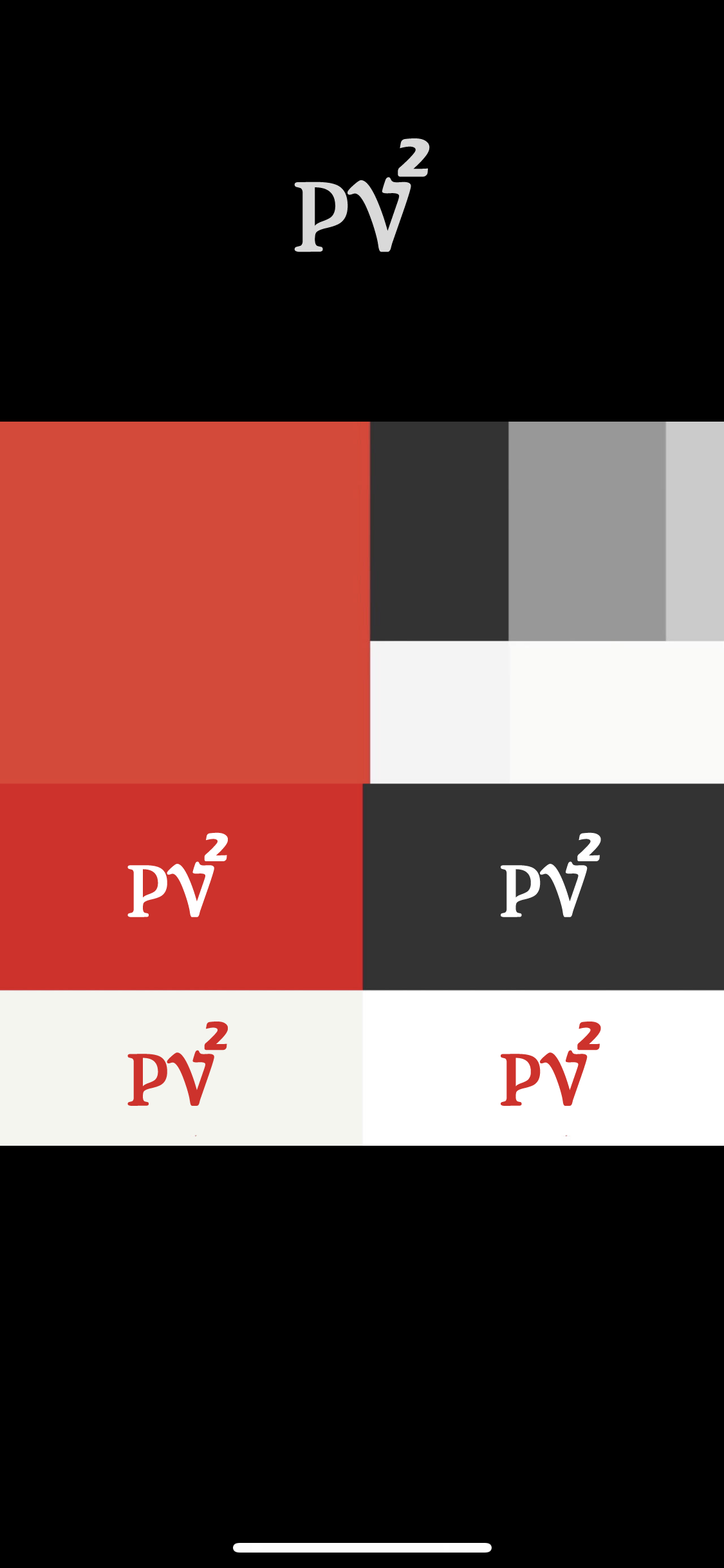
However, if in the near future we feel it is necessary to make a switch, I might reach out to other candidate and make a purchase based on the rate I promised in this thread. I personally like #14 by @DesignPros it looks really great but my partners said it is less clear and lack of professional attitude. Who knows, if I in the future still like it I might reach out. As for @galalogo 's work, (#8) I think your work always deliver uniqueness and I especially love your work. I will reach out if I change my mind to your direction. Thank you
At the moment stage, we think Kraman's work is best fit in both clarification and simplicity. The concept "circle" could stand for the earth, and 2 can stand for "accelerator", Font also delivered as clear and modern.