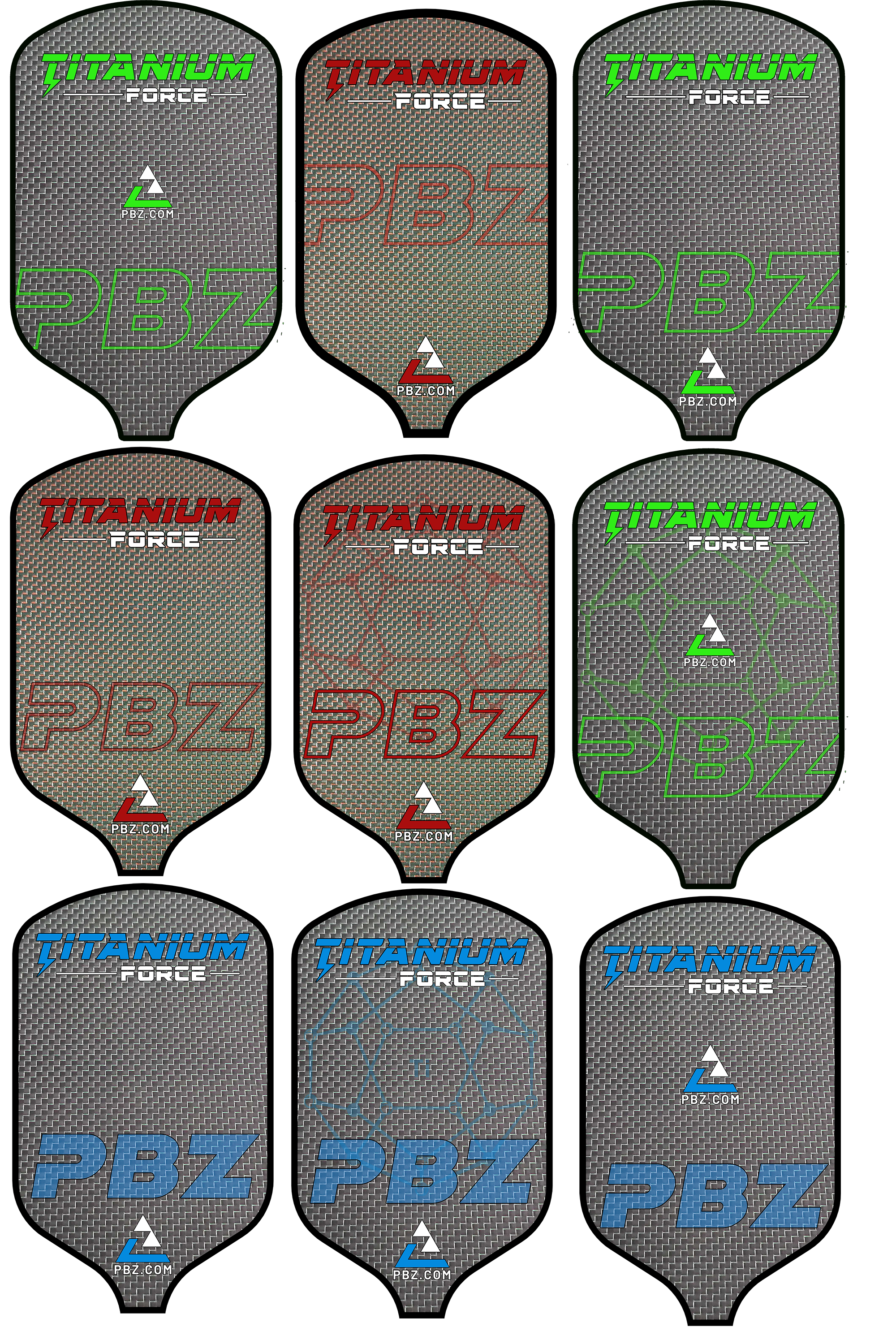
I opted for a design without the large Z and liked the placement on the sides the best. By keeping the middle free, the design becomes a little sleeker, calmer, and more chic. At least, that is how I experience it. With option 3, left and right are also in balance. Good luck.
The designs with the large Z remind me how tennis folks would dye their strings.
It got me wondering if the Z had any technical meaning besides fashion. I'm not a pickle ball player, just wondering if the Z could resemble the sweet spot of the paddle where you try to hit the ball?
Then I got lost trying to picture a pickle ball paddle like the pitch zone in baseball, where the hitters zone is broken down to a grid, showing a pitcher the potential hot and cold spots for a batter. Or a training racket, perhaps there are certain spots of the paddle one tries to hit the ball with for the best slice vs topspin vs flat shots? Put a sensor in the middle of the paddle and record how many shots hit the sweet spot?
By the time I was done trying to reinvent the paddle of a sport I've only played a few times, I forgot the original question was multiple choice, 1-4.
Anyways, after all this, all I have to say is nice initiative to make use of this 3L.com!
I've only played a few times and had my pickle balls handed to me by a regional champ each time.
I'd view videos and see what the resting position of the paddle is between plays and/or while resting. It might work out in such a way that the orientation should be up/down rather than left right.
Additionally, have it flipped from side A as opposed to side B so no matter how it is 'rested', the name/logo has a better chance of being easily read.
If you plan to use a 3L of this caliber, make that sucker big! Let the live crowd, still photos and/or videos make it easy to see.
Number 3. The biggest logo. Good color to put over dark grey.
People need to see your logo from afar while watching the game.
You must emphasize your logo. I don't see the point on the big Z.
Best whishes in the paddle business!


")