Unstoppable Domains

My Domain Sales Page

Spaceship Spaceship
Watch

Messiah

Active MemberTop Member
Impact
1,540
After searching all over the Google, I took the decision to create my custom domain sales page. I wanted it to be simple without much info on it and only a contact form for inquiry.

So, I took a free sales landing page and customized it according to my needs. I made it responsive, added a contact form. I then added a captcha feature which can be added/removed whenever I want. The contact form sends an email in the below format.

Subject: Domain Inquiry - Votzy.com
Message: Hello, You have received domain inquiry
Name: XXXX
Email: [email protected]
Domain: Votzy.com
Offer: $ Price
Message: Comments

Please review my sales landing page. Votzy.com
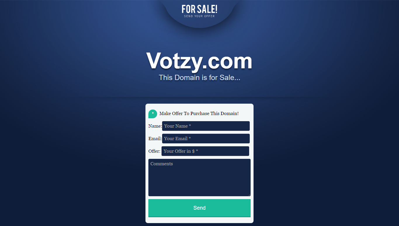
votzy.com screenshots.png
 
•••
The views expressed on this page by users and staff are their own, not those of NamePros.
Absolutely love it! Well done. Are you selling it?
 
0
•••
Thanks @premium_seller :) I didn't think of selling it because I created it as per my needs... If domainers are also looking for same thing, then I will put it on sale.
 
0
•••
I think you should. It looks clean. Make it into a template and sell away. I think in the range of $8 would be awesome. Add it on www.themeforest.com.

Let me know if you do. I would buy it!
 
2
•••
Very nice landing page! I also decided to put all my domains in my own landing page, here is example: bozue.com

Bozue.com   May be available for sale .png
 
1
•••
1
•••
I like it! I think you should tighten the margins on the For Sale! , the domain name and the form though. See the shadow line above the form? Make all the margins equal to that. The domain name will be in a lighter area and give it more depth in that lighter blue too.
 
Last edited:
1
•••
FYI your page isn't dispaying correctly for me AND I have heavy tweaking so sometimes it's just me, however you can run it through one of those browser display checkers to be sure
My setup is linux firefox 1835x1468

Like it very much anyway - Very clean and simple.
 

Attachments

  • SS-NP-skew-votzy.png
    SS-NP-skew-votzy.png
    240.6 KB · Views: 188
3
•••
FYI your page isn't dispaying correctly for me AND I have heavy tweaking so sometimes it's just me, however you can run it through one of those browser display checkers to be sure
My setup is linux firefox 1835x1468

Like it very much anyway - Very clean and simple.
Thanks.. I tested on all major browsers to be sure....I tested once again on Firefox and it is fine.. :)
 
1
•••
FYI your page isn't dispaying correctly for me AND I have heavy tweaking so sometimes it's just me, however you can run it through one of those browser display checkers to be sure
My setup is linux firefox 1835x1468

Like it very much anyway - Very clean and simple.
I've tested @Messiah sale page on FF, Chrome, Safari, Vivaldi and looks fine for me.
 
3
•••
2
•••
2
•••
1
•••
amazing design great work...
 
1
•••
Love the sales page Messiah. Clean and non-cluttered.
 
1
•••
Looks nice and clean to me.

If possible, you should capture the visitor's IP address too. It's valuable information when you're trying to determine who's really on the other side of an incoming offer.
 
2
•••
Looks great, well done! Like others said, nice and clean. It's doing what it's supposed to.
 
1
•••
Thanks for suggestion @NameClerk.com . I now included the IP address code along with a custom link to get full IP details of the user :)
 
1
•••
Thanks for suggestion @NameClerk.com . I now included the IP address code along with a custom link to get full IP details of the user :)
How do you add the IP address code? I use Wix for my website?
 
0
•••
How do you add the IP address code? I use Wix for my website?
Hi, I believe Wix doesn't support server side scripting such as PHP which is really terrible. But there might be possible workaround using Javascript.

PHP code: $ip = $_SERVER['REMOTE_ADDR'];
 
1
•••
EXcellent look and feel, but as @frank-germany shared above make sure to test on multiple devices, especially phone displays. Using numerous line <br> breaks punches the form on a couple of our test phones below the fold. FWIW we cheat and use 1px spacers…
 
1
•••
Looks great on mobile, @Messiah! Love the color/colour scheme!
Impressed.
 
1
•••
Thanks @martinrussell . Yeah, I agree...Actually I used <br> tags as a lil workaround.. I need it to sanitize it more.. :)
 
1
•••
1
•••
3
•••
  • The sidebar remains visible by scrolling at a speed relative to the page’s height.
Back