Dynadot .com transfer sale, only $10.12 with coupon code DYNA12, available while supplies last, ends October 1, 2026.

DomainEquity Logo input needed

Namecheap AuctionsNamecheap Auctions
Spacemail by SpaceshipSpacemail by Spaceship
SpaceshipSpaceship
Watch

Rob Monster

Founder of EpikTop Member
:heavy_check_mark: Epik Founder
Impact
18,367
I am looking for some input on logo selection.

We have been working to finish a project called Domain Equity for peer to peer lending -- empowering domainers to access liquidity outside of the conventional banking pool. For those not aware, DomainEquity was a project long before COVID-related shutdowns, but has taken added urgency as a result of pressure on the banking system.

The site is scheduled to go live sometime in April. Here is a preview of the homepage:
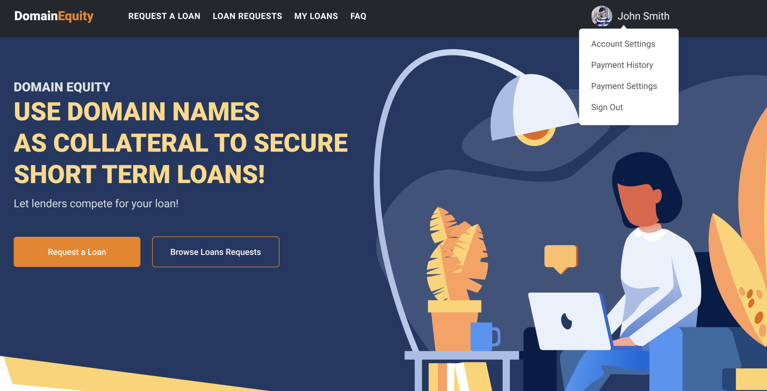
upload_2020-4-5_10-18-12.png


And here is a walk-through:

https://www.loom.com/share/547cf9f24a9d4f1e90701361f34651fc

We have some logo concepts -- here is the short list of final candidates:
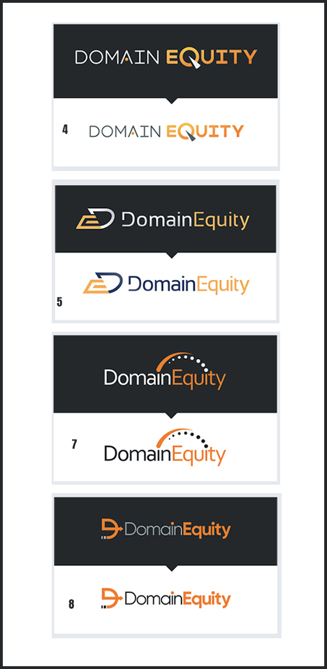
upload_2020-4-5_10-20-48.png


For the long run, I tend to prefer a logo that can ultimately be branded in a way that can be logowear, e.g. you could put it on a baseball cap, etc.

Welcome any feedback.
 
•••
The views expressed on this page by users and staff are their own, not those of NamePros.
GoDaddyGoDaddy
8
•••
#4 &#8 Rob... Actually #8 more
 
3
•••
I liked #7 , Great work by the team there :)

Thanks,
Sumeeth
 
5
•••
I like the icon in five, would has as favicon maybe. seven looks good, got the whole "cross your t's and dot your i's" thing going synonymous with negotiations.
 
1
•••
Good for # 7 , but great for # 8
 
1
•••
I'm surprised how many people are saying #8 idk but I dont like the icon. Same with #5 too much going on with it IMO. #7 comes close but doesn't go overboard but I still love the simplicity of #4. :xf.wink:
 
1
•••
I'm diggin' #7
 
3
•••
#4 seems like a nicer one.
 
2
•••
I like #5
 
0
•••
I agree with @BrandPlease. 5 & 8 are the best. 8 appears to be the most popular so far according to my unscientific scanning of the feedback, but 5 also has a nice logo that can stand by itself on a baseball cap or t-shirt for instance. In the opening thread, Rob did say that the "logowear" concept (brands that look good on apparel) was important too
 
1
•••
I originally liked #8, but on second thought, I think it (the avatar) looks too much like something from the early 00’s. Almost like something Godaddy would do.

I’m settling for #4 because, for one, it’s simpler. It incorporates the avatar into the domain itself and would look much more professional on hats and t-shirts.
 
0
•••
#7.

Brad
 
1
•••
Also a fan of 7
 
1
•••
they all look like a fivr $5 USD job
why don't you pay a designer?
 
2
•••
#7 and #8 but leaning toward #7
 
2
•••
#4 by far

At a first Wee glance #8 could easily and does (IMO) look like "D DomainEquity" Icon hinders it looks to much a like a "D". no good! ( same with 5)

#4 pops out and is CLear!

7 would be my 2nd choice
 
Last edited:
0
•••
#8

> concept:

domainequity.jpg
 
7
•••
they all look like a fivr $5 USD job
why don't you pay a designer?

Haha I thought the same thing!!

or at least show some NamePros support, sense you love this community so much and do a design contest here @Rob Monster
 
2
•••
I originally liked #8, but on second thought, I think it (the avatar) looks too much like something from the early 00’s. Almost like something Godaddy would do.

Perfectly pt to words what I was thinking. Sorry Tib fir the GD comparison but I agree, it gives me that same huh feeling GDs new logo did.
 
3
•••
7
 
1
•••
DomainEasy: white label portfolios are live. Enable yours.

We're social

Escrow.com
Spaceship
Escrowly
CryptoExchange.com
Domain Recover
Catchy
  • The sidebar remains visible by scrolling at a speed relative to the page’s height.
Back