Recently, I received some inquiries on 2 of my domains through landing pages at a top registrar (won't mention which one as it isn't important). The offers were not too bad but I felt that as the inquiry was routed to a broker, after the 20% commission, the offer did not seem enough to warrant the sale. After a bit the deal went cold.
I couldn't help but feel that since the inquiry came from a landing page, that I could have easily handled this deal myself and kept the 20% commission as well as having a lot more time to interact with the inquirer and possibly strike a deal. Whereas the broker was most likely handling multiple inquiries at a time and allowed the deal to grow cold.
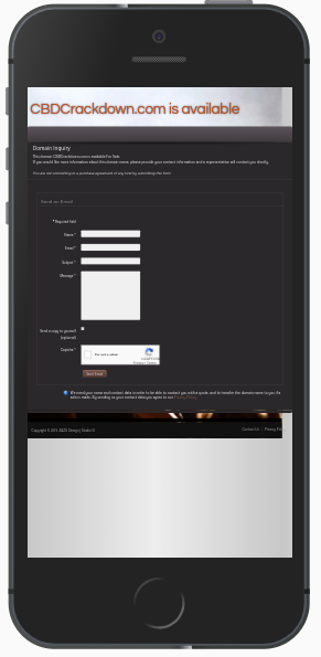
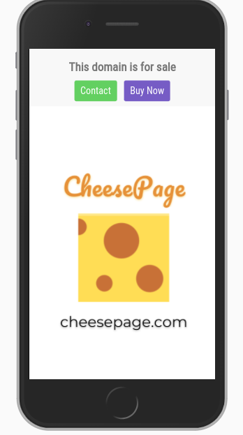
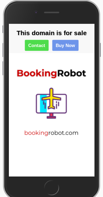
I wanted to try out my own landing page for one of my more premium domains and I wanted to get your thoughts on whether a landing page like this one is a good idea. If you could provide some feedback on what you think is good or bad about this lander and whether it is better to stick with a landing page provided by one of the big players like Uni, Sedo, Undeveloped etc. Landing page is below - it looks better on PC (moving background) but it still works well on mobile.
I personally like it as it is engaging, allows you to inquire immediately by clicking a button and filing a form but also gives the buyer information on the domain name and its potential if they wish to read on. Furthermore, I have chat functionality on there so if they have any questions that can chat to me in realtime. The form also goes to 2 of my email addresses so less likely that inquiries will be missed. But is this all too much?
Please keep comments to the point and this is about the landing page not the domain itself so do not start a side discussion about the domain.
Furthermore, it would be great if you could all share your own bespoke landing pages so we can all learn from each other on the best design concepts!
thanks,
CK
I couldn't help but feel that since the inquiry came from a landing page, that I could have easily handled this deal myself and kept the 20% commission as well as having a lot more time to interact with the inquirer and possibly strike a deal. Whereas the broker was most likely handling multiple inquiries at a time and allowed the deal to grow cold.
I wanted to try out my own landing page for one of my more premium domains and I wanted to get your thoughts on whether a landing page like this one is a good idea. If you could provide some feedback on what you think is good or bad about this lander and whether it is better to stick with a landing page provided by one of the big players like Uni, Sedo, Undeveloped etc. Landing page is below - it looks better on PC (moving background) but it still works well on mobile.
I personally like it as it is engaging, allows you to inquire immediately by clicking a button and filing a form but also gives the buyer information on the domain name and its potential if they wish to read on. Furthermore, I have chat functionality on there so if they have any questions that can chat to me in realtime. The form also goes to 2 of my email addresses so less likely that inquiries will be missed. But is this all too much?
Please keep comments to the point and this is about the landing page not the domain itself so do not start a side discussion about the domain.
Furthermore, it would be great if you could all share your own bespoke landing pages so we can all learn from each other on the best design concepts!
thanks,
CK
Last edited:

")