IT.COM

REQ-LOGO $125 Logo Contest! We May Choose 2 Winners

Spaceship Spaceship
Watch
Status
Not open for further replies.
We've held 4 successful Logo contests and paid quickly.

This contest has 2 Logo options to choose from. The winner may choose the strategy of only submitting a very good Logo #1 OR a very good logo #2. Logo #1 & Logo #2 are the primary focus so, for example, if you choose to only submit one logo and win for Logo #2, we'll select a 2nd winner that made the best Logo #1 (hopefully one of the 2 winners will have submitted an entry for logo #3 which is the afterthought of this contest).

It's not against the rules to submit all 3 but doubtful anyone will.
Logo #3 Now Closed, Eric Won
Those that submit Logo #3 will have a shot at a consolation prize of $30 if your entry for logo #3 is chosen.

Prize: $125 USD Grand Prize paid via Paypal upon receipt of the winning files. We reserve the right to choose 2 winners in the case that two different Designers win separately for Logo #1 & Logo #2. Please see the detailed rules in the intro above.
Type of Contest: 3 Logos to choose from. Please see the detailed rules in the intro above.
Company Name: HostHeroes.com, Connecticut Western, & Panther
Deadline: 12/27/20 at 11:59pm. We reserve the right to end this contest early if an incredible entry comes in.
Color: Open to various color schemes but the male superhero should include a shade of red in the costume. The female superhero may use any color scheme.
Size Requirements: .psd / Vector / PNG. The winner will need to provide the layered logo image on a transparent background.
Number of Entries: If interested in participating, you may submit as many entries as you desire.

1) Logo #1 - HostHeroes.com -
Suggested Format:
(Superhero drawing)
HostHeroes.com
Heroic Support

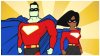
A webhosting company to use a superhero logo with a Caucasian male hero (please use some red in his costume) and an African American female hero pictured together to be placed at HostHeroes.com. Or use a helmet & full body suit to make their race unknown.
Please include this tagline on your logo (perhaps below?):
"Heroic Support"

The goal for this site would be that it would eventually be as amazing as this one: https://monster-tamer.com/ (If you know how to build a site as cool as that one using WordPress, please private message your price & details.)

To get your creative juices flowing, I saved my favorite original superheroes to this Pinterest Board: https://www.pinterest.com/timothybjones90/original-superheroes/

(Please notice that the male & female pictured together below is poor quality art but included below to show that we desire to have a male and female superhero pictured together.)

2) Logo #2 - Connecticut Western News -
Suggested Format:
(Logo art incorporated with/beside name?)
Connecticut Western News
CTWest.com Northwest Corner

(Online Newspaper) to be placed at: http://ctwest.com/
Please include this tagline on your logo (perhaps below?):
"CTWest.com Northwest Corner"

The winner of this logo will use web 2.0 format (the other 2 logos do not need to be in web 2.0). One option is to play into the "Country Western" theme to make the word "Western" fun? Open to your idea to make this logo special. This news site will cover the Northwest Corner of Connecticut - sparsely populated with rolling hills, trees & rivers. Very pastoral. The current logo & name will be replaced by yours.

Here are two Newspaper logos I like. The brown color is bad but this logo is visually striking:
https://99designs.com/profiles/byx888/designs/1082861

I like this 2nd logo for its great use of web 2.0 & nice Color contrast:
https://99designs.com/profiles/diwaz/designs/73439

-----------------------------
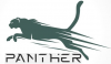
Logo #3 Now Closed, Eric won
Suggested Format:
(Panther art)
Panther (stylized font as attached)
 

Attachments

  • Green Panther logo with text.png
    Green Panther logo with text.png
    81.9 KB · Views: 304
  • Man and Woman hero.jpg
    Man and Woman hero.jpg
    27.3 KB · Views: 270
  • Very Cool Red hero.png
    Very Cool Red hero.png
    20.5 KB · Views: 272
  • Monster Tamer Hosting.jpg
    Monster Tamer Hosting.jpg
    298 KB · Views: 311
Last edited:
1
•••
The views expressed on this page by users and staff are their own, not those of NamePros.
Here's two concept ideas to get the contest going.
Took a few hours to illustrate them from scratch, otherwise I would have entered sooner.

#1 - Super Heroes
1.png


#2 - News Site

1.png


Feedback Appreciated
 
1
•••
Your Host Heroes is good! I'm feeling your logo & what I like:
1) How you followed directions well
2) The 2 heroes look like they match, part of the same team - nice touch!
3) Nice use of web 2.0 in the Heroes even though it wasn't required. I really like web 2.0.
4) I like how you wrote the name of the company except please give me that small ".com" at the end if the name, in a font at least 2x smaller than the rest (Almost as an afterthought but at least letting people know in one logo where they can find us online).
------------------------

I'm not feeling your Logo #2, but have to give you mad props for using one of the 2 most iconic structures in the Northwest Corner of Connecticut! Brilliant touch:
The Heublein Tower, in Simsbury, is a very notable Connecticut landmark which provides spectacular views. It was built as a residence for Gilbert Heublein, maker of A1 Steak Sauce.
The other great structure iconic of Northwest corner is the Beckley Furnace here: https://christinablais.com/beckley-furnace-i-and-ii/
Both are great to use.
What I liked:
1) You nailed the rolling hills, trees, & rivers of the Northwest Corner! Great use of an iconic building. This area is very pastoral & I can tell you really did your homework.

What I'm not feeling:
1) I would not try to rework this logo as it's better to go with a different concept. I don't like the colors.
2) I'm not liking how "Western" is a larger text size than the rest.
3) If you decide to redo this logo, please follow this suggested format & please change your tagline as follows:

Connecticut Western News
CTWest.com Northwest Corner

4) If it helps, here are two Newspaper logos that I like. The brown color is bad but this logo is visually striking:
https://99designs.com/profiles/byx888/designs/1082861

I like this 2nd example logo for its great use of web 2.0 & nice Color contrast:
https://99designs.com/profiles/diwaz/designs/73439
 
Last edited:
1
•••
2
•••
Thanks for the feedback

#1 - Revised

2.png


#2 - New concept
2.png


Feedback appreciated
 
Last edited:
2
•••
1
•••
Dear Diana Gyms,

I appreciate you joining this contest, the degree of difficulty is greater than most contests. A good start and some feedback for you and your best rendering is your last one with the shadowing.

The final result of the winning Superheroes is to make a 3 panel rotating slide show in the header the same size and detail you see here:
https://monster-tamer.com

Thus we need larger size superheros that have more details like you see in Eric's rendering above.

Your female looks a little too much like wonder woman, I want to be careful of a possible trademark claim from them. Please give her a full body suit for slightly more modesty. Our target demographic includes older women & men who include those that are "old-fashioned" in their taste.

Please give the male Superhero a different more handsome face to reflect the chiseled jaw superhero stereotype.

Thanks for entering!


Hi,
Here's my try. :)

dearkfd-84aaaa88-c4be-4c6d-8677-ef47890a1133.png
 
Last edited:
0
•••
I'm liking where this one is going, much better than yesterday.
1) Better colors.
2) I like your use of the Beckely Furnace.
3) I like the web 2.0 that you added.

Would you be willing to try an experiment if not too difficult?

This is one of my favorite header art that appears on our Twitter account:
https://twitter.com/Boston__Metro

Would you be willing to place that rendering above centered on a similar background? I'll post the background soon.
 
Last edited:
1
•••
#3 - Panther
Re-illustrated with smaller ear, 2nd ear, horizonal tail, claws, open mouth with teeth, added shoulder detail, different font, and black instead of green.
1.png

Feedback Appreciated
 
Last edited:
2
•••
I'm liking where this one is going, much better than yesterday.
1) Better colors.
2) I like your use of the Beckely Furnace.
3) I like the web 2.0 that you added.

Would you be willing to try an experiment if not too difficult?

This is one of my favorite header art that appears on our Twitter account:
https://twitter.com/Boston__Metro

Would you be willing to place that rendering above centered on a similar background? I'll post the background soon.
If you attach the background in a reply I would be happy to put it on there for you to see how it looks. It may need some tweaking to contrast (Depending on background), but should be doable.
 
Last edited:
2
•••
If you attach the background in a reply I would be happy to put it on there for you to see how it looks. It may need some tweaking to contrast (Depending on background), but should be doable.
Thanks Eric, here attached is a sample of background for our experiment. It's fine if the logo covers a majority of the background. It's no problem that our background is low resolution like in our Metro header example. We want the logo itself to be in focus instead of the background.
 

Attachments

  • IMG_20201220_172549.jpg
    IMG_20201220_172549.jpg
    68 KB · Views: 230
1
•••
#2 - Revised - Removing tag-line gradient
3-2.png

#2a - Header sample
3-2b.png


#2b - Header Sample
3-2c.png
 
Last edited:
2
•••
Yes your 2ND version with the angled background is good but can it keep the same size background as in your first version? In other words, the 2ND version looks like the background is blown up in size but we want to keep it normal size.

Next step is to please examine the 2 attached images below.

Our logo is lost on the background. Notice we can go one of two ways to solve it.
1) The second image uses a border around your logo to demarcate the logo from the background. It draws your eye to the logo instead of the background. Please make your logo take up a clear rectangle space with a border with the added shape around the Beckely Furnace. In other words, the space around your logo is a white almost complete rectangle surrounded by a black border line.
Or
2) The 1at attached image below uses the same rectangle defined border with a special lighting effect surrounding it. Not sure what this effect is called?
Thanks!

#2 - Revised - Removing tag-line gradient
Show attachment 176894
#2a - Header sample
Show attachment 176895

#2b - Header Sample
Show attachment 176896
 

Attachments

  • IMG_20201221_032640.jpg
    IMG_20201221_032640.jpg
    65.2 KB · Views: 217
  • IMG_20201221_032627.jpg
    IMG_20201221_032627.jpg
    64.7 KB · Views: 215
Last edited:
1
•••
Yes to all your changes (well done) except:
1) No to the added shoulder detail.
2) Your front leg/shoulder proportions look different than the original, no to this change. Please use the original proportions & angles for both the front & back legs.
3) No to the font change, please keep the original font below it EXCEPT, yes to the lines through the font if you can make those lines thinner & more subtle. That's a nice touch.

#3 - Panther
Re-illustrated with smaller ear, 2nd ear, horizonal tail, claws, open mouth with teeth, added shoulder detail, different font, and black instead of green.
Show attachment 176880
Feedback Appreciated
 
Last edited:
1
•••
Dear Diana Gyms,

I appreciate you joining this contest, the degree of difficulty is greater than most contests. A good start and some feedback for you and your best rendering is your last one with the shadowing.

The final result of the winning Superheroes is to make a 3 panel rotating slide show in the header the same size and detail you see here:
https://monster-tamer.com

Thus we need larger size superheros that have more details like you see in Eric's rendering above.

Your female looks a little too much like wonder woman, I want to be careful of a possible trademark claim from them. Please give her a full body suit for slightly more modesty. Our target demographic includes older women & men who include those that are "old-fashioned" in their taste.

Please give the male Superhero a different more handsome face to reflect the chiseled jaw superhero stereotype.

Thanks for entering!
Revision.~

deatafw-247515e1-33ad-4821-b19a-5e51f98af45d.png
 
2
•••
Yes, the way you have the ".com" is perfect.

I think that the woman is all set and I appreciate the modesty in her outfit.

Please would you give the guy dark hair, slightly red lips, and a slightly darker shade of skin to reflect a suntan? A little more facial detail is needed for the guy.

Thanks

Thanks for the feedback

#1 - Revised

Show attachment 176872

#2 - New concept
Show attachment 176870

Feedback appreciated
 
1
•••
Thank you Diana, getting closer.

Please compare the level of detail of the Superheros I have linked here with yours:
https://www.pinterest.com/timothybjones90/original-superheroes/

We're looking for fully detailed superheros ready to star in their own comic strip. They will literally star in their own 3 panel rotating comic strip at the top of our site. We need them bigger and fully detailed because these aren't just logos, these are fully detailed Superheros.

The girl is close but needs more details. Best to remove the male's face and start again. His ears look like they stick out and his nose looks too large for his face.

Thanks for the progress you made.


Revision.~

deatafw-247515e1-33ad-4821-b19a-5e51f98af45d.png
 
Last edited:
1
•••
Thanks for the feedback

#1 Superheroes - Revised face, skin tone, and hair
3.png


#2 Social Header - Revised border and background
3-3.png


#3 Panther - Made changes as requested and changed the tip of the tail
2.png
 
1
•••
I have reserved the right to end early if all requirements are met.

Congratulations & well done Eric! You have won the $30 prize for your Panther Logo #3!

You're still in the running for the $125 Grand Prize. Both you, Diana, and anyone else that enters is eligible for the Grand Prize of $125. As I posted above, if different people win at Logo #1 & Logo #2, there will be 2 winners each receiving $125.

Please use a similar font in a line below "Panther" to add in a smaller dark red font: "PantherWear.com". Please provide me your PayPal email address.

I will provide you additional feedback on the other two logos late tonight.
 
Last edited:
2
•••
I have reserved the right to end early if all requirements are met.

Congratulations & well done Eric! You have won the $30 prize for your Panther Logo #3!

You're still in the running for the $125 Grand Prize. Both you, Diana, and anyone else that enters is eligible for the Grand Prize of $125. As I posted above, if different people win at Logo #1 & Logo #2, there will be 2 winners each receiving $125.

Please use a similar font in a line below "Panther" to add in a smaller dark red font: "PantherWear.com". Please provide me your PayPal email address.

I will provide you additional feedback on the other two logos late tonight.
Thanks for choosing my Panther design as the #3 winner. Personally, I think it's important that the small domain font is legible when scaled down to a smaller size with the logo, so I did a variation that can still be read in small print. Please let me know if you want me to redo it in a different font. Happy to. I'll DM my Paypal in a few minutes.

#3 - Panther - With PantherWear.com
3.png
 
2
•••
You're right about the legible domain font, looks great! PayPal Payment sent.

I think it's important that the small domain font is legible when scaled down to a smaller size with the logo, so I did a variation that can still be read in small print.
 
0
•••
You're right about the legible domain font, looks great! PayPal Payment sent.
Payment confirmed / Files sent via DM

Thanks again for selecting my design for #3.

I look forward to the feedback on #1 and #2 in the contest.
 
2
•••
Payment confirmed / Files sent via DM

Thanks again for selecting my design for #3.

I look forward to the feedback on #1 and #2 in the contest.
Great. Let's do feedback.
On Logo #2, Background is now the right size and angle - all set.

Your logo is lost in the background so please:
1) Shading around logo is good but it still lacks the black line border memtiomed above.
2) Please make your logo a degree larger to cover up a bit more of the background.
3) Their is too much difference in color between the background and your logo. Lets please use that same green from the word "Western" to make trees to the left of the Furnace and then bring back your blue river & rolling hills as well from your original logo so that your logo is a perfect rectangle outlined in black. Know what i mean? The new space you create left of the Furnace will have the trees/river/hills.

Got to go to work but will give Logo #1 Feedback in afternoon
 
1
•••
Dear Eric,

On Logo #1, my word "dark" was not clear. For me "Tall dark and handsome" means black hair. Please also give him brown eyes. Please give his face more detail. The lips are too red making him look like a little like a clown.

Please bring out his features so that his nose is visible instead of blending in.

Please try a different color cape for him.

Thanks
 
1
•••
Thanks for the feedback

#1 - Superheroes - Revised Males face, hair, brown eyes, cape color, re-illustrated nose and mouth, went with a larger smile showing teeth to make him more inviting and friendly.
4.png


#2 - News Site - Revised Logo with trees, hills, and stream
5.png


#2A - News Site - Revised social header with border
4a.png


Feedback Appreciated
 
Last edited:
2
•••
Status
Not open for further replies.
  • The sidebar remains visible by scrolling at a speed relative to the page’s height.
Back