Dynadot Aftermarket: discover domain gems worth investing in. Visit our aftermarket.

DomainEquity Logo input needed

SpaceshipSpaceship
SpaceshipSpaceship
Namecheap AuctionsNamecheap Auctions
Watch

Rob Monster

Founder of EpikTop Member
:heavy_check_mark: Epik Founder
Impact
18,367
I am looking for some input on logo selection.

We have been working to finish a project called Domain Equity for peer to peer lending -- empowering domainers to access liquidity outside of the conventional banking pool. For those not aware, DomainEquity was a project long before COVID-related shutdowns, but has taken added urgency as a result of pressure on the banking system.

The site is scheduled to go live sometime in April. Here is a preview of the homepage:
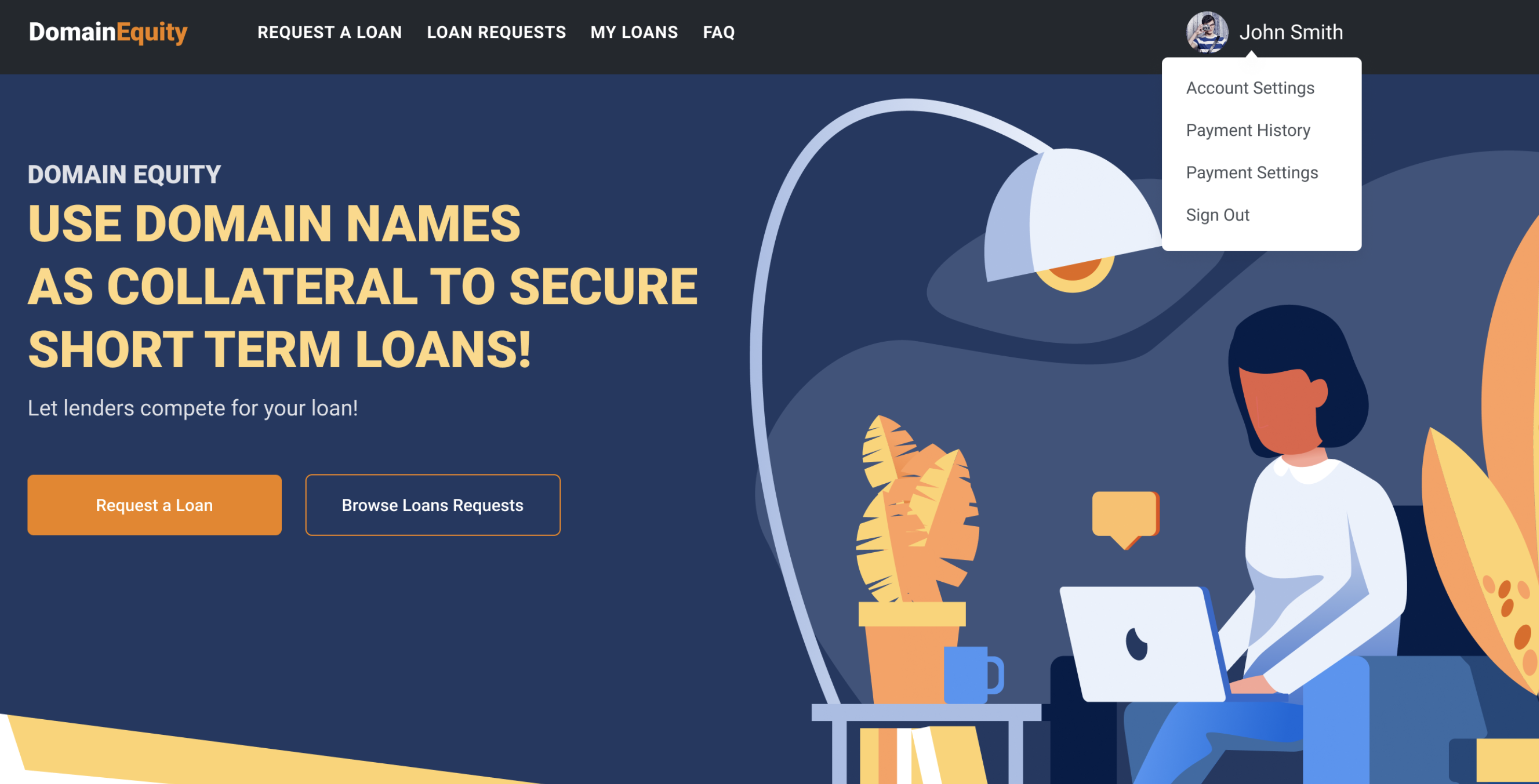
upload_2020-4-5_10-18-12.png


And here is a walk-through:

https://www.loom.com/share/547cf9f24a9d4f1e90701361f34651fc

We have some logo concepts -- here is the short list of final candidates:
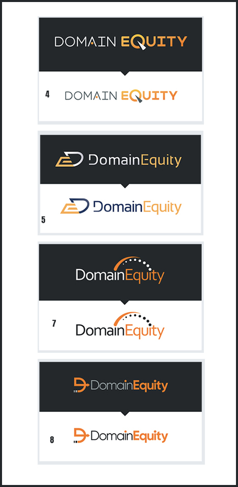
upload_2020-4-5_10-20-48.png


For the long run, I tend to prefer a logo that can ultimately be branded in a way that can be logowear, e.g. you could put it on a baseball cap, etc.

Welcome any feedback.
 
Close
The views expressed on this page by users and staff are their own, not those of NamePros.
GoDaddyGoDaddy
#7 stand out for me. Font is nice, but if you can replicate #7 font in #8 it would have been the best.
#mythought
 
4
Close
# 8
When the concept of Business really Matters Most, Supreme importance on aesthetics of Logo doesn't Matter too much in the early stages, It is only an added advantage. I guess.
 
Last edited:
3
Close
I like the #7 but without the rainbow, on the top, just plain simple word and color would be great
 
3
Close
#4 Rob.
 
7
Close
5 or 8 - the logo is pretty unique & seems to stand out + I remember it, the others are nice (dont get me wrong) this is simply from a does the brand image "pass the radio test" well, you know what I mean HAHA. If I had to pick one, I'd pick 8
 
3
Close
8
 
Last edited:
3
Close
#8 because it's the easiest to identify the words
 
3
Close
#8
 
3
Close
Leaning 7 here.
 
4
Close
#8
 
3
Close
I like #8
Looks decent and professional
 
2
Close
I like THE 5
 
2
Close
I'm going to go with 7, but 4 could also be a good choice.
 
4
Close
I like 4 the best.
 
2
Close
I like #7 most
 
4
Close
I think they all look very good Rob, but I particularly like #7. The orbit arc above figuratively ties in with idea of project really well, in my opinion.

Bob
 
8
Close
easily 7 for me
 
Last edited:
5
Close
I think #8 looks best imo...
 
3
Close
I think there wasn't enough variety in the choices, TBH. But I likes #7 the most.
 
5
Close
Honestly simple is better. What it is currently is great

this one
167217_d546a750a85c33b8fa419274fc6b1330.png
 

Attachments

  • 4513CE19-C849-47A7-B84A-A0ABF275C15C.png
    4513CE19-C849-47A7-B84A-A0ABF275C15C.png
    875.9 KB · Views: 536
  • upload_2020-4-5_21-39-43.png
    upload_2020-4-5_21-39-43.png
    7.2 KB · Views: 377
Last edited:
10
Close
CatchedCatched

We're social

Escrow.com
Spaceship
Domain Recover
CryptoExchange.com

NamePros updates

Switch between accounts
You can now stay logged in to more than one NamePros account in the same browser. Click your avatar, then "Accounts in this browser", to...
AIVikings
Catchy
  • The sidebar remains visible by scrolling at a speed relative to the page’s height.
Back