Dynadot

Reviews, ideas, and advice are appreciated

Spaceship Spaceship
Watch

inzo

Established Member
Impact
38
Firstinspire.com

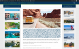
have been working on this site for almost a year now. Suggestions and reviews as to how diverse(in terms of content) the website can go and any other ideas would be much appreciated.
 
Last edited:
•••
The views expressed on this page by users and staff are their own, not those of NamePros.
That is called simple design, or minimalistic design. my color schemes are black, white, and maybe blue. I plan on sticking to it thanks.
you worked on your site for 1 year and I still don't see there any color schemes...
you can use only 2 colors, but use them properly, to make all elements look clearly
anyway, the site about inspiration must be less boring designed
 
0
•••
Couple of ideas. Have you considered making the text links blue instead of black? Might get more clicks. Also the bottom ad. Have you considered making it sticky? Not intrusive and might attract more clicks.
 
0
•••
you worked on your site for 1 year and I still don't see there any color schemes...
you can use only 2 colors, but use them properly, to make all elements look clearly
anyway, the site about inspiration must be less boring designed
I think this can be achieved with images not site-wide design changes. Maybe move the footer blog posts to the sidebar so they can be seen by visitors more easily. Could get more clicks, lower bounce rate.
 
0
•••
I think this can be achieved with images not site-wide design changes. Maybe move the footer blog posts to the sidebar so they can be seen by visitors more easily. Could get more clicks, lower bounce rate.
remove the latest posts to somewhere else, add very light grey color to the background, make all Inspirational Quotes 1 row carousel, after that carousel add grid section with posts where he has 6 posts now, but make them at least 12..
remove all that unused white space from everywhere.. all those margins and padding...
and some good image for the FP header, something like sunrise, ocean, mountains etc... something to represent inspiration
 
Last edited:
0
•••
Couple of ideas. Have you considered making the text links blue instead of black? Might get more clicks. Also the bottom ad. Have you considered making it sticky? Not intrusive and might attract more clicks.
The ads are auto displayed. Can make it less intrusive.
 
1
•••
The ads are auto displayed. Can make it less intrusive.
use AdSense in-article ads they look much more decent
 
0
•••
remove the latest posts to somewhere else, add very light grey color to the background, make all Inspirational Quotes 1 row carousel, after that carousel add grid section with posts where he has 6 posts now, but make them at least 12..
now that looks like a good idea.

remove all that unused white space from everywhere.. all those margins and padding...
The inspirational quotes Section is only temporary, Adding more based on SEO on the main page and topics related to that. all those might look like a list with related search terms.
 
Last edited:
0
•••
use AdSense in-article ads they look much more decent
In the article ads sometimes don't appear, even if you add the ad code to it. Got to mix multiple ads category and see what works.
 
0
•••
Last edited:
1
•••
0
•••

Attachments

  • Screenshot 2022-01-08 at 23-14-36 Original ideas for future travels – Fantastic Routes.png
    Screenshot 2022-01-08 at 23-14-36 Original ideas for future travels – Fantastic Routes.png
    1.4 MB · Views: 90
Last edited:
0
•••
i don't talk about the footer, I talk about the ads area.. add there background image..
Way too many squares and sharp edges on that website. Looks very corporate. Try using curved edges instead.
 
0
•••
Way too many squares and sharp edges on that website. Looks very corporate. Try using curved edges instead.
i like the corporate style
 
0
•••
i don't talk about the footer, I talk about the ads area.. add there background image..


.entry ins {
background: #D5E1EA;
background-image: url("http://yourwebsite.com/wp-content/uploads/ads-img.jpg");
margin-bottom: 15px;
}
ins.adsbygoogle { background: transparent !important; }

How about this? The loading image might take time. Ads are already affecting page speed, don't wanna add too much to it.
 
Last edited:
1
•••
ins.adsbygoogle { background: transparent !important; }

How about this? The loading image might take time. Ads are already affecting page speed, don't wanna add too much to it.
I don't know if you have that area with the same name..
Just search for the right div and add there background-image
 
0
•••
ins.adsbygoogle { background: transparent !important; }

How about this? The loading image might take time. Ads are already affecting page speed, don't wanna add too much to it.
a few kb more, a few less... we are not in early 2000
 
0
•••
a few kb more, a few less... we are not in early 2000
Disagree. Saving file size is the key to a fast loading website. O-p- web site loads in four seconds on mobile. Saving one second even that will make a massive difference to visitors.
 
Last edited:
0
•••
Disagree. Saving file size is the key to a fast loading website. O-p- web site loads in four seconds on mobile. Saving one second is will make a massive difference to visitors.
nonsense.. we are in 2022 already... and 1 second more or less doesn't matter
 
0
•••
Disagree. Saving file size is the key to a fast loading website. O-p- web site loads in four seconds on mobile. Saving one second even that will make a massive difference to visitors.
true, even 1 sec brings in more traffic and ranks better. One of those Google Algo gimmicks that hadn't changed over years
 
Last edited:
2
•••
true, even 1 sec brings in more traffic and ranks better. One of those Google Algo gimmicks that hadn't changed over years
you can save even more kb if you remove all CSS, images and scripts..
just write a plan text, better without spaces, this will save you a lot of kb and for sure bring more traffic...
 
0
•••
just write a plan text, better without spaces, this will save you a lot of kb and for sure bring more traffic...
Now who's been drinking? Come on this is a sensible web site review and ideas discussion where the o-p- is asking us for sensible feedback. Let's raise the bar now. I think the o-p- has enough tips to be getting on with. I hope @inzo uses Yoast to sort out those meta titles and meta descriptions. An easy fix to improve S.E.O. Takes an hour at most even for a novice, which the o-p- clearly isn't. It would be illogical not to make this fundamental and easy S.E.O. improvement.
 
0
•••
Now who's been drinking? Come on this is a sensible web site review and ideas discussion where the o-p- is asking us for sensible feedback. Let's raise the bar now. I think the o-p- has enough tips to be getting on with. I hope @inzo uses Yoast to sort out those meta titles and meta descriptions. An easy fix to improve S.E.O. Takes an hour at most even for a novice, which the o-p- clearly isn't. It would be illogical not to make this fundamental and easy S.E.O. improvement.
I gave him good advice, the better one could only be just to write on the 1 and unique site page his mobile phone and ask to call him to get inspirational quotes.
No need to write on the site posts and quotes, every letter = additional kb.
 
Last edited:
0
•••
I gave him good advice, the better one could only be just to write on the 1 and unique site page his mobile phone and ask to call him to get inspirational quotes.
No need to write on the site posts and quotes, every letter = additional kb.
You are so smart and funny. I think his design is good enough for now, save for a few easy changes as aforementioned in this delirious thread. We need chat room back so I can banter and bounce weird concepts with people like you @forge @jhm @Daniel Owens and @MasterOfMyDomains. #bringbackchat #saveforge
 
0
•••
You are so smart and funny. I think his design is good enough for now, save for a few easy changes as aforementioned in this delirious thread. We need chat room back so I can banter and bounce weird concepts with people like you @forge @jhm @Daniel Owens and @MasterOfMyDomains. #bringbackchat #saveforge
I don't have any weird concepts, all my reviews, advice, and suggestions which I use to give are very logical and reasonable, just like my own sites.
 
0
•••
0
•••
  • The sidebar remains visible by scrolling at a speed relative to the page’s height.
Back