- Impact
- 197
Logo Contest: $45.00 Prize Via PayPal
Contest Ends: February 21st or sooner.
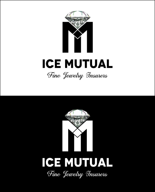
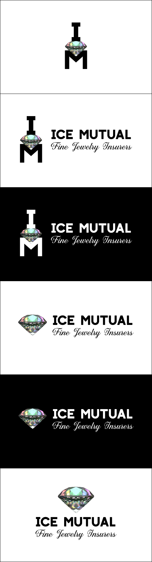
Versions: Need two versions of the logo. One for white background and one for black background. Also need the icon part of the logo both as part of the logo and as a separate file.
Files Needed: PNG, JPEG, and AI or Similar
Original Design Only Please.
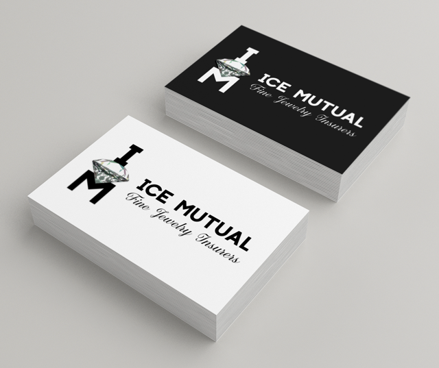
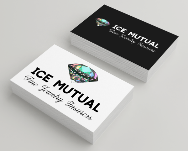
The Company is a Jewelry Insurance Company. The name is IceMutual.
The Tagline is: Fine Jewelry Insurers
Please see below for the concepts I have in mind. Basically I want the logo to include the letter "I" and the letter "M" with a diamond in the middle. I created what you see by basically taking an "M" and turning one upside down and putting it on top of the other one. That way you can see the "I"'s and the "M"'s in it.


I am open to other concepts, so blow me away!
Please let me know if you have any questions.
Contest Ends: February 21st or sooner.
Versions: Need two versions of the logo. One for white background and one for black background. Also need the icon part of the logo both as part of the logo and as a separate file.
Files Needed: PNG, JPEG, and AI or Similar
Original Design Only Please.
The Company is a Jewelry Insurance Company. The name is IceMutual.
The Tagline is: Fine Jewelry Insurers
Please see below for the concepts I have in mind. Basically I want the logo to include the letter "I" and the letter "M" with a diamond in the middle. I created what you see by basically taking an "M" and turning one upside down and putting it on top of the other one. That way you can see the "I"'s and the "M"'s in it.
I am open to other concepts, so blow me away!
Please let me know if you have any questions.


")