IT.COM

REQ-LOGO Increased Prize - Maple Brand Logo Design Contest

Spaceship Spaceship
Watch
Status
Not open for further replies.

MapleDots

Account Closed (Requested)
Impact
13,169
Prize increased FROM $50 TO $75 due to nature of request.
I AM LOOKING FOR SOMETHING COMPLETELY ORIGINAL AS A LOGO

It is very difficult to decide what to do as a logo for this one so I am looking for creativity without going too complex.

Contest: Logo Design
Prize: $75.00 USD payable by PayPal only
Contest End Date & Time: Exactly 10 days to the hour of this post

Logo: MapleBrand - Branding Canada

File: High Resolution PNG/EPS

I own the .com and .ca so please do not include the extension as part of the logo.

I have tried to visualize a logo and have decided to keep the concept open. Basically end use would be for a company that uses the name Maple Brand.

This one is a free for all, it will be based solely on looks and how I feel about the end product so get as creative as you like.
 
Last edited:
1
•••
The views expressed on this page by users and staff are their own, not those of NamePros.
logo.jpg
 
0
•••
Two days to gi

I really like that one... balanced into a rectangle.

Beautifully done @galalogo

Might want to try it with a small stem.... not sure but WOW

I was trying to balance it with the b & d but the box below and stripe on top works really nice.
 
1
•••
1
•••
I like it better without the stem but because I am branding the Maple I think it needs to be the real deal, so this revision is perfect and puts you in the lead.
 
1
•••
0
•••
Oops posted on the wrong place
 
Last edited:
1
•••
removed
 
Last edited:
0
•••
@galalogo

Could you get me a look at the non paper version of this?
 
0
•••
0
•••
0
•••
Last edited:
0
•••
1
•••
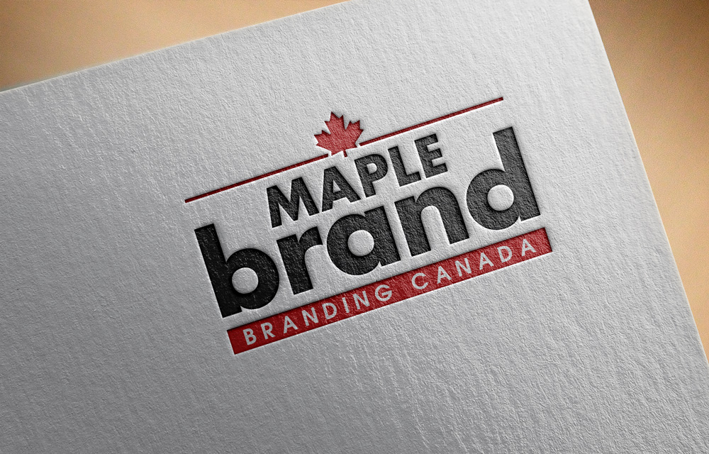
The boxed in concept with the lower box and the upper stripe appealed to me instantaneously because on the paper version of the logo it looked like it could be a stamp, which was my original idea.

@galalogo used that first and the look immediately appealed to myself and my staff. The logos will naturally become similar toward the end of the contest because the designers are tuning in to what I am asking for and having done this on 99designs previously I found it was a small variation in font or something that made the winner.

My MapleDots was designed at 99designs and as we got to the end quite a number of designs were similar.

Once I ask for a lower case version brand with Maple inset and a leaf then the designs will have to start being similar. In the end it is the one that is voted on in my office that wins. I run a big online store so I have a number of staff that have a keen eye and I do listen to feedback from all sides.

So top line on either side of the leaf and the box on the bottom with the b's on the side make almost a rectangle. This reminds me of a stamp (inkpad and stamp) and that is the appeal for me. @galalogo did use that first.
 
Last edited:
1
•••
0
•••
I like it better without the stem but because I am branding the Maple I think it needs to be the real deal, so this revision is perfect and puts you in the lead.

It is nice but branding Canada means only the real canadian maple leaf will work.

@galalogo has the most elegant design and he just has to add the stem back and make sure the word maple is properly centered to take the win.
 
1
•••
Thank you for your feedback! Here is my revision:

mb17.png
 
0
•••
Trying something a little different

maple 2.png
maple 3.png
maple.png
 
0
•••
0
•••
0
•••
brandnew.png


brand1.png


brand13.png


maplee.png

mprfg.png


mapleee.jpg


mapl new.jpg
 
Last edited:
0
•••
0
•••
75089_3642068caa5137c2c34d2115d04f4c10.jpg


win.png


OK guys and gals.... I am going to call it at this time....

The winner is @galalogo

I did like some of the boxed designs but in the end decided on this logo because it does not completely bix the design but does give the illusion of doing so.

Congratulations @galalogo please check your pm in a few minutes.

I will keep the post open a few days for member feedback and congratulations to the winner.
I wish I could have picked more designs to win but I saw some great concepts I can use in my next contests.

I will open two more contests for Maple designs early in the week.
 
2
•••
Maple (3).png
 
Last edited:
0
•••
1
•••
1
•••
Status
Not open for further replies.
  • The sidebar remains visible by scrolling at a speed relative to the page’s height.
Back