Dynadot โ€” .com Transfer

Logo Design Contest $50 KettlecornDepot

Spaceship Spaceship
Watch
Status
Not open for further replies.

pdel

Established Member
Impact
20
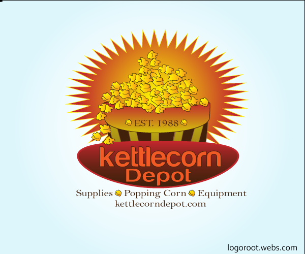
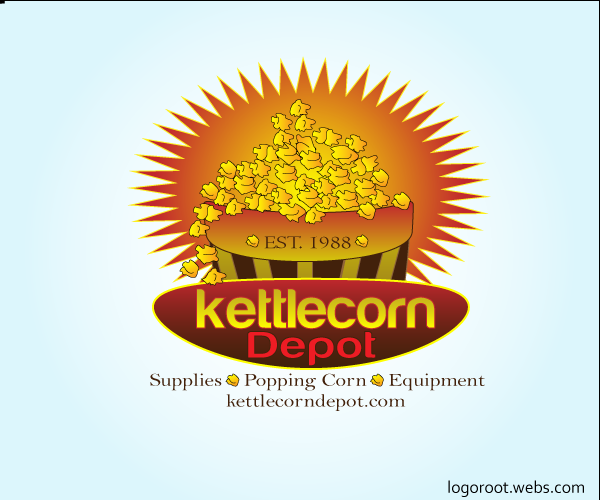
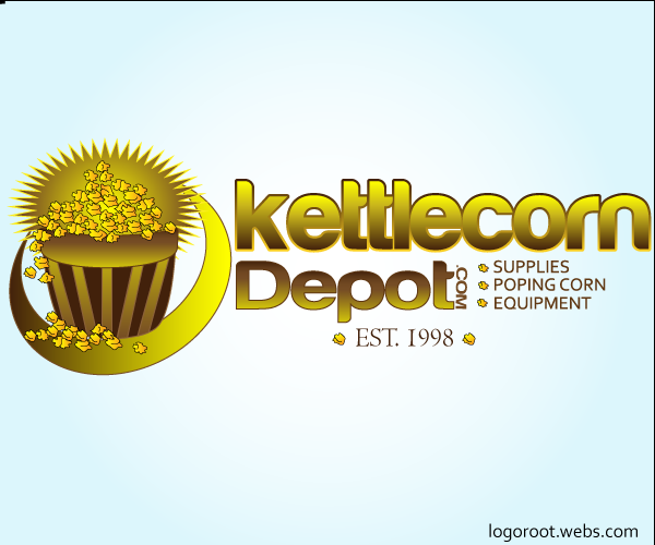
Hello, I need a logo design for use on a website and on packaging. KettlecornDepot.com I have attached a basic design that may work, I am open to new designs. It is more of a business to business site and not retail, however I would like it to be festive, carnival even old tyme feel. I have included a jpeg with a sunburst background just to help get the creative juices flowing.

Thank you.

I would like to have this completed as soon as possible. Lets end the contest on Friday May 11th 2012.

P.S. I will need vector artwork and associated royalty free files.
 
Last edited:
0
•••
The views expressed on this page by users and staff are their own, not those of NamePros.
Unstoppable Domains โ€” AI StorefrontUnstoppable Domains โ€” AI Storefront
attachment.php


Feedback appreciated.
 

Attachments

  • kc.jpg
    kc.jpg
    132.9 KB · Views: 166
0
•••
Thanks for the entry, it is good work but it is not really working for me. Perhaps a bit more of a festive look? It does not have to be an emblem design, I just put that out there, however, if a great one shows up it may win.
 
0
•••
here is my entry hope you like this one ^_^ ...
KETTLECORNDEPOT.png
 
0
•••
Logo idea:
kettlecorndepot.jpg


Feedback is appreciated.. :)
 
0
•••
Feedback appreciated.
 
Last edited:
0
•••
kettlecorn.jpg
 
1
•••
MrRooT - I think there is too much going on in the icon, it is probably not needed

blairwitchii - I like the design, I have few people looking at it and they agree, the popcorn needs to lok a bit more realistic to be easily distinguished and I am not sure about not having the "popping corn supplies and equipment listed?

Webmango - The logo is too busy, good conceptual but the viewer has to "read through it" to get the message

Nunulka - So far this is getting the most votes on my end. Great look. I would like to see the popcorn remain and be a bit more realistic, not sure how, I will try to post a sample. Please make the dots on equal plane, they are all at different heights, the one in front of the word popping seems to be in a good spot. Also I like the placement of the 1988 and although the font gives an old time feel I think the "19" should be even with the "88"
 
Last edited:
0
•••
hope you this on too ^_^ ...
KETTLECORNDEPOT21.png


KETTLECORNDEPOT2.png
 
0
•••
revised

kettlecorn-1.jpg
 
0
•••
wait for my entry please

Thanx
Shery
 
0
•••
wait my entry
 
0
•••
I am waiting. Thank you
 
0
•••
Hello Nunulka,
A)I have attached a basic update just for ease of communication. Please add the specs to the 3 popcorn kernels that you have designed. I just put basic markers close to where they might be on as popped kernel.
B)Also I like the hatch pattern for website use but will also need solid colored back grounds for print, the hatch pattern may blur out on some printing equipment.
C)The dot in front of popcorn should be a bit closer to the word as it is on the end of the word
D) The separation between KETTLECORN AND DEPOT is a bit too close, perhaps you can make the word DEPOT a bit smaller
E) Please add the glyph TM at the end of the top of the letter "T" in DEPOT for trademark purposes.

Thank you, Sorry for the pickyness>>>it looks great!
 

Attachments

  • logo 1a.jpg
    logo 1a.jpg
    118.2 KB · Views: 53
0
•••
here is my entry :

kettlecorn.jpg


thanx
Shery
 
0
•••
Thank you to all who entered, Nunulka is declared the winner. I would like to see the requested changes incorporated into the winning design.
 
1
•••
Congrats on the win Nunulka
------------------------------
Please remember to update this thread once you both finalize files / payment so we can close the thread.

Thanks,

Eric Lyon
 
1
•••
Payment received, files sent. Many thanks!
 
2
•••
Payment sent and files received. Thank you.
 
2
•••
Status
Not open for further replies.
Dynadot โ€” .com TransferDynadot โ€” .com Transfer
Appraise.net
Domain Recover
DomainEasy โ€” Live Options
  • The sidebar remains visible by scrolling at a speed relative to the pageโ€™s height.
Back