Unstoppable Domains โ€” AI Assistant

Logo Contest $40 Smart Choice Fine Foods

SpaceshipSpaceship
Watch
Status
Not open for further replies.

pdel

Established Member
Impact
20
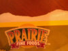
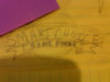
Hello, I need a logo design for use on wesite and packaging. I have attached my rough sketch and another logo to help define the look. I like the idea of a blue banner attached as seen n bigstockphoto.com id18832268. The sun in the back ground can be a harvest gold. SMART CHOICE is the main text and FINE FOODS on the banner. I will need scalable vector original artwork. Thank you. I would like to have this completed as soon as possible. Lets end it on Wednesday 12/14/2011 at 3pm Eastern Standard Time
 

Attachments

  • 18832268 big stock photo.jpg
    18832268 big stock photo.jpg
    55.3 KB · Views: 69
  • Prairie logo.jpg
    Prairie logo.jpg
    50.4 KB · Views: 86
  • Smart Choice logo sketch.jpg
    Smart Choice logo sketch.jpg
    43.6 KB · Views: 81
Last edited:
0
•••
The views expressed on this page by users and staff are their own, not those of NamePros.
Unstoppable Domains โ€” AI StorefrontUnstoppable Domains โ€” AI Storefront
Here's a concept idea to help get things started


Feedback Appreciated​
 
0
•••
Thank you scorpionagency for the design. I do like the design. However, the first thing I thought and noticed was the suns rays. They almost seemed too intense, like fire. Save this and please see if you can eliminate them or make them look more subdued or folksy. It would actually be okay if people wondered whether it was the harvest (full) moon or a sun. Our main products are corn related so thats why I have that element in the design idea. Thanks
Revised samples


Feedback Appreciated​
 
0
•••
Hi,

smartchoice.png
 
1
•••
smartchoice.png
 
1
•••
Hello, I appreciate your creative work. I am now 100% back on your original designs. After showing it to my family they convinced me that it is a winner. I did notice on the 2nd set the banner is lower and this creates a slight separation between it and the smart choice banner above it. Can you make that subtle change? I would also like the various colors in case the packaging varies I can make sure it still stands out.

Respectfully,
Pete
Revised Design
Spaced out the banner


Feedback Appreciated​
 
Last edited:
0
•••
My bad. Please look at the separation on your second set of designs. That is what I was looking for. The end of the ribbon has a slight clearance. Thank you.
 
0
•••
My bad. Please look at the separation on your second set of designs. That is what I was looking for. The end of the ribbon has a slight clearance. Thank you.
Not a problem :)

Revised


Feedback Appreciated​
 
0
•••
Perfect!
 
0
•••
4kwxma.jpg
 
1
•••
Payment confirmed / Files sent / +iTrader added.

Thanks for a great contest.

Eric Lyon
 
0
•••
Status
Not open for further replies.
Appraise.net
Spaceship
Domain Recover
CatchDoms
DomainEasy โ€” Payment Flexibility
  • The sidebar remains visible by scrolling at a speed relative to the pageโ€™s height.
Back