- Impact
- 13,169
Prize increased FROM $50 TO $75 due to nature of request.
I AM LOOKING FOR SOMETHING COMPLETELY ORIGINAL AS A LOGO
It is very difficult to decide what to do as a logo for this one so I am looking for creativity without going too complex.
Contest: Logo Design
Prize: $75.00 USD payable by PayPal only
Contest End Date & Time: Exactly 10 days to the hour of this post
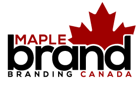
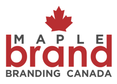
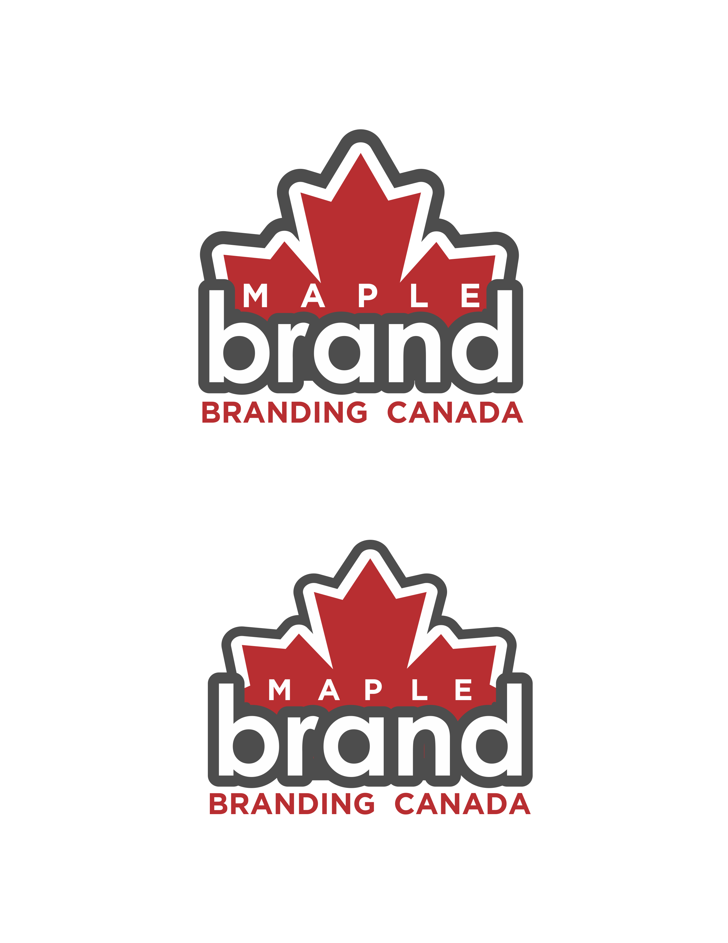
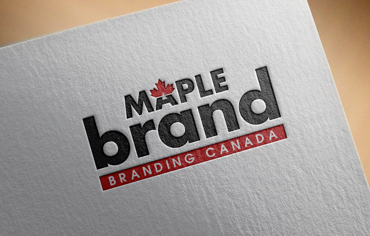
Logo: MapleBrand - Branding Canada
File: High Resolution PNG/EPS
I own the .com and .ca so please do not include the extension as part of the logo.
I have tried to visualize a logo and have decided to keep the concept open. Basically end use would be for a company that uses the name Maple Brand.
This one is a free for all, it will be based solely on looks and how I feel about the end product so get as creative as you like.
I AM LOOKING FOR SOMETHING COMPLETELY ORIGINAL AS A LOGO
It is very difficult to decide what to do as a logo for this one so I am looking for creativity without going too complex.
Contest: Logo Design
Prize: $75.00 USD payable by PayPal only
Contest End Date & Time: Exactly 10 days to the hour of this post
Logo: MapleBrand - Branding Canada
File: High Resolution PNG/EPS
I own the .com and .ca so please do not include the extension as part of the logo.
I have tried to visualize a logo and have decided to keep the concept open. Basically end use would be for a company that uses the name Maple Brand.
This one is a free for all, it will be based solely on looks and how I feel about the end product so get as creative as you like.
Last edited: