


- Impact
- 8
Hi all,
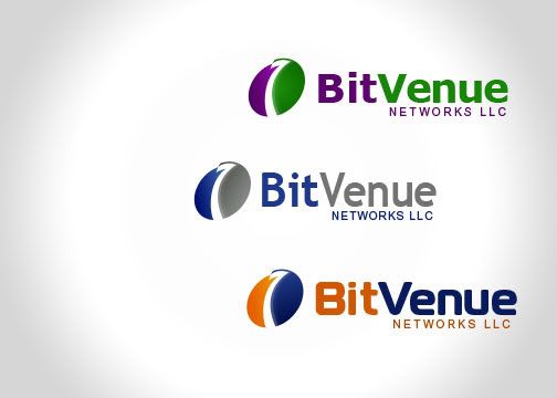
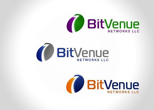
Recently, we held a contest here for a new logo for BitVenue Networks, LLC. That first contest was here: Old Contest. In that contest, umxca and alex's logos were our favorite, and we're currently trying to decide which logo to pick (both alex and umxca have received money for their efforts in the previous contest PRIOR to me creating this new contest).
We'd like to start a new contest, and see if we can get any new ideas, before moving forward with choosing a logo from the previous contest. The rules of this contest are:
1) All logos must be new. Do not submit designs that were submitted in the previous contest, please. You can; however, submit MODIFIED designs of submissions from the previous contest.
2) Please ignore the information given in the previous contest. Focus on this contest only. Feel free to take design ideas from my comments on designs submitted in the previous comments, but don't tie your ideas to those designs.
3) Please please PLEASE keep the logo simple. We want our logo to unique, but very simple. If your logo is a simple swoosh and a line or two, and if it makes me excited and explains who we are, I'll be excited.
4) As a hint, we liked umxca and alex's logos from the previous contest.
Type of Contest : Logo contest
Prize : $30 (with additional $70 bonus IF we choose to use your logo for our company)
Contest End Date & Time : Sunday, November 30th @ 5:00 PM EST
Size Requirements : Not too big, not too small
Color Requirements : Unspecified, but we like purple and yellow/orange (shades that match of course).
Good luck!
EDIT:
For record keeping sake (since we send people to this thread for people to give their advice), the winners of the previous contest were:

and

EDIT: There was a typo in the original end date of this contest. It should have been November 30th, not December 30th. a 40 day contest is not allowed per the rules, etc., and it was an honest typo.
Recently, we held a contest here for a new logo for BitVenue Networks, LLC. That first contest was here: Old Contest. In that contest, umxca and alex's logos were our favorite, and we're currently trying to decide which logo to pick (both alex and umxca have received money for their efforts in the previous contest PRIOR to me creating this new contest).
We'd like to start a new contest, and see if we can get any new ideas, before moving forward with choosing a logo from the previous contest. The rules of this contest are:
1) All logos must be new. Do not submit designs that were submitted in the previous contest, please. You can; however, submit MODIFIED designs of submissions from the previous contest.
2) Please ignore the information given in the previous contest. Focus on this contest only. Feel free to take design ideas from my comments on designs submitted in the previous comments, but don't tie your ideas to those designs.
3) Please please PLEASE keep the logo simple. We want our logo to unique, but very simple. If your logo is a simple swoosh and a line or two, and if it makes me excited and explains who we are, I'll be excited.
4) As a hint, we liked umxca and alex's logos from the previous contest.
Type of Contest : Logo contest
Prize : $30 (with additional $70 bonus IF we choose to use your logo for our company)
Contest End Date & Time : Sunday, November 30th @ 5:00 PM EST
Size Requirements : Not too big, not too small
Color Requirements : Unspecified, but we like purple and yellow/orange (shades that match of course).
Good luck!
EDIT:
For record keeping sake (since we send people to this thread for people to give their advice), the winners of the previous contest were:
and
EDIT: There was a typo in the original end date of this contest. It should have been November 30th, not December 30th. a 40 day contest is not allowed per the rules, etc., and it was an honest typo.
Last edited:


 Sorry. But thanks for the submissions!


