- Impact
- 21,831
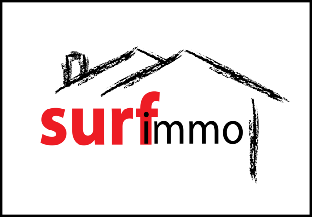
[Winner Selected] [REQ-LOGO] for REAL ESTATE portal ($100)
[EDIT]
Winner Selected
Contest is over
:tu:
[/EDIT]
Type of Contest: Logo
Contest End Date & Time: 11th October 2006 - 12:00 EST
Contest may close early if right design is found.
Prize: $100 via Paypal
~~~~~~~~~~~~~~~~~~~~~~~~~~~~~~
Hello,
I need a good, catchy logo for a real estate portal")
The name is S u r f I m m o (without the blanks of course, this is just to escape the search engines )
Size Requirements: roughly:
max. 100px height
max. 300px width
These are approximate requirements however. Logo will be at screen topleft of the website so it should not take up half the screen size
Color Requirements:
Background color: WHITE (#FFFFFF) or transparent
Suggested colors for the logo itself are green (a must I believe) & orange... don't forget it is a real estate site. Probably no more than 3 dominant colors. No flashy colors.
The logo will serve as a basis for the rest of the design (CSS).
General Requirements
Would prefer vector graphics but not a must.
The name S u r f I m m o should be embedded within logo.
FYI I have the name under .com and several other exts. However the ext (.com or other) must not be in the name.
Design guidelines
No waves, no 'surf board' please. In spite of the name it has nothing to do with aquatic sports :hehe: Here 'surf' stands for browsing the Internet.
Here are some keywords that may provide you some inspiration:
roof - house - globe/map (Europe) - magnifier - Internet - mouse
The name with Europe/Mediteranean sea area in the background could be an example.
Here is an example: http://www.immostreet.com/z/is/isi/images/pays/724.gif
I need some ideas so creativity is a must.
Keep in mind the site will be viewed by a lot of people.
To guide you I will try to show you examples that I like:
http://i77.photobucket.com/albums/j69/koncepts/nametrader1.gif => not real estate related but I like the soft colors and the right balance between colors
http://img458.imageshack.us/img458/5219/nametradermz1.gif => nice typography and high-tech look
http://mmavalon.com/images/front_logo_box.gif => nice colors & typography
http://homes.point2.com/Photo/Agency/2006-02-27/66310/1-Logo.jpg => Remax logo: use of world map as background
http://homes.point2.com/807AAA359696B2CCC21BE5A099399412.jpg => interesting logo
http://www.cirea.com/images/main_logo.gif => use of world globe
Additional Information
'IMMO' means real estate in short form in several European languages: immobilien (German), immobilier (French), immobiliare (Italian) etc.
This is for a pan-European site that will be available in several languages and countries. I need a logo that is culture/language-neutral.
The web site will be for people looking to find a property (sale/rental/vacation etc) in Europe and for real estate agencies to add their own portfolio. It's mainly real estate ads.
Deliverables
Logo in GIF or compatible format.
I will also need the raw sources of your work (ie Photoshop or vector graphics). These must be supplied for project to be considered completed.
I will endeavour to provide timely feedback as designs are submitted. Questions or need clarifications feel free to post or PM.
As usual don't forget to watermark your work.
Thanks and good luck to all
Kate
[EDIT]
Winner Selected
Contest is over
:tu:
[/EDIT]
Type of Contest: Logo
Contest End Date & Time: 11th October 2006 - 12:00 EST
Contest may close early if right design is found.
Prize: $100 via Paypal
~~~~~~~~~~~~~~~~~~~~~~~~~~~~~~
Hello,
I need a good, catchy logo for a real estate portal
The name is S u r f I m m o (without the blanks of course, this is just to escape the search engines
)Size Requirements: roughly:
max. 100px height
max. 300px width
These are approximate requirements however. Logo will be at screen topleft of the website so it should not take up half the screen size
Color Requirements:
Background color: WHITE (#FFFFFF) or transparent
Suggested colors for the logo itself are green (a must I believe) & orange... don't forget it is a real estate site. Probably no more than 3 dominant colors. No flashy colors.
The logo will serve as a basis for the rest of the design (CSS).
General Requirements
Would prefer vector graphics but not a must.
The name S u r f I m m o should be embedded within logo.
FYI I have the name under .com and several other exts. However the ext (.com or other) must not be in the name.
Design guidelines
No waves, no 'surf board' please. In spite of the name it has nothing to do with aquatic sports :hehe: Here 'surf' stands for browsing the Internet.
Here are some keywords that may provide you some inspiration:
roof - house - globe/map (Europe) - magnifier - Internet - mouse
The name with Europe/Mediteranean sea area in the background could be an example.
Here is an example: http://www.immostreet.com/z/is/isi/images/pays/724.gif
I need some ideas so creativity is a must.
Keep in mind the site will be viewed by a lot of people.
To guide you I will try to show you examples that I like:
http://i77.photobucket.com/albums/j69/koncepts/nametrader1.gif => not real estate related but I like the soft colors and the right balance between colors
http://img458.imageshack.us/img458/5219/nametradermz1.gif => nice typography and high-tech look
http://mmavalon.com/images/front_logo_box.gif => nice colors & typography
http://homes.point2.com/Photo/Agency/2006-02-27/66310/1-Logo.jpg => Remax logo: use of world map as background
http://homes.point2.com/807AAA359696B2CCC21BE5A099399412.jpg => interesting logo
http://www.cirea.com/images/main_logo.gif => use of world globe
Additional Information
'IMMO' means real estate in short form in several European languages: immobilien (German), immobilier (French), immobiliare (Italian) etc.
This is for a pan-European site that will be available in several languages and countries. I need a logo that is culture/language-neutral.
The web site will be for people looking to find a property (sale/rental/vacation etc) in Europe and for real estate agencies to add their own portfolio. It's mainly real estate ads.
Deliverables
Logo in GIF or compatible format.
I will also need the raw sources of your work (ie Photoshop or vector graphics). These must be supplied for project to be considered completed.
I will endeavour to provide timely feedback as designs are submitted. Questions or need clarifications feel free to post or PM.
As usual don't forget to watermark your work.
Thanks and good luck to all
Kate
Last edited: