Rainmaker-NL
Established Member
- Impact
- 330
Hi,
Didnt know there was a design section on Namepros. Just came across it and I happen to be in need for something.
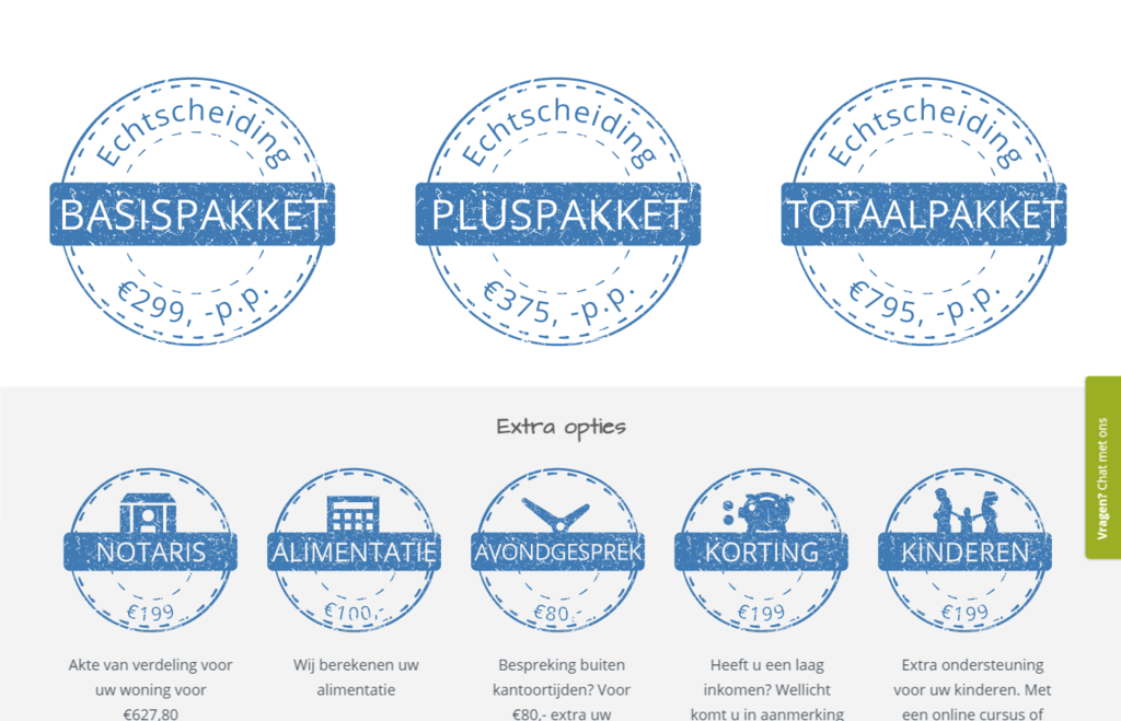
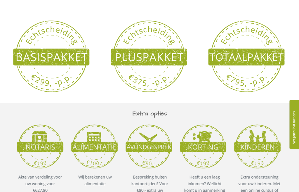
Currently, we use stamps on our website to identify products
This is our staging website.
On the bottom half of the site you see 3 large stamps and at the bottom you see 4(5) smaller stamps.
Its in Dutch, so to give you the correct feeling:
- its a website for online divorce
- the large stamps are for the main products: basic package, plus package and complete package
- the smaller stamps are for additional services: ownership transfer of house, alimony, meeting in the evening, discount with goverment aid.
- the 5th small stamp is for a new service where couples can have extra help for their child. assistance from an educational psychologist, or an online course to help children during a divorce.
What I need:
1. the 5th stamp for the service for children
2. either in the exact same style as the other stamps or a makeover of all stamps(I am open to improvement)
3. possibly a better logo for the website (topbar left side: scheiden.online)
this logo is nice and clean, what I like, but its very basic and just made with text and an enlarged dot.
Small warning: please dont come up with logos with broken rings, judges gavels, etc etc. Thats very tacky in my opinion and something you find on a lot of easy-made divorce law websites.
and for your information: scheiden.online means divorce.online in Dutch
I like to keep the dot in the logo for a reason. I have the domain scheiden.online and would like the logo to match with that name.
Logos should be scalable as they are now. I am open to color change, but I think they should not be green or the same green as the rest of the website.
Compensation:
$ 75.- for a 5th stamp
$ 200.- for a makeover of all stamps (3+5)
$ 100.- for a improved logo
And for the person I hire there will be more coming. In the near future I will need all logo and stamps to be transferred into a different color and some variations for a divorce site for expats, and for a website for alimony calculation, and for a website for online creation of a parenting plan. Thats for later.
If you have questions, let me know!
regards,
Auke
Didnt know there was a design section on Namepros. Just came across it and I happen to be in need for something.
Currently, we use stamps on our website to identify products
This is our staging website.
On the bottom half of the site you see 3 large stamps and at the bottom you see 4(5) smaller stamps.
Its in Dutch, so to give you the correct feeling:
- its a website for online divorce
- the large stamps are for the main products: basic package, plus package and complete package
- the smaller stamps are for additional services: ownership transfer of house, alimony, meeting in the evening, discount with goverment aid.
- the 5th small stamp is for a new service where couples can have extra help for their child. assistance from an educational psychologist, or an online course to help children during a divorce.
What I need:
1. the 5th stamp for the service for children
2. either in the exact same style as the other stamps or a makeover of all stamps(I am open to improvement)
3. possibly a better logo for the website (topbar left side: scheiden.online)
this logo is nice and clean, what I like, but its very basic and just made with text and an enlarged dot.
Small warning: please dont come up with logos with broken rings, judges gavels, etc etc. Thats very tacky in my opinion and something you find on a lot of easy-made divorce law websites.
and for your information: scheiden.online means divorce.online in Dutch
I like to keep the dot in the logo for a reason. I have the domain scheiden.online and would like the logo to match with that name.
Logos should be scalable as they are now. I am open to color change, but I think they should not be green or the same green as the rest of the website.
Compensation:
$ 75.- for a 5th stamp
$ 200.- for a makeover of all stamps (3+5)
$ 100.- for a improved logo
And for the person I hire there will be more coming. In the near future I will need all logo and stamps to be transferred into a different color and some variations for a divorce site for expats, and for a website for alimony calculation, and for a website for online creation of a parenting plan. Thats for later.
If you have questions, let me know!
regards,
Auke
Last edited: