


Rainmaker-NL
Established Member
- Impact
- 330
Contest: logo design
Prize: $ 100.-
Contest End Date & Time: May 15th 2017, 0900 AM GMT
Size requirements: scalable, should have about the size ratio of the logo on the top left on ontwikkel.scheiden-online.nl
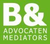
General requirements: a logo that has a clean, modern look, just like the temporary logo on ontwikkel.scheiden-online.nl (top left: scheiden.online), combined with our company logo on the left or right side of the logo or in stead of our company logo another graphic design. I attached our logo with this posting.
You can get creative and alter the company logo to make it match with the website logo.
logo 1: scheiden.online (meaning: divorce.online) with the company logo or some other graphics left or right of the text.
The website will be for online divorces.
The colors of the website you can view on the temporary website. These colors are final, so you can use them as reference, although I do think the text scheiden.online should be white to make it stick out on the green background of the top bar. And I like the bigger orange dot as it is.
logo2: echtscheiding-buitenland.nl (meaning: international divorce) with company logo or other graphic
The colors of the website will be blue, instead of the green of ontwikkel.scheiden-online.nl. And I will use the same orange color.
The website will be for online divorces for (Dutch) clients that live abroad.
logo 3: alimentatie.online (meaning: alimony.online) with company logo or other graphic
The colors of this website are still not final, although I will use the orange color and probably blue.
The website is for online alimony calculation
logo 4: ouderschapsplan.online (meaning: parentingplan.online) wth company logo or other graphic
Colors are still not final. I will use same orange color.
The website will be for creating a parenting plan online for parents that are divorced or going to divorce.
So 4 logos, matching styles so you can immediately see they belong to the same company.
Possibly incorporate our logo, but I am open for other suggestions. And keep the logo flat so it doesnt take to much height at the top bar.
Additional information: the name of the company is "B& Advocaten", meaning B& Attorneys. And the 4 websites are not the corporate websites, but themed websites where we offer only one service per website.
And one last thing. This is probably the most challenging one: if you decide not to use our company logo in any form, but decide to create a diferent graphic per site, please please do not use broken rings, a court gavel or a angry wife and husband for the graphic design. Its tempting, but in my opinion makes the website look cheap. Every lawfirm can get images like that from Thinkstock or Shutterstock and it almost looks like a cheap easy solution.
Cannot wait to see what you come up with!
Regards,
Auke
Prize: $ 100.-
Contest End Date & Time: May 15th 2017, 0900 AM GMT
Size requirements: scalable, should have about the size ratio of the logo on the top left on ontwikkel.scheiden-online.nl
General requirements: a logo that has a clean, modern look, just like the temporary logo on ontwikkel.scheiden-online.nl (top left: scheiden.online), combined with our company logo on the left or right side of the logo or in stead of our company logo another graphic design. I attached our logo with this posting.
You can get creative and alter the company logo to make it match with the website logo.
logo 1: scheiden.online (meaning: divorce.online) with the company logo or some other graphics left or right of the text.
The website will be for online divorces.
The colors of the website you can view on the temporary website. These colors are final, so you can use them as reference, although I do think the text scheiden.online should be white to make it stick out on the green background of the top bar. And I like the bigger orange dot as it is.
logo2: echtscheiding-buitenland.nl (meaning: international divorce) with company logo or other graphic
The colors of the website will be blue, instead of the green of ontwikkel.scheiden-online.nl. And I will use the same orange color.
The website will be for online divorces for (Dutch) clients that live abroad.
logo 3: alimentatie.online (meaning: alimony.online) with company logo or other graphic
The colors of this website are still not final, although I will use the orange color and probably blue.
The website is for online alimony calculation
logo 4: ouderschapsplan.online (meaning: parentingplan.online) wth company logo or other graphic
Colors are still not final. I will use same orange color.
The website will be for creating a parenting plan online for parents that are divorced or going to divorce.
So 4 logos, matching styles so you can immediately see they belong to the same company.
Possibly incorporate our logo, but I am open for other suggestions. And keep the logo flat so it doesnt take to much height at the top bar.
Additional information: the name of the company is "B& Advocaten", meaning B& Attorneys. And the 4 websites are not the corporate websites, but themed websites where we offer only one service per website.
And one last thing. This is probably the most challenging one: if you decide not to use our company logo in any form, but decide to create a diferent graphic per site, please please do not use broken rings, a court gavel or a angry wife and husband for the graphic design. Its tempting, but in my opinion makes the website look cheap. Every lawfirm can get images like that from Thinkstock or Shutterstock and it almost looks like a cheap easy solution.
Cannot wait to see what you come up with!
Regards,
Auke

")

