Rainmaker-NL
Established Member
- Impact
- 330
Contest: logo design
Prize: $ 70.-
Contest End Date & Time: November 23th 2017, 2100 PM CET
Size requirements: scalable, should have about the size ratio of the logo on the top left below the top slider on
http://3b3.b6e.myftpupload.com
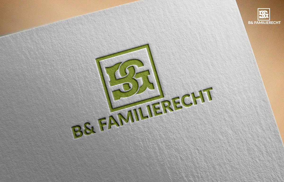
General requirements: on http://3b3.b6e.myftpupload.com you can see our new website being developed. It is still in progress, but you can get an idea of the new look and feel. On the top left, just below the Top slider you see a temporary logo. There we will need our new logo.
Our current (old) website is http://www.familierechtadvocaten.nl
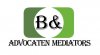
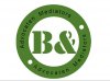
At the top left you can see our current logo. (green square)
The new logo will become our main logo that is used on our main website, letters, paperwork, pens, etc
The color should still be green. We now use #AAF24 as a main color for our websites. The logo color me be the same or a bit darker and matching with #9AAF24.
The shape may be changed from a square to rectangular, like the temporary logo.
If possible, please make two versions of a logo, one square variant and one rectangular variant, so we can use both.
The style should be modern and clean.
Please try to avoid any logos with legals icons in it, such as a gavel, a courtbuilding, things like that. Unless you have a brilliant way to incorporate a drawing or icon, please dont.
The logo needs to contain one of the following combinations:
'B& Familierechtadvocaten'
'B& Familierecht Advocaten'
'B& Advocaten Mediators'
'B& Familierecht'
'B&' is the company name
'Advocaten' means lawyers/attorneys
'Familierecht' means Family Law
'Mediators' means mediators")
I will give feedback to show you the way.
Cannot wait to see what you come up with!
Regards,
Auke
Prize: $ 70.-
Contest End Date & Time: November 23th 2017, 2100 PM CET
Size requirements: scalable, should have about the size ratio of the logo on the top left below the top slider on
http://3b3.b6e.myftpupload.com
General requirements: on http://3b3.b6e.myftpupload.com you can see our new website being developed. It is still in progress, but you can get an idea of the new look and feel. On the top left, just below the Top slider you see a temporary logo. There we will need our new logo.
Our current (old) website is http://www.familierechtadvocaten.nl
At the top left you can see our current logo. (green square)
The new logo will become our main logo that is used on our main website, letters, paperwork, pens, etc
The color should still be green. We now use #AAF24 as a main color for our websites. The logo color me be the same or a bit darker and matching with #9AAF24.
The shape may be changed from a square to rectangular, like the temporary logo.
If possible, please make two versions of a logo, one square variant and one rectangular variant, so we can use both.
The style should be modern and clean.
Please try to avoid any logos with legals icons in it, such as a gavel, a courtbuilding, things like that. Unless you have a brilliant way to incorporate a drawing or icon, please dont.
The logo needs to contain one of the following combinations:
'B& Familierechtadvocaten'
'B& Familierecht Advocaten'
'B& Advocaten Mediators'
'B& Familierecht'
'B&' is the company name
'Advocaten' means lawyers/attorneys
'Familierecht' means Family Law
'Mediators' means mediators
I will give feedback to show you the way.
Cannot wait to see what you come up with!
Regards,
Auke
Last edited: