Dynadot โ€” .com Transfer

Logo Design Contest Prize $25

Spaceship Spaceship
Watch
Status
Not open for further replies.

StingBee

Established Member
Impact
0
Type of Contest : Logo Design
Prize : $25

Contest End Date & Time : 10 days from creation of thread. (But reserve right to end it earlier if i get what I'm looking for).

Size Requirements : Logo minimum height 200px.
Color Requirements : Flexible
Image Requirements : PSD or AI file

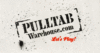
General Requirements : Logo for PulltabWarehouse.com. Pulltabs are gambling tickets that you play at a bar. I am looking for a logo that looks rough and worn like a warehouse. Perhaps in stencil form, perhaps with over-spray.

Additional Information :
The logo is for banner on a website. Open to all ideas.

Would like to see multiple concepts from each entrant instead of revising just the one; however not required.

I am open to all styles, colors, but raw and warehouse like.

I will provide feedback to ALL entrants.

Good luck, wish you all the best.

If you require further information, please get in touch here.

Thanks again,
Jerry
 
0
•••
The views expressed on this page by users and staff are their own, not those of NamePros.
Unstoppable DomainsUnstoppable Domains
Here's a concept Idea


Feedback Appreciated​
 
0
•••
pulltabbanner.jpg


pwtab.jpg
 
Last edited:
0
•••
Scorpion, very clean design. But the pull-tabs are to difficult to see when the logo is smaller. I have in my mind a stencil warehouse look with over spray. The tag line I liked was "Lets Play".

---------- Post added at 03:40 PM ---------- Previous post was at 03:30 PM ----------

Muniz, thanks for the submission. Seems like too much of a western feel for me.
 
0
•••
take2l.jpg
 
0
•••
Here's my concept..Feedback appreciated.

pw.jpg


Regards,
Sammy
 
0
•••
^thats pretty cool, looks fresh/professional.
 
0
•••
I really have a minds eye concept of a stencil with over spray.

---------- Post added at 10:02 PM ---------- Previous post was at 10:00 PM ----------

Muniz think old time stencil sprayed on the side of a cargo crate
 
0
•••
pulltaasdasdasdb.jpg


Entry Revised.
 
Last edited:
0
•••
Dakouten, getting there. The black is hard to see and the stencil font is the right stencil font. I like the over spray. Also often on stencils that are spray painted the outer edges of the form are visible.
 
0
•••
1st entry

pulltabwarehouse.jpg
 
0
•••
Thank you for the feedback. Here here is another version.

pulltab11.jpg
 
0
•••
i will enter the contest tonight :)
 
0
•••
dlight, too disco on the first draft. I like that you tried to show the outer frame of the stencil template but it is to uniform and there would be more of it if spray painted on.
 
0
•••
Here is a first idea

logo2.jpg


i'm working on some other impressions, please leave some feedback

regards

Jurrie
 
0
•••
I like this

I really like this logo can the creative minds of the contest improve it?
 

Attachments

  • PulltabWarehouse_logo.gif
    PulltabWarehouse_logo.gif
    52.1 KB · Views: 69
0
•••
Dakouten, I don't like the font colors and in a true stencil spray over there would be no splatter around the letters acccept around the outside of the stencil template.

---------- Post added at 08:10 AM ---------- Previous post was at 08:09 AM ----------

jurrie, thanks for the submission. Your first logo look to much like a western brand and not over spray and paint.
 
0
•••
pulltabcopy.jpg
 
0
•••
Scorpion,

I posted an example of something that I like. I like your work see if you can work your magic on this example.
 
0
•••
Attempted to "improve" the design you uploaded

PulltabWarehouse.jpg
 
0
•••
Status
Not open for further replies.
Appraise.net
Domain Recover
NameMaxi - Your Domain Has Buyers
  • The sidebar remains visible by scrolling at a speed relative to the pageโ€™s height.
Back