Unstoppable Domains โ€” AI Assistant

Kickoff: $25 Logo Contest

SpaceshipSpaceship
Watch
Status
Not open for further replies.

ecollective

Account Closed
Impact
0
Kickoff: $40 Logo Contest

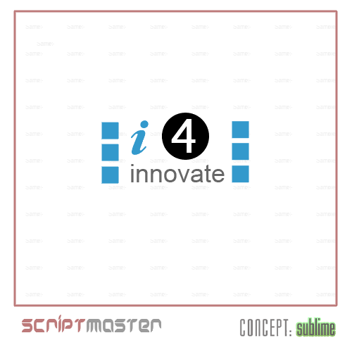
I'm looking for a new logo for a new firm. It's a small innovation management consultancy firm and I'm looking for a cool and formal logo that can be used on the website and businesscards.

The name of the firm is: i4innovate

The name comes from "i for innovate" as in spelling something and saying "s for success".
But also having an eye for innovation (i4innovation.com was already taken :()

Please use this without stating the obvisous. So no eyes in the logo please.

I see different possibilities like a logo for "I4" in combination with "innovate" or a seperate logo in combination with i4innovate. We don't have any fixed ideas yet, so we will be giving hints and directions as we go along.

Since we would like to be able to use our logo in print as well, we prefer vector designs. Please let me know if it's vector or not. Thanks.

Good luck everybody, I'm looking forward to your entries.

Since we are not in a hurry I will let the contest run till July 31st 2006.

Prize money has been changed to $40
(still too low, just let me know ;))
 
Last edited:
0
•••
The views expressed on this page by users and staff are their own, not those of NamePros.
GoDaddyGoDaddy
Here's my first entry. Feedback appreciated.

i44ue.jpg


i426ce.jpg
 
0
•••
i4innovate.gif
 
0
•••
i will be in soon..
 
0
•••
well, here's mine. 100% vector, colors adjustable, etc.
i4innovate4mc.jpg
 
Last edited:
0
•••
Ok, the first comments:

P|A|T|R|I|C|K ~ this is not what I'm looking for. First of all the logo reminds me of the Teletubbies and I don't want to be associated with them. It has to be something cool, maybe a bit agressive and formal (business).

Scriptmaster ~ also not really what I'm looking for. The design seems to consist of loose elements. It's has to function as a whole.

koncepts ~ I'm looking forward to your designs. I've seen a couple of them and I like them.

aznchong91 ~ no, sorry. not what I'm looking for. It's to simple and I wont be able to use I4 as a strong logo on it's own.

---

I will look around this forum for logos I like. This doenst mean I want to have a copy of them, but it should show my taste. For now I will leave you with a blank sheet, so I hope to see some cool creative ideas.

Oh, we added a heading under the company name: 'dare to do it different'.

Here are some words that we feel we are associated with:
- innovation
- improvement
- change (radical)
- strategy
- creativity
- flexibility
- technology
- entrepreneurship

This does not mean you have to use these words literaly, but it's just a sense of direction.
 
0
•••
my try.feedback appreciated.


Last edited:
0
•••
hello, here's my first approach, feedback most welcomed (style, font, color...) thanks!
 
0
•••
josephine ~ this is going somewhere. I dont know where ;) but I like what you did. There is just one thing that bugs me about the light. The first impression I got was of an alien head. Furthermore I'm looking for a more complete logo. Maybe you can play around with the the characters of I4INNOVATE a bit. Since I don't think we will be using just the logo part of your design.

blue-rain ~ ok, colors are not really special, style and font is not what I'm looking for. It reminds me of the SS logo (WWII). Sorry.
Too strained, if I can use that work. And too simple. Not that simple is bad, but this just doesn't have it.
 
0
•••
thanks for the quick feedback, heres another try
 
0
•••
Thank you for the feedback.Expect revisions.

ecollective said:
josephine ~ this is going somewhere. I dont know where ;) but I like what you did. There is just one thing that bugs me about the light. The first impression I got was of an alien head. Furthermore I'm looking for a more complete logo. Maybe you can play around with the the characters of I4INNOVATE a bit. Since I don't think we will be using just the logo part of your design.

blue-rain ~ ok, colors are not really special, style and font is not what I'm looking for. It reminds me of the SS logo (WWII). Sorry.
Too strained, if I can use that work. And too simple. Not that simple is bad, but this just doesn't have it.
 
0
•••
Here are some simple concepts I created:

i4Innovate.jpg

i4Innovate2.jpg


On the bottom two I made the "i4i" have the same color to subliminally give off the "eye for eye" relationship. I'd be more than glad to modify anything on either design. I can make these vector images for print media, etc. Feedback is appreciated :)
 
0
•••
blue-rain ~ these are just 3 different elements, 3 different styles I / 4 / innovate. I'm looking for something that is more united

MOGBase ~ to me this is not really a logo, it's just a combination of fonts and different colors. I'm looking for something unique. More of a design.

---

After the weekend I will let you know which logo's on this forum I really like. Till then please use your creativity. I know there is a lot of that on this website. I will also ask some of the other designers, who made cool design, to participate.
 
0
•••
Here is my entry. It's 100% vector. Fully scalable to all sizes and proportions. :)
Let me know what you think.

.

i4innovate-1.png


.

Edit: And colour variation.

.

i4innovate-2.png


.
 
Last edited:
0
•••
This is completly vector created in Illustrator.
 
Last edited:
0
•••
Bas ~ nope, not what I'm looking for. The font is too skinny and I can't find any cohesion between the elements

VickiUK ~ Yes, this is something I like. Simple, but strong. Maybe you can let the I4 in the ball be a bit more present, so it can be used seperate from the company name.

Don't forget we have a company slogan: "dare to do it different"
 
0
•••
Thanks for the reply. I have made the required change.

i4innovatebg6.gif


Again with the i4 stronger still...

i4innovate2by3.gif
 
Last edited:
0
•••
here's another try.feedback appreciated.Let me know if you want me to change the other light with this one.


Last edited:
0
•••
VickiUK ~ Nice, but can you make the I4 pop out even more. Maybe with a different color (white, grey) or an effect (stroke).

josephine ~ it's doesnt really look like a light anymore and I liked the idea of the light. Can you try something completely different. I've seen a couple of logos you designed that where really nice.
 
0
•••
I've added some more, different colors.
Do you want it styled?(meaning shadows/gloss etc)

Thanks for the feedback,i might give it another try.
 
0
•••
Status
Not open for further replies.
Appraise.net
Escrow.com
Spaceship
Rexus Domain
CryptoExchange.com
Domain Recover
CatchDoms
DomainEasy โ€” Zero Commission
DomDB
  • The sidebar remains visible by scrolling at a speed relative to the pageโ€™s height.
Back