


- Impact
- 2,448
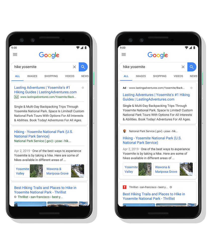
Today, when I was scrolling through the Google search results on mobile, I noticed a small visual change and was pleasantly surprised.
Earlier, the search results were blue and the source i.e. The domain name would be displayed below in a smaller, green font. Now, the domain name is given somewhat more preference. With the latest update, the website name is shown at the top and also includes the site’s own icon.
Until now, Google has somewhat devalued the source of search results, displaying a website’s name in a smaller font below each link.
In Google's own words:
Source:
https://www.blog.google/products/search/new-design-google-search/
Earlier, the search results were blue and the source i.e. The domain name would be displayed below in a smaller, green font. Now, the domain name is given somewhat more preference. With the latest update, the website name is shown at the top and also includes the site’s own icon.
Until now, Google has somewhat devalued the source of search results, displaying a website’s name in a smaller font below each link.
In Google's own words:
With this new design, a website’s branding can be front and center, helping you better understand where the information is coming from and what pages have what you’re looking for.
The name of the website and its icon appear at the top of the results card to help anchor each result, so you can more easily scan the page of results and decide what to explore next. When you search for a product or service and we have a useful ad to show, you'll see a bolded ad label at the top of the card alongside the web address so you can quickly identify where the information is coming from.
Source:
https://www.blog.google/products/search/new-design-google-search/


