Dynadot

Created A Sales Page For Domain - Opinions?

Spaceship Spaceship
Watch
Hey all. I was reading up on the forum and noticed a lot of people having success creating their own type of portfolio websites and basically showcasing their names that way. When someone lands on their domain name, they deal with the lead themselves and get their offer etc.

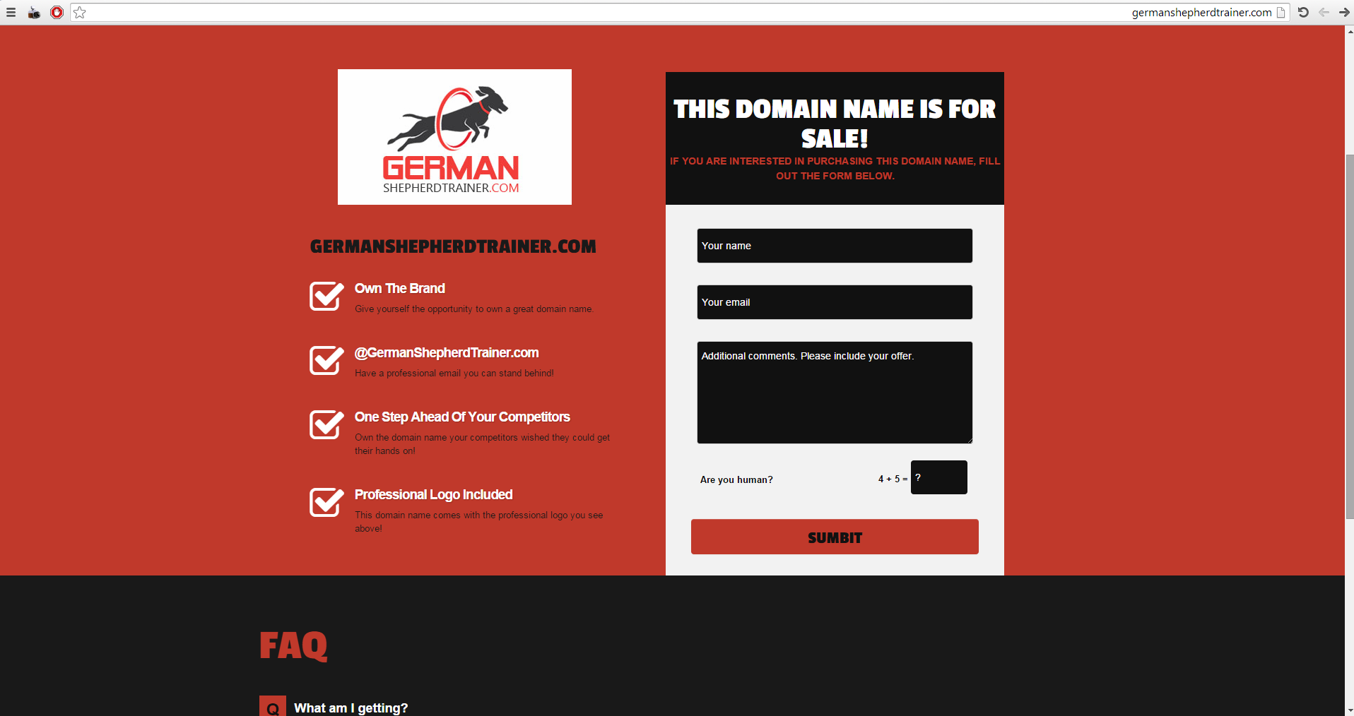
Basically, not parking your page and putting a little for sales sign in the corner. Having an all out Sales page.

I wanted your opinions on the one I just put up...

german /shepherd/ trainer (dot) com

Looking forward to your feedback!
 
1
•••
The views expressed on this page by users and staff are their own, not those of NamePros.
Looks good overall. I just think you could use the space a little better at the top. Maybe the logo and the men off to the left and then bring the form up to the right along side of it.

And the space above the left column should be tightened up as well.

Maybe just a little bit of margin or padding under the form too.

But the general elements on the page all look great! Just tighten up the spacing.
 
1
•••
Yeah I was looking into the spacing. I knew it looked a little funny. I'm not a pro coder or anything like that but I'm sure there's a way I could make those edits.

Thanks for the feedback!
 
0
•••
Nice template.

If you owned more domains you can link them @ footer (with link)

also need header corrections as Beezy told.

add more seo tags like h1, h2 & meta tags etc., , it will helps you to bring direct enduser from organic searches.

Goodluck :).
 
1
•••
Thanks for the idea regarding the footer!

Yeah, I am going to install a plug-in for SEO related terms. Thanks for the heads up!

-Omar
 
0
•••
Looks good :)

With respect, you have a typo on your submit button!
 
0
•••
1
•••
You design looks promising. I would suggest you only need "Domain Name For Sale." The additional two words (this ,is) are distracting.

Also, maybe make the dog's ears more triangular. I know the dog is running and jumping, so his ears are laid back, but the dog does not look like a German Shepherd. Lastly, perhaps the wrong words are highlighted in the logo. I would suggest that having German so large and in red is not the best option. I think the keywords here are German Shepherd together and trainer. Maybe "German Shepherd" in red on the first line, trainer in alternate color on the second line. I do not think you need the .com in the logo even if it is creating balance.
 
1
•••
@DavidH - Thanks for the sumbit button mistake. Can't believe I didn't catch that! lol

@hookbox - Great article. Made me think about maybe varying some colors but I haven't really had any visitors come to this page yet, so I have nothing to based any results on so maybe I will see what the initial response is.

@WhiteCloud - I made the domain for sale edit. I agree with that. Regarding the logo, I think for now I may leave it to test how it works out. I had to pay for the logo and would have to pay to have it re-done. Let's see what happens. Hopefully the "end user" just likes the overall look of the page and makes the next step to inquire about it...that's the goal.

Thanks for all the great tips everyone!
 
0
•••
imo

cancel the header

27775_96c31e8c1c919215dc6c59b834115220.png


and if you check the smartphones browser you find that there is problem in the text going out of the page
you know many surfing the internet using their smartphones

Good luck
 

Attachments

  • 1212.png
    1212.png
    124.5 KB · Views: 30
2
•••
imo

cancel the header

27775_96c31e8c1c919215dc6c59b834115220.png


and if you check the smartphones browser you find that there is problem in the text going out of the page
you know many surfing the internet using their smartphones

Good luck
This is much better. Less cluter.
 
0
•••
imo

cancel the header

27775_96c31e8c1c919215dc6c59b834115220.png


and if you check the smartphones browser you find that there is problem in the text going out of the page
you know many surfing the internet using their smartphones

Good luck

@Abdul Aziz R, Like your layout more...

All other suggestions are also good

The colors are just too strong/dark, background seems to take away the effect, maybe white will be better.
 
0
•••
@Abdul Aziz R - Thanks for that template style idea. I did some editing and made something a bit similar.

If you want to see the updated version you can visit the site now.

german /shepherd/ trainer (dot) com

Again, I am just testing these different types of landing pages because I didn't like what I saw out there and also I like to have control of several aspects of my business. Thanks all for the ideas!
I like this version better but when searched in mobile the germanshepheredtrainer.com text above the logo is to big so it gets cut off when in responsive mode. Shorten some and I think you'll be good.
 
0
•••
The words extend beyond the page width on my iphone, so I have to scroll sideways to read the text.
 
0
•••
  • The sidebar remains visible by scrolling at a speed relative to the page’s height.
Back