IT.COM

Contest - $50 USD - for DomainBeLL - Project: Pilgrim - 1

Spaceship Spaceship
Watch
Status
Not open for further replies.

DomainBELL

DNOA Founding MemberTop Member
Impact
1,089
Prize will be $50. - USD paid via PayPal

- - - I might also select a 2nd place winner for a prize of $25. USD - paid via PayPal
(see terms below)


there will be at least 5 other contests coming very soon.... so if this one doesn't suit you or you don't have time to enter this one... be sure to check back - or PM me for information on future contests - with links to your portfolio or online samples...


Contest
Starts: Sunday 7-30-06
runs 8 days...
Ends: Monday August 7th, 2006

Feedback will be left ONCE per day - in the THREAD - for ALL the entires for that day...


The designs that you submit must be your own work, unique and exclusive.


Entries must be watermarked...

Entries must be posted within the CONTEST THREAD

I reserve the right to NOT pick a winner IF:
there are no designs that I like enough to use...
I am sure that enough designers that do GREAT work will enter - so there should not be a problem picking a winner... in the event there are no suitable designs within the contest period - I reserve the right to extend the contest dates... I want to pick a winner... I want there to be a winner... I want a design I like enough to actually USE... (smile)

In the event there isn't a design I like enough to use - I will send each person that entered designs 200 NP$ as a thank you for trying...

Two winners might be chose - and if so - that 2nd place winner will receive $25. USD
- - - just depends on the entries...


NOTE: the 2nd place winner is not obligated to turn their design over to me for the second place price of $25. USD - if they choose not to for whatever reason - an alternate 2nd place winner may or may not be selected...


What I am looking for:
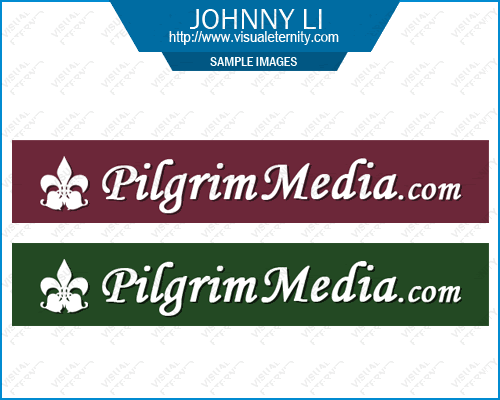
I am looking for somehting to use as a brandable logo for :

P-i-l-g-r-i-m-M-e-d-i-a.c-o-m

(without all the hyphens)

and

P-i-l-g-r-i-m--M-e-d-i-a.c-o-m

(the version with one hypen between the two words)


I'd like to see some harvest related colors used ...
and possibly something pilgrim theme related

NOT exclusively requiring these colors or a pilgrim in design - I would like to see what that might look like though...

However the winning design could very well be on not even in harvest colors... nor having a pilgrim in the design...

I need the end product to be in the following formats:
Vector .jpg .gif

You may enter even if you don't design in Vector... and you need to state in your post with your entry what formats you are able to provide the finished product in...

Winner will be paid via PayPal - BEFORE the designs are turned over to me in the finished un-watermarked format...

However - everything you post in the contest - online - MUST be watermarked... and - if I should request it - the winning designs may be required (by me) to be removed from the contest thread - after the contest ends...

If you are chosen as one of the Category Winners, I receive FULL Rights to the design(s) – the unique and exclusive rights - and you can NEVER display or sell them again. You may not mention the URL or Domain Name in any future manner that would be picked up by a search engine or any other media... I want my privacy protected...

The designs that you submit must be your own work, unique and exclusive.

Consider your entry into this contest as your agreement to all the terms above...

Good Luck to Everyone...


I look forward to working with you on future projects...


Ready... Set... GO !!!!!

~DomainBeLL (Patricia)


- - - note there was a slight editing - for appearnce preferences done on this post - PRIOR to any ENTRIES....


- - - - UPDATED: 8-3-06

I have decided against using any graphics depicting pilgrims...
no corn... no pilgrims... nothing pilgrim related...

and further on into the thread on page 3 - - - there are some links I included to samples of colors and fonts and things I've seen that caught my eye - so you can get more of an idea of what I am looking for....

I also sent some NP$ to every designer that jumped on board early on pages 1 and 2...

and at the end of the contest - after I pick a winner --- any NEW designers that enter at two or more designs - from page 3 on - will be getting a special treat - as a thank you from me at the end...

show me your talent... and have FUN....


..
 
Last edited:
0
•••
The views expressed on this page by users and staff are their own, not those of NamePros.
P|A|T|R|I|C|K said:
Thank you for the feedback. Here it is. Btw, I'll make the symbol soon. Thanks.

pilgrim52jk0.jpg


Symbol:
pilgrim53cn1.jpg

hi Patrick....

thanks for trying again... the pilgrim guy still looks too barrelie... needs black shoes... and a semi smile mouth (poor fellow looks so so so sad in the mouth area)...

the other one... I don't like that symbol at all... if possible try something smaller and something more like what one would see on a professional corporate site....

feel free to try again - with something totally fresh if you feel like it...

thanks for participating...

I sent you some NP$... because you have been doing allot of revisions etc...

thanks again...

~DomainBeLL (Patricia)

============================================================


.

yule said:
New entry. Two versions. Mayflower ship...

Version 1.
pilgrimmediadsj5.jpg


Version 2.
pilgrimmediad2ma5.jpg


Any sort of modification can be made to the ship. Size, color, ect.

hi yule...

the mayflower isn't working for me... too big and clunky...

would you like to try again ?? - - - with some symbol or icon sort of choices... nice ones like what would be on a professional corporte type site... that sort of quality...

thank you for everything you've tried so far... I also decided to send you some NP$ - you've been hanging in there on this one and although none of the designs yet in the contest are what I am looking for - I still appreciate your efforts...

thanks...

~DomainBeLL (Patricia)

=============================================================


.

will7 said:
I wasn't really that much of a fan of my first entry either :lol:

61cdabd034.jpg


Changed colour scheme and also created a new layout and icon design. Icon is aimed at representing travelling and pilgrimages involve a lot of travels :p If you have any other ideas of what you would like to see in the icon, please let me know.

Feedback appreciated :)

hey Will....

let's scrap this one... and do something fresh... I don't like the colors the font or the pilgrim... (smile) - - - you do good work - it's just not grabbing me this time...

I hope you enter something else into the contest...

maybe try a darker burguny wine color with black... on a totally new design...

thanks... and... I sent you some NP$ as a thank you...

~DomainBeLL (Patricia)

============================================================


.

logo master said:
Entry

pilgrimzb0.png


feedbacks appriciated

best regards
raghav


hi there...
thank you for entering the contest... let's scrap the clip art... change the font colors to some darker Harvest Fall type colors - - - here are some links that have pictures on them - that include the colors that caught my eye:

examples of some Harvest Colors:

harvest colors:
http://www.getflowers.com/itemphotos/_fsh501.jpg

more harvest colors:
http://www.jpkabala.com/photogallery7/index.htm

especially the one called: Valentina
http://www.christenbrown.com/supplies/ribbon/hanah/autumn/index.html

I hope you'll try something new and enter again...

thanks...

~DomainBeLL (Patricia)

=========================================================


.


o
o
o
o
o

Message to EVERYONE
don't forget that the entire DOMAIN name needs to be on the logo...
including the .com part...

o
o
o
o
o


.
 
Last edited:
0
•••
Sorry for the delay Patricia. Took me a bit longer to do it on the computer than it was with my tablet. :P

This is somewhat my best "transfer" from paper to your monitor. :)

All colors are changeable. Feedback is much appreciated.

Want something new? That's fine too as I have quite a few ideas on the tablet just waiting to be delivered. :)

http://www.blindweaver.com/previews/w3e8f14f3q5s/logo.jpg

The pilgrim hat, you probably know. The little flag, I was hoping to give the impression of the sail on the MayFlower. :P

[EDIT]
Forgot to mention, the hat, font color, etc. can all be changed.
 
0
•••
Static said:
Sorry for the delay Patricia. Took me a bit longer to do it on the computer than it was with my tablet. :P

This is somewhat my best "transfer" from paper to your monitor. :)

All colors are changeable. Feedback is much appreciated.

Want something new? That's fine too as I have quite a few ideas on the tablet just waiting to be delivered. :)

http://www.blindweaver.com/previews/w3e8f14f3q5s/logo.jpg

The pilgrim hat, you probably know. The little flag, I was hoping to give the impression of the sail on the MayFlower. :P

[EDIT]
Forgot to mention, the hat, font color, etc. can all be changed.


Hi Static...

the link isn't loading for me on FF - in Ohio USA...

I can hardly wait to see it though.... :)

~DomainBeLL (Patricia)


.
 
0
•••
I hope you will surely love this... this is a vector..

Regards.

pilgrim-man1a.gif


pilgrim-man1b.gif


pilgrim-man1.gif
 
0
•••
Last edited:
0
•••
hello, here are my new tries, feedback welcomed, thank you!
 
Last edited:
0
•••
Thank you for the feedback. Here's another shot at it. Feedback appreciated. Btw, that's Pillsbury Dohboy in his Thanksgiving costume. :hehe:

pilgrim54vb8.jpg


pilgrim55bv2.jpg


pilgrim56ac5.jpg


pilgrim57qn7.jpg
 
Last edited:
0
•••
DomainBELL said:
would you like to try again ?? - - - with some symbol or icon sort of choices... nice ones like what would be on a professional corporte type site... that sort of quality...
Always willing to try. My attempt at a symbol. It hopefully resembles corn. :)

pilgrimmediaekn6.jpg


Again, everything’s changeable.
 
Last edited:
0
•••
koncepts said:
I hope you will surely love this... this is a vector..

Regards.

pilgrim-man1a.gif


pilgrim-man1b.gif


pilgrim-man1.gif

Hi koncepts...

he's SCARRY looking... (smile)... let's forget a pilgrm...

I am going to post some samples for you and the others to think about and then see what you can come up with...

thank you for continuing...

~DomainBeLL (Patricia)

=======================================================


.

Static said:
Patricia, it seems to be working for me right now.

Anyways, here's a link from imageshack.
http://img214.imageshack.us/img214/3222/logosq4.jpg

Tell me if this works for you. Thanks!

Btw, koncepts, that's a great picture of a pilgrim. :)

[EDIT]
Here's a slightly different one with .com "blending in" with the word Media.
http://img92.imageshack.us/img92/1449/logo2xu7.jpg

Hi Static....

I've decided to not use any pilgrim related graphics or hats or corn or anything like that... those don't seem to be working out...

I am going to post some samples later today (hopefully) - or tomorrow...
and those will help you think about something fresh for me...

thank you for participating... I hope you continue...

~DomainBeLL (Patricia)

=========================================================


.

blue-rain said:
hello, here are my new tries, feedback welcomed, thank you!
pilgrim00.jpg

pilgrim01.jpg

Hi blue-rain,

that's a nice hat - I have however decided not to use any pilgrim related graphics... they aren't quite working well enough for the design...

and on your next entries - the domain name needs to be all in one line and include the .com

I am going to post some samples - for you to look at and think about...
either later today or tomorrow... and I hope you will submit again once you see those...

thank you...

~DomainBeLL (Patricia)
=============================================================


.
 
0
•••
P|A|T|R|I|C|K said:
Thank you for the feedback. Here's another shot at it. Feedback appreciated. Btw, that's Pillsbury Dohboy in his Thanksgiving costume. :hehe:

pilgrim54vb8.jpg


pilgrim55bv2.jpg


pilgrim56ac5.jpg


pilgrim57qn7.jpg

oh patrick...
he does look sorta like the Pillsbury Doughboy now that you mention it... LOL...
I've decided not to use any pilgrim or related graphics in the logo - they aren't quite working out as I had hoped... so we'll try something else...

the blue symbol is nice but not for this project... thanks though...

I am gathering some samples to share with you - and then I hope you will submit something fresh...

thank you for participating so far...

~DomainBeLL (Patricia)
===========================================================


.

yule said:
Always willing to try. My attempt at a symbol. It hopefully resembles corn. :)

pilgrimmediaekn6.jpg


Again, everything’s changeable.
hi yule...
thanks for still haning in there...

I have decided not to use any images like corn hats, pilgrims, ships or anything related to a pilgrim - it's not working out - and so we'll try something else...

I thought maybe - if I gathered some samples for inspiration - to show what sorts of things have caught my eye in the past - that maybe that might help all of you... so I will be working on that today and tomorrow - and then I will post those... Then I hope you will continue to try...

thanks again...

~DomainBeLL (Patricia)
=============================================================


.
 
0
•••
okay....


here we go... some of those examples I mentioned above....


see the text on this one....
www.mayflower.cl/
- - - is that a called a gel type font ??

I was wondering what my domain name would look like if done like that
(with the .com part included)
but maybe in the sort of plum or maroonish type colors you see in the
background on the picture here:
http://www.triumph-brochure-page.de/gfx/brochure_opt/mayflower/Mayflower_6.jpg
- - - I see that there are 2 shades there - the upper one darker etc..
I'd like to possibly see the domain name in 2 versions - one for each of those shades...


I saw something on the sign here:
http://www.mahc.coop/Photo/River%20House%20Coop,%20MI/River-House-(21).gif

see where the yellow section is and the white lettering...
I like that... but not those colors...
I LOVE the font on that one..
the font in white would be good
and replace the yellow with the colors mentioned above ( the plum maroonish colors)
here:
http://www.triumph-brochure-page.de/gfx/brochure_opt/mayflower/Mayflower_6.jpg

- - - note on the sign on mahc.coop - - - the only part that caught my eye was the
yellow with white lettering and that font...


on this one:
http://www.mahc.coop/Photo/Three Fountains West, IN/three-fountains-2.gif
- - - the little flourish at the top of that sign caught my eye... if used much smaller
and at the beginning of the domain name... and in the contrasting color of the plum maroonish colors suggested
above... where maybe if you did the domain in one of those shades and then did the flourish in the other
that might look nice... would have to see it to decide... might work... might not...

are you up for the challenge ??

anything else creative you want to try... I'd be happy to look at and give feedback on...


I like the COLOR - on this one also:
http://www.signoutfitters.com/store/viewItem.asp?idProduct=4854

I haven't yet finished looking for samples to show... I wanted to show some actual LOGOS
also... haven't yet gathered those...

I didn't want to keep you all waiting... so I thought I would go ahead and post this
for you to be letting it do it's magic in your creative heads.... (smile)

thank you so much for all you have done so far...

I'll have another treat for you at the end of the contest...

GOOD LUCK...

ready.... set... GO...

~DomainBeLL (Patricia)


.
 
0
•••
Here is my entry. Three variations on the symbol. Three variations on the text. I can mix and match if you wish. Or try different colors.

Version 1.
pilgrimmediaf1wr2.jpg


Version 2.
pilgrimmediaf2oq4.jpg


Version 3.
pilgrimmediaf3yn9.jpg
 
Last edited:
0
•••
Hi again DomainBELL, here is another submission using a flowery-styled symbol:

4663c8eaef.jpg


Two variations on the sizes of the symbol. I noticed from your example, it seems that you like the script style fonts so I tried to incorporate that into the design.

Feedback appreciated :)
 
0
•••
hi domainbell..can you advise as to what type of business the design will be for? IT, domain name site etc etc. That way we have a concept to work on. You have ruled out "pilgram" and also "media" as guidelines. If I missed this info somewhere in the thread I apologize.
regards thx
 
0
•••
My entries:

p2be9.png


p4to4.png


p3lj8.png


pas9.png


Anything can be changed :)
 
0
•••
Thanks for the feedback and new information. Here's my new entry:

pilgrimlogo21final.gif


More feedback is appreciated :)
 
Last edited:
0
•••
Here are some more entries. Feedback appreciated.


pilgrim58td4.jpg


pilgrim581yo5.jpg


pilgrim582pd7.jpg


pilgrim583cv4.jpg


pilgrim584jh4.jpg
 
0
•••
A bit late right now. I'll try to think a few creative ones. :P I've got one in mind, except I wonder how I'll be able to put it on the monitor. ;)
 
0
•••
yule said:
Here is my entry. Three variations on the symbol. Three variations on the text. I can mix and match if you wish. Or try different colors.

Version 1.
pilgrimmediaf1wr2.jpg


Version 2.
pilgrimmediaf2ed4.jpg


Version 3.
pilgrimmediaf3mu7.jpg

hi yule,

thanks for trying the flourish... I am wondering - what would it look like without the goldish tan border around the flourish ?? Can you do - just the FLOURISH - not the domain name.... in the 4 diff. shades you see here: http://pilgrimmedia.com/banners.html

thanks for capturing that flourish for me... I don't know why I like it so much... but I'd need it in other colors than what you've shown...

you did create the flourish on your own, and not copy it directly, correct ??

thank you for continuing...

~DomainBeLL (Patricia)

==========================================================


.

will7 said:
Hi again DomainBELL, here is another submission using a flowery-styled symbol:

4663c8eaef.jpg


Two variations on the sizes of the symbol. I noticed from your example, it seems that you like the script style fonts so I tried to incorporate that into the design.

Feedback appreciated :)

Hi will,

I glad you entered the contest again...

I do like the full color version of the little round design element...

could you move it over so no lettering is touching it... and keep it the same colors and same size and try another font and larger on the font too...
I'd like to see what that would look like...

and on the same exact thing in sizing and spacing... could you also
try a version where the colors would coordinate with the colors on
the banners here:
http://pilgrimmedia.com/banners.html

thank you again...

~DomainBeLL (Patricia)

============================================================


.

umxca said:
hi domainbell..can you advise as to what type of business the design will be for? IT, domain name site etc etc. That way we have a concept to work on. You have ruled out "pilgram" and also "media" as guidelines. If I missed this info somewhere in the thread I apologize.
regards thx

hi there umxca,

The business sells ad space in various media...
http://pilgrimmedia.com/banners.html

I've decided not to use any images depicting pilgrims or pilgrim related items...
and the "media" part of the domain name is just a text word - I don't want any graphics to depict that word.... other than the actual word itself... (smile)

there are some good entries on this page 3 of the contest - to give you ideas... from post #62 through #67

I hope you enter something...

Good Luck...

~DomainBeLL (Patricia)

==============================================================


.
 
Last edited:
0
•••
Thank you for you feedback again.
Yes I did create it, it isn't a direct copy.
I've done the 4 diff. shades without and with the border for you to see.

Shade 1.
pilgrimmediaf1ec5.jpg
Shade 1 With Border.
pilgrimmediaf1wsxo5.jpg


Shade 2.
pilgrimmediaf2bw7.jpg
Shade 2 With Border.
pilgrimmediaf2wsok5.jpg


Shade 3.
pilgrimmediaf3ej3.jpg
Shade 3 With Border.
pilgrimmediaf3wsty5.jpg


Shade 4.
pilgrimmediaf4tr9.jpg
Shade 4 With Border.
pilgrimmediaf4wsjj3.jpg
 
0
•••
Fran said:
My entries:

p2be9.png


p4to4.png


p3lj8.png


pas9.png


Anything can be changed :)

Hi Fran,

Thank you for your entries... they are nice, just not what I am looking for...


examples of some Harvest Colors:

harvest colors:
http://www.getflowers.com/itemphotos/_fsh501.jpg

more harvest colors:
http://www.jpkabala.com/photogallery7/index.htm

especially the one called: Valentina
http://www.christenbrown.com/suppli...tumn/index.html


- - - and from a previous post:


see the text on this one....
www.mayflower.cl/
- - - is that a called a gel type font ??

I was wondering what my domain name would look like if done like that
(with the .com part included)
but maybe in the sort of plum or maroonish type colors you see in the
background on the picture here:
http://www.triumph-brochure-page.de...Mayflower_6.jpg
- - - I see that there are 2 shades there - the upper one darker etc..
I'd like to possibly see the domain name in 2 versions - one for each of those shades...


I saw something on the sign here:
http://www.mahc.coop/Photo/River%20House%20Coop,%20MI/River-House-(21).gif

see where the yellow section is and the white lettering...
I like that... but not those colors...
I LOVE the font on that one..
the font in white would be good
and replace the yellow with the colors mentioned above ( the plum maroonish colors)
here:
http://www.triumph-brochure-page.de...Mayflower_6.jpg

- - - note on the sign on mahc.coop - - - the only part that caught my eye was the
yellow with white lettering and that font...


on this one:
http://www.mahc.coop/Photo/Three ...fountains-2.gif
- - - the little flourish at the top of that sign caught my eye... if used much smaller
and at the beginning of the domain name... and in the contrasting color of the plum maroonish colors suggested
above... where maybe if you did the domain in one of those shades and then did the flourish in the other
that might look nice... would have to see it to decide... might work... might not...

are you up for the challenge ??

anything else creative you want to try... I'd be happy to look at and give feedback on...


I like the COLOR - on this one also:
http://www.signoutfitters.com/store...?idProduct=4854

I haven't yet finished looking for samples to show... I wanted to show some actual LOGOS
also... haven't yet gathered those...

I didn't want to keep you all waiting... so I thought I would go ahead and post this
for you to be letting it do it's magic in your creative heads.... (smile)

thank you so much for all you have done so far...


I hope you'll try something new and enter again...

thanks...

~DomainBeLL (Patricia)

==========================================================


.

TheDoc said:
Thanks for the feedback and new information. Here's my new entry:

pilgrimlogo21final.gif


More feedback is appreciated :)

hi johnny...

thank you for the entires... so far this is one of the top 3...
I'd like the symbol changed to something else... what other goodies could you
put in it's place... can you try a few so I'll have choices... I like the maroon and the green versions... so don't change the color... and don't change the font... just work on the little icon...

thanks (smile)

~DomainBeLL (Patricia)

=============================================================


.
 
0
•••
P|A|T|R|I|C|K said:
Here are some more entries. Feedback appreciated.


pilgrim58td4.jpg


pilgrim581yo5.jpg


pilgrim582pd7.jpg


pilgrim583cv4.jpg


pilgrim584jh4.jpg

hi Patrick....

of everything you have done for me so far - these are my favorite submissions from you...

please leave them posted until the contest is over - so you can be in the running for the final decision...

also - could you make some with some sort of icon at the beginning...
some icon choices would be nice...

you are in the top 3 so far...

thank you very much for sharing your talent with me...

~DomainBeLL (Patricia)
==========================================================


.
 
0
•••
i figured i would give it a shot, so here you go (i personaly like the first one better)

reminder, 100% Vector, everything can change

Let me know what you think
 
0
•••
Hi Patricia,

Here's my entry.
Need to explain the concept... or "you make it happen" is enough? :D

*** temporary removed ***

Feedback is appreciated.
 
Last edited:
0
•••
Here they are. Feedback appreciated.

pilgrim59gt2.jpg


pilgrim591nr8.jpg


pilgrim592qb1.jpg


pilgrim593qu1.jpg
 
0
•••
Status
Not open for further replies.
  • The sidebar remains visible by scrolling at a speed relative to the page’s height.
Back