Unstoppable Domains

$80 logo design contest

Spaceship Spaceship
Watch
Status
Not open for further replies.

IdahoFarmer

mmm ... Pizza ....Established Member
Impact
5
-H-o-m-e-S-o-u-r-c-e-.com without the hyphens (don't want the search engines to pick this thread up, so please don't use unhyphenated version in the thread... but ok in the image of course!

Prefer logo without a home in it... or if there is a home would like it to be an abtract image. Professional, clean, impressive logo.

Contest ends this Sunday July 16th at 11:00pm Mountain Time.

Good luck and have fun!

IdahoFarmer
 
0
•••
The views expressed on this page by users and staff are their own, not those of NamePros.
.US domains.US domains
Give me just one second ;)

------

Here's my first attempt, 100% vector:

logo29yk.jpg
 
Last edited:
0
•••
here is my first entry.

100% vector , colors adjustable


homesource.jpg


regards


jurrie
 
0
•••
my try.feedback appreciated.

 
0
•••
here's my entry, hope you like it! 100% vector, colors adjustable, all the good stuff included. :p
homesource0vh.jpg
 
0
•••
Nice prize :tu: I'm in :)
 
0
•••
Thank you for the submissions so far. Good stuff... but none has the feel I'm looking for. Keep 'em coming!
 
0
•••
any feedback? what exactly are you looking for (or a basic idea)?
 
0
•••
Here's my first entry. Feedback appreciated.

house2yq.jpg
 
0
•••
IdahoFarmer said:
Thank you for the submissions so far. Good stuff... but none has the feel I'm looking for. Keep 'em coming!


Please,give us an idea of what you'd like.or maybe some examples of logos you like so as to help us understand the feel you want it to be.

Thanks.
 
0
•••
homesource.gif
 
0
•••
Idahofarmer- Could you please describe your site's purpose or any ideas for a logo you may have. This should help all of us designers to get a better grasp of the concept.

Thanks!
 
0
•••
Hi, its me,

home-source.gif
 
0
•••
Hello
Here's my entry:
logo24bg.jpg

I can send you psd, gif, jpeg etc...
Thanks
globalgamez
 
0
•••
i am in...

removed ...lol
 
Last edited:
0
•••
Looking good everyone... haven't seen the winner yet but I'm liking what I'm seeing...

I'm looking to a 100% professional design... something you could see advertised on a national basis. It needs to be legible, iconic and graphically attractive. Design elements are welcome, but should not be too distracting. Perhaps a logotype with interrelated icon. Proper kerning is appropriate, relative spacing is important, colors are important, design is important.

I would like the first letter of each word to be caps, and the rest of the letters to be lowers... this will promote legibility.

Gio~logist - Like the clean logo design... but the square box is too, well, square... also the domain is wrong... it home not house... and some folks will read the words backwards... putting Source first. Aesthetically pleasing design but its not right for me.

Jurrie - Nice design but its not the design I'm looking for. Thank you for your submission.

Josephine - Nice design but its not the design I'm looking for. Thank you for your submission.

aznchong91 - Nice design but its not the design I'm looking for. Thank you for your submission.

PATRICK - Nice design but its not the design I'm looking for. Thank you for your submission.

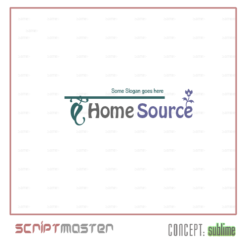
Scriptmast - Too much going on in this logo. Don't like the font. But... nice colors and a nice design. Thank you.

Ami - Nice design but its not the design I'm looking for. Thank you for your submission.

Akakader - Nice design but its too bold and blocky and imposing. Thank you for your submission.

Koncepts - I like these. The center one is my favorite followed by the center right and the bottom one. Feel free to adjust these if you're motivated to do so. Straighten the tree... the root ball can remain at an angle, but the trunk that extends out of it should be at 90degrees. Also... need caps and lowers as described above.


Thank again to all who have participated so far. Keep 'em coming!

Oh... and the sites purpose is the listing and sale of real estate.
 
0
•••
Here's My second entry:
(1)
logo38sb.jpg

(2)
logo40hr.jpg
 
Last edited:
0
•••
My entry:
[Feedback Appreciated]
imageprotecths6fk.jpg
 
0
•••
My Try
Feedback appreciated

i103_home.gif


A little more variation

i104_home.gif
 
0
•••
some more logos

i105_b.gif
 
0
•••
Status
Not open for further replies.
Appraise.net
Domain Recover
DomainEasy โ€” Zero Commission
  • The sidebar remains visible by scrolling at a speed relative to the pageโ€™s height.
Back