Unstoppable Domains

$30 Logo Contest or DojoArts.com

Spaceship Spaceship
Watch
Status
Not open for further replies.

-Adam-

The Caffeine King!VIP Member
Impact
115
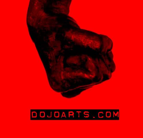
My site is going to be based all aspects of the martial arts community. From Korean to Japanese to UFC etc... It will encompass different study aspects to forms and technique styles.

Please give this a professional feel but with a friendly community type genre. I will end this contest if a logo is created that I like or exactly 1 week from Today. Thursday, July 6, 2006.

Please submit all entrys here as I will be monitoring this thread until contest completion. If you have any questions/comments or concerns please feel free to AIM me at :Adamlr81

Thank you for looking.
 
0
•••
The views expressed on this page by users and staff are their own, not those of NamePros.
AfternicAfternic
Does it need to be vector? I suck with vectoring :(
 
0
•••
I'd perfer vectoring, however I am willing to accept submissions that are not. Thank you for your intrest.
 
0
•••
Here's my first entry. Feedback appreciated.
 
Last edited:
0
•••
P|A|T|R|I|C|K said:
Here's my first entry. Feedback appreciated.

I really like the concept and your on the right track. I like your second design out of them both. The text however is nicley done and the colors are a good blend. Although I haven't decided if I like the circle or not.
 
0
•••
Ok, thanks for the feedback. :) I was wondering if you would like me to add anything else.

~Patrick
 
0
•••
How about this. Feedback appreciated.
 
Last edited:
0
•••
will enter soon.

nikki.
 
0
•••
1152271122.png


Feedback Appreciated.
 
0
•••
Here is one of my ideas


feed back appreciated
 
Last edited:
0
•••
me to nikki..
 
0
•••
dojoarts.jpg
 
0
•••
Patrick Da3 looks good, but instead of shaped backgrounds what about like a rising sun or something a little more scenic?

Swefx, the design is a nice one but it's a little to childish for what I'm looking for.

Scriptmaster, way to big and way to much color contrasting.
 
0
•••
How about this? Feedback appreciated.
 
0
•••
Now thats what I'm lookin for! Patrick no more changes are needed for your submission. Great job btw.

Contest will continue until date completion to give others a chance to enter.
 
0
•••
Thank you for the feedback. :)
 
0
•••
any feedback on mine?????

tks...
 
0
•••
Maxter I like the symbol design in DA1, However the neon green and blue mix will not mesh well with what I am looking for. Also the text is a bit childish for what I'm looking for and the DA sitting above the lower domain name text is out of place and not really needed. All in all the symbol is great just revise it to give it a more mature feel.
 
0
•••
Laura Perry- Freelance Designer 100% vector

dojoarts6jd.jpg


feedback would be appreciated
 
0
•••
Laura, very nice design and color use. Font size is good I'm just not to sure about the text. The golden globe behind the shadow is a nice use however it probably should be somewhat smaller to take care of that clipping problem at the very top of it. Other than that I like where your going with this design.
 
0
•••
Status
Not open for further replies.
Dynadot โ€” .com TransferDynadot โ€” .com Transfer
Domain Recover
DomainEasy โ€” Live Options
  • The sidebar remains visible by scrolling at a speed relative to the pageโ€™s height.
Back