NameSilo

REQ-LOGO TRYPOPOBIA Logo Contest 1st 2nd 3rd place $35

Spacemail by SpaceshipSpacemail by Spaceship
Watch
Status
Not open for further replies.
Hey everyone,

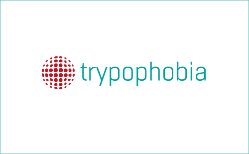
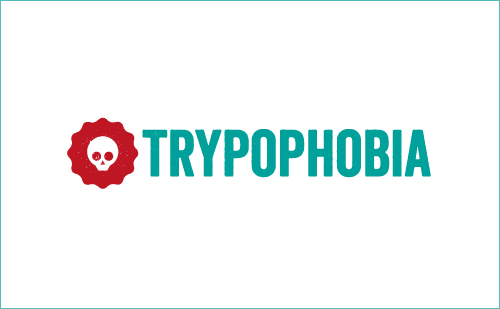
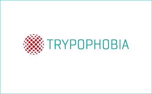
I am looking for a logo for our Trypophobia website.

If you are wondering what trypophobia is you can visit my website www.trypophobia.com

I am looking to have a 1st 2nd and 3rd place in this contest. If you win any place I will be expecting to have ownership of the logos for future projects etc.

1st place: $35
2nd place: $30
3rd place: $25

Payment via paypal

Contest ends February 10, 2015.

You all should have a LOT of fun with this one. Enjoy!
 
Last edited:
1
•••
The views expressed on this page by users and staff are their own, not those of NamePros.
AfternicAfternic
trypophobia3.png
 
0
•••
Thanks. Not a big fan of the concept.Any way you can get closer to trypophobia? Trypophobia means the irrational fear of clusters of holes.

Still looking for others. 3 places here people. Great opportunity for you to make some quick cash
 
0
•••
trypophobia4.png


Thanks for the feedback. In this version I have made a symbol that uses clustered holes in a regular geometric pattern. My intention was to visually represent the condition without triggering it when viewed. This regular pattern is less likely to trigger trypophobia as, I understand it, organic clusters of holes are more likely to trigger trypophobia.
 
0
•••
this one is better my friend:) Thanks!
 
1
•••
trypophobia.png
 
0
•••
looking good any others?
 
0
•••
tyro.png
tyro2.png
 
0
•••
ops.png
 
0
•••
1.png

2.png

3.png
 
0
•••
No issues with latest submissions. Keep it up. My one note of feedback is it seems to me like the images are all coming out very similar in nature. Anyone want to mix it up? and completely surprise me?
 
1
•••
trypophobia5.png


Here's a revision that adds some extra meaning to the symbol.

I realised that my first version had a symbol that could be seen as an 'X' and therefore could have negative connotations. I turned it 45 degrees to form a red cross which has a much more positive association. I also changed the type to lowercase to make the logo less shouty and more inviting and approachable.

Together the symbol and logotype communicate the condition in a positive and engaging manner that will keep visitors on your site for longer.
 
1
•••
great work
 
0
•••
My try:

mockup.jpg


try.png
 
0
•••
Just wanna scratch looking at this logo!!
dead, rotten skin
33wv0np.jpg
 
0
•••
great work everyone!
 
0
•••
Simple and Elegant :)
The image after letter P on trypo represent holes also a person connected and encourage to each other from trypophobia.

Any feedback would be appreciated @ODST.com


trypo2.png


Trypophobia.png
 
Last edited:
0
•••
4.png

5.png
 
0
•••
Here's my idea. Hope you like it. Good luck
 
Last edited:
0
•••
keep em comin guys the more the merrier let those creative juices run wild
 
0
•••
Status
Not open for further replies.
Dynadot โ€” .com TransferDynadot โ€” .com Transfer
Appraise.net
Domain Recover
NameMaxi - Your Domain Has Buyers
  • The sidebar remains visible by scrolling at a speed relative to the pageโ€™s height.
Back