[REQ-LOGO] Loopneckties.com - $35

SpaceshipSpaceship
Namecheap AuctionsNamecheap Auctions
Watch
Status
Not open for further replies.
Type of Contest : LOGO Design

Prize : $35.00

Contest End Date & Time : 1/9/2013 18:00 PST

Size Requirements : Vector

Color Requirements : No restrictions

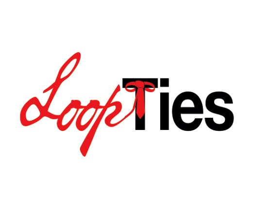
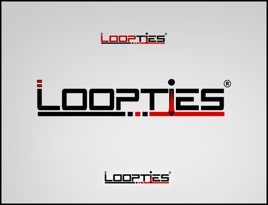
General Requirements : We would like the logo to incorporate "Loop Ties", a necktie and possibly the loop you would make while tying a tie. We also want the design to represent the current trends in mens fashion, which is sleek, classy and tailored fit, as re-introduced by the TV show "Mad Men".

*Payment will be made via PayPal within 2 business days of winner's announcement on the 9th.
 
0
Close
The views expressed on this page by users and staff are their own, not those of NamePros.
GoDaddyGoDaddy
tiecopy.jpg
 
Last edited:
0
Close
logo_loopties_zps71b0a31b.jpg
 
0
Close
ltlogo.jpg
 
1
Close
Removed.
 
Last edited:
0
Close
Hello, here's my first concept:

Loopties001.png
 
0
Close
Thank you all for your submissions thus far.

Amin, I like both of your submissions. If possible, I'd like to see what they would look like with the tie moved down more to center and with loop ties in black.

Gooddesigner, I like your thinking with your second design except it is difficult to tell it is a tie to the left. Your design made me think of Loop Ties being encircled by the loop of the tie, with the tie hanging down in the middle, maybe with a less rigid font. Not a big fan of the orange.

Cool, I really like your design, pulls in the Mad Men theme very well. Is it possible to see just the Loop Ties portion without the background?

Matt, it is hard to tell the tie is a p. Expanding on your design, I'd be curious to see with it would look like if you stacked loop over ties, and made one of the o's in loop, the loop of the tie, and had the knot and tie portion form the i in ties.

Loko, I really like our design as well. Only thing I would be curious to see is if you can add a loop to the top of the tie you used to for the "T", to make it look more like a "T"

Thanks again, good stuff so far.
 
0
Close
Matt, it is hard to tell the tie is a p. Expanding on your design, I'd be curious to see with it would look like if you stacked loop over ties, and made one of the o's in loop, the loop of the tie, and had the knot and tie portion form the i in ties.

Thanks for the feedback - I had that concern about the logo as well, but I figured it would be a good idea to see what you thought about it.

I'll submit another concept based on the idea you mentioned. :)
 
0
Close
Working on a revision..
 
0
Close
logo_loopties_zpsafcc33ff.jpg
 
0
Close
Revision:

ltlogob.jpg


Fresh Concept:

ltlogo2.jpg
 
Last edited:
0
Close
Amin, I like both of your submissions. If possible, I'd like to see what they would look like with the tie moved down more to center and with loop ties in black.

Revised..!
tiecopy.jpg
 
1
Close
sggv3p.jpg


my entry :D feedback please
 
0
Close
Thank you for your revisions and new entries:

Gooddesigner: I appreciate your effort on this, my only feedback is that it is not easy to tell that the tie is a tie. Your design did make me think of a cool revision, where the tie is straight and the loop more circular and the left part of the top portion of the T crosses over the tie to make it look like a tie bar.

Cool: I really like your original design. I like your thinking with the new design but it is difficult to tell that the tie is a L.

Amin: Thank you for revising your design. The only thing I would like to see differently is to switch the colors. Have the words be black and the tie blue.

Namanda: Thank you for your submission. I like your thinking with the font, especially the loop portion. For color, I prefer black font to blue. For the tie, I am fine with its placement (although I started thinking about what it may look like at the end) however, the top of the tie has a look of an engagement ring which took away from the tie concept.

Thanks again for your efforts. I look forward to seeing your revisions.
 
0
Close
Working on a revision...

---------- Post added at 10:26 AM ---------- Previous post was at 08:53 AM ----------

Revised.. Hope u like it..
tiecopy.jpg
 
0
Close
logo_loopties_zps97e99b40.jpg
 
0
Close
thanks for the feedback

261ffc8.jpg
 
0
Close
Thanks for the feedback. Here's an update :blink:

Loopties002.png
 
0
Close
loop-tie-preview_zps794c670e.png
 
0
Close
Regards,
Catfish.
 
Last edited:
0
Close
Status
Not open for further replies.
DomainEasy: flexible LTO options. Close more domain deals with financing.

We're social

Escrow.com
Spaceship
Domain Recover
CryptoExchange.com

NamePros updates

Each character of a domain name in its own box, with how to type one of them
Bookmarks: see bookmarks without a label
You can now show only the bookmarks you have not labeled. Open the label filter in the Bookmarks tab of your account menu, or on your...
AIVikings
Catchy
  • The sidebar remains visible by scrolling at a speed relative to the page’s height.
Back