IT.COM

[REQ-LOGO] Logo for a web properties/portfolio website - $60

Spaceship Spaceship
Watch
Status
Not open for further replies.
Type of Contest : Logo Design

Prize : $60.00 USD through PayPal only

Contest End Date & Time : July 18th, 5PM PST

Size Requirements : Open/Undetermined; needs to be used as a website logo, and printed on letterheads and business cards.

Color Requirements : Zest colours; eg. think citrus fruits: oranges, lime, lemons. Just keep in mind that the colours you choose for the logo, will then be used for our web design. We want a logo first, before designing the website.

General Requirements : We are looking for a logo for "ZestCore", which will be a web portfolio, web property firm that will display the various Web2.0 websites under our network. What we are looking for in the logo is that it's brand-able, professional, and that it is modern looking, and mild to the eyes (eg. nothing too bright); ie. Web2.0 looking.
As to how ideas go, what I was thinking is that it should relate to the two words of the company; Zest and Core. Zest as in citrus fruit (peel anyone?), and Core as in the Earth? Or maybe a core of a fruit, eg. apple core! Any entries are welcome; We don't want to limit ourselves to those ideas. Be Creative! I'm sure there are very good ideas out there.

Additional Information : The final product should be in a PSD and vector format so that it could be used for marketing purposes. Being able to be printed on t-shirts, and through any other monochromatic medium would be a plus.

P.S. Please, no stock photos! We want to have 100% of the rights for this logo.


If you have any additional questions, please let me know. If the prize is too low, it can be negotiated in this thread.
 
Last edited:
0
•••
The views expressed on this page by users and staff are their own, not those of NamePros.
Hello,

Please see my attached entry.

I welcome feedback, and am happy to revise the concept as per your instructions.

Thanks

2.png


PS. Please ignore the watermark; the logo is fully vector, and completely custom made.
 
1
•••
:kickass:! Thanks for the entry, webmango! Appreciate it.

I'm definitely liking the 2nd entry more than the 1st entry, as it looks like a globe wrapped in an orange peel (?), which kind of fits the "web" theme. I'm assuming the "core" or the "globe" is transparent at this point? I can't really confirm through the watermark.

If it is transparent at this point; would it be possible to revise it to make the circle more visible? i.e. it's actually wrapping a sphere; maybe a transparent glass sphere with the continents sketched in to the glass? kind of like this in real life but without the blue LED light: http://soul-amp.com/pics/pics_to_post_electric_globe/Electric_Earth_Globe__soul-amp_8.jpg

Thanks again!
 
0
•••
Logo idea:
zestcore.jp


Feedback is appreciated. :)
 
Last edited:
0
•••
Colors can be changed according to your requirement..

ZEST%20CORE%201.jpg


ZEST%20CORE%203.jpg


ZEST%20CORE%202.jpg
 
0
•••
Thank you for all the entries!

@blairwitchii: The logo definitely looks nice, but unfortunately, does not fit the modern web2.0 look we are looking for to build our website with.

@TheGraphicsGuy: My partner certainly likes the modern looks of those 3 versions, but the thin font doesn't really fit in with the large "O" core. I personally prefer the 2nd and 3rd one. The 2nd one will probably look better in orange.

Looking great everyone! Keep them coming in :)
 
Last edited:
0
•••
Logo idea:
zestcore1.jp


Feedback is appreciated

---------- Post added at 12:47 AM ---------- Previous post was at 12:16 AM ----------

Logo idea:
zestcore2.jp


Feedback is appreciated
 
Last edited:
0
•••
Those are good ideas :) I'll have to have a chat with my partner on this before giving any more feedback.
 
0
•••
here is my logo idea.
can be modified as needed if you like the idea at all.
any feedback, positive or negative is appreciated.

Thanks

horrible first design... here are some much improved different ideas.

The first is just a cross section of the earth showing the layers of the earth, but using zesty colors instead of normal colors.

The next ideas are also cross sections of the earth but filled with a citrus fruit instead of the normal material.

I can do a much more detailed world or more detailed fruit if you would like. obviously font changes are easily done as well
 

Attachments

  • zestcore1.PNG
    zestcore1.PNG
    48.2 KB · Views: 54
  • zestcore2.PNG
    zestcore2.PNG
    41.7 KB · Views: 50
  • zestcore4.PNG
    zestcore4.PNG
    38.2 KB · Views: 50
  • zestcore5.PNG
    zestcore5.PNG
    36.7 KB · Views: 54
  • zestcore3.PNG
    zestcore3.PNG
    37.4 KB · Views: 56
Last edited:
0
•••
:kickass:! Thanks for the entry, webmango! Appreciate it.

I'm definitely liking the 2nd entry more than the 1st entry, as it looks like a globe wrapped in an orange peel (?), which kind of fits the "web" theme. I'm assuming the "core" or the "globe" is transparent at this point? I can't really confirm through the watermark.

If it is transparent at this point; would it be possible to revise it to make the circle more visible? i.e. it's actually wrapping a sphere; maybe a transparent glass sphere with the continents sketched in to the glass? kind of like this in real life but without the blue LED light: http://soul-amp.com/pics/pics_to_post_electric_globe/Electric_Earth_Globe__soul-amp_8.jpg

Thanks again!

Thank you indeed for the feedback.

Please see the following: I've made the overall image larger, and have incorporated the globe as per your instructions.

I've included two; one clean simple blue globe, and one with a slight green tint to make the globe a bit more complex.

I've opted to stay away from including countries, because a) I'm going to assume your business will be international b) it will add too much to the design making it feel less fresh, modern and less overall 2.0

6.jpg


Feedback appreciated.
 
Last edited:
0
•••
0
•••
Logo concept:
zestcore4.jp


Feedback is appreciated
 
Last edited:
0
•••
@a.jipping: Thank you for your time on the entries. Unfortunately, they don't look professional enough to be used for a portfolio website.

@webmango: Thank you for taking your time to revise it based on my comments; the concept looks great - the entry I'm liking most so far. The colours may be too dull, but colour can be changed if yours does get chosen? I know I did say something in regards to not having too bright of colours :P oops... but the orange peel might need some "brightening" to make it look like it does come from an orange. Oh, and I love the font.

@Gooddesigner: Thank you for your time on the entry. I love the concept of the "e" being the orange! however, the font looks too bubbly to be used for a professional website and the color/gloss seems too over. If it can somehow be changed to make it look professional, there is a big chance it will get chosen!

@blairwitchii: Thank you for your entries! I think the logo looks too "clipart-y" (if that's a word) to be used as a logo, but thank your taking your time nevertheless!

Again, thank you for everyone's hard work on the entries! There may very well be multiple winners with how it's going, assuming it's not against any rules.
 
Last edited:
0
•••
1
•••
Last edited:
0
•••
thanks for the feedback. How about this one?
zestcore6.jpg
 
1
•••
0
•••
@blairwitchii: Just lovely! We love it! The colour is great, the design is great, the font is great!

@TheGraphicsGuy: Looks great too!

I'm leaning towards blairwitchii's entry at this point! But wow, it'll be hard comes decision making time with so many quality entries.

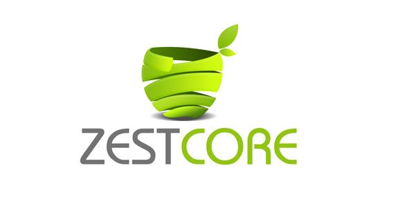
EDIT: @blairwitchii; my partner just let me know that he wanted more contrast on the colours so that it'll show better in monochromatic. Would it be possible to make the peel a different colour, like a lime color (like the green in the zestcore5.jpg or a lemon color?

Thanks again everyone!
 
Last edited:

0
•••
Thank you for the feedback. Here's the revision:
zestcore7.jpg


:)
 
0
•••
0
•••
Thank you for the feedback. Here's the revision:
zestcore7.jpg


:)

that colour doesn't look too great does it? and how about yellow?

Sorry for being so picky!

@Gooddesigner: Looking much better now; thanks!
 
0
•••
thanks for the feedback here's my revision
zestcore8.jpg


:)
 
0
•••
thanks for the feedback here's my revision
zestcore8.jpg


:)

Great! Sorry about that; the original orange is still the best because of the contrast of the wrapping. Thanks again!
 
0
•••
0
•••
@webmango: Thank you for taking your time to revise it based on my comments; the concept looks great - the entry I'm liking most so far. The colours may be too dull, but colour can be changed if yours does get chosen? I know I did say something in regards to not having too bright of colours :P oops... but the orange peel might need some "brightening" to make it look like it does come from an orange. Oh, and I love the font.

Thanks again for the feedback.

Please see the following, which is a little more detailed, and formed into a 3 dimensional icon.

It would work equally well as an favicon/app icon (as shown).

7.jpg
8.jpg


Feedback appreciated.
 
0
•••
Status
Not open for further replies.
  • The sidebar remains visible by scrolling at a speed relative to the page’s height.
Back