Dynadot

[REQ-LOGO] Hotel and Restaurant Online Furniture Store $100

Spaceship Spaceship
Watch
Status
Not open for further replies.
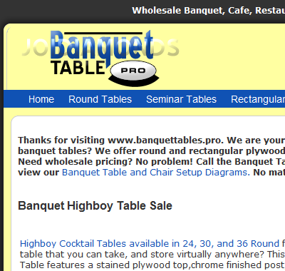
[REQ-LOGO] Hotel and Restaurant Online Furniture Store $250

Type of Contest : Logo
Prize :$250 USD MINIMUM (paypal,check, or CC)
Contest End Date & Time : Sept 7th 1pm
Size Requirements : 100px x 350-550W
Color Requirements : Our Web Colors are #1052b4, and #ffffa1 (#ffffa1 being behind, and around logo)
General Requirements : Our business name is "Banquet Tables Pro" and web address is BanquetTables.pro we want a blend of them both. THE VISITOR MUST REMEMBER THE .PRO
Please visit the site to get a better vision.

Additional Information :
Our Target customer is the hotel, restaurant, and corporate purchasing agent.
 
Last edited:
0
•••
The views expressed on this page by users and staff are their own, not those of NamePros.
removed
 
Last edited:
0
•••
Post Removed by the designer to help protect his intellectual property / copyrights
 
Last edited:
0
•••
1z1gtg5.jpg
 
0
•••
Definitely ditch the concept one.

And the first one, the picture of the table takes over the image. The focus should be on the name. Our name is our brand. "Banquet Tables .Pro"

---------- Post added at 07:09 PM ---------- Previous post was at 07:03 PM ----------


Honestly i cant say anything but no.
 
0
•••
Here is my attempt, feedback appreciated
( i did realize after upload i left off the "s" in tables-sorry)
banq.png


Banquet Flat no outline
banq3.png
 
Last edited:
0
•••
Here's my entry

Feed back will be appriciated...

wdc.im.gif


wdc.gif


Thanx

best regards
 
0
•••
I sent you my entry on PM :)
Please leave a feedback! ;) /for others too/

_______
Haven't read the rules Sorry mod and everybody!
 
Last edited:
0
•••
I sent you my entry on PM :)
Please leave a feedback! ;) /for others too/


No PM's are allowed for contests. AND its a great logo for a surf shop, unfortunately we are not a surf shop.

There should be no "sunshine, daytime theme" Banquets are a night time event for the most part.

Joid, There is an S at the end. We sell to clients looking for "Tables" not A "table" BUT original thought was this has potential. (ok just saw your comment about the S)


UNTIL I saw WD's


WD both of those are on the right track. I myself though of suggesting the one where the pro is picked up by the table (but did not want to suggest it, and receive idiotic responses) The other with the "T" table has potential as well.

The texture/fade style of the letters is not what I want. The black spots in the middle of the letters do not look good. BUT outer edge does look good.


Now that I am not so scared to lose money on something i wont put on my site. I am increasing the minimum prize


Guys YOUR logo is going to be seen by 10's of thousands of people per month. So give it what you've got, or don't post.
 
0
•••
Sounds good! :)
Will enter this one for sure.
 
0
•••
J- said:
Hi, just a couple of quick questions about your current logo contest:

1. Are you looking for a logo that is strictly text based?
2. Do you want a symbol incorporated directly into the text?
3. Do you want text and then a symbol separate from the text?


Response to a PM.

Both of WD's are the style we want
 
0
•••
removed
 
Last edited:
0
•••
J man, thats not going to take the prize.


Put the PRO on a Pedestal,, because in essence. Thats what we do
 
0
•••
0
•••
J man. WD's picture with the pedestal table underneath the .pro is still in the lead.

Now if you can take that idea, and make it come alive, you can win.
 
0
•••
changes done

have a look

feedback will be appriciated
sss.gif

ssss.gif
 
0
•••
Might have a crack at this chap if no one mines. I'll have access to my machine and tools in about 4hrs.

Can you wait that long Alex?

Thanks
Matt
 
0
•••
WD the dot underneath the pro is not a good idea.

Your first picture in this thread is the closest. What I do not like about the first one.

1) The Black that's inside the letters ( but the black on the outer edge looks good)

2) The .pro needs to be bolder (not necessarily literally)

---------- Post added at 05:37 AM ---------- Previous post was at 05:36 AM ----------

Might have a crack at this chap if no one mines. I'll have access to my machine and tools in about 4hrs.

Can you wait that long Alex?

Thanks
Matt

Goes through the 7th unless someone does it before
 
0
•••
have a look

feedback plz..
wdsc.gif
 
Last edited:
0
•••
WD looking better

Couple of ideas

Make the .pro larger and more fuller/dimensional

Try a larger .pro and make a shadow underneath the table
 
Last edited:
0
•••
WD looking better

Couple of ideas

Make the .pro larger and more fuller/dimensional

Try a larger .pro and make a shadow underneath

I will try again with new entry :)
Hope then you will like it ...
But how to put "night" feeling into yellow background and about my idea with the hotel ?
Feedback?
Just to know what to do...
Also I will make some samples and upload them later today!

Maybe something like these:
banquettablespro2copy.png

http://img42.imageshack.us/img42/8613/banquettablespro2copy.png
or
banquettablespro3copy.png

http://img90.imageshack.us/img90/5431/banquettablespro3copy.png
Just in btw. I sent you my 1st entry on pm to avoid stealing my idea :o I will post my future in this thread :)

PS.I will remake it until you like it :o
250bucks :X
 
Last edited:
0
•••
Done

wdscs.gif

have a look now a. exact dimensions and visible look
 
0
•••
0
•••
Not even close Bodil4o. It looks to cartoonish.
 
0
•••
Tell me more about the fonts ?
What do you want them :?
Web 2ish /like they are now/ or something static?

banquettablespro7copy.png

Maybe something like this ?

banquettablespro8copy.png


banquettablespro9copy.png
 
Last edited:
0
•••
Status
Not open for further replies.
  • The sidebar remains visible by scrolling at a speed relative to the page’s height.
Back