NameSilo

[REQ-LOGO] $60.00 for Costume Jewelry Company

Spacemail by SpaceshipSpacemail by Spaceship
Watch
Status
Not open for further replies.
Type of Contest: LOGO Design
Prize: $60 1st prize via Paypal
Contest End Date & Time: 2 February 2012, 9:00 pm paris time
Size Requirements: Vectorized (?)
Color Requirment: Black and white
General Requirements:
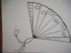
Looking to design a logo for my company, which is called Nuaje. Its is a costume jewelry company I made with my mother. I would like something classical and elegant, without colors (to constrast with the very colorful jewelry we do). I was thinking of a fan for the logo.

Additional Information: Attachements are my ideas (quick draw) : classical letters for the name, fan as a logo. Last image is the kind of jewelry we do to give you an idea ;)
PS: Nuaje in French means cloud !
 

Attachments

  • logo2.png
    logo2.png
    2.8 KB · Views: 97
  • _DSC0004.JPG
    _DSC0004.JPG
    256.4 KB · Views: 85
  • CIMG6582.JPG
    CIMG6582.JPG
    196.8 KB · Views: 75
Last edited:
1
•••
The views expressed on this page by users and staff are their own, not those of NamePros.
AfternicAfternic
Hello all,

No one ? :P
Come on :wave:
 
0
•••
Hi poulet,

The end date is still a while off, so plenty of time. :)
I'll be entering and I'm sure a few others will too. :)
 
0
•••
Nice :loveyou:
Good luck then :snaphappy:
 
0
•••
Hello,

Still no inspiration? :bah:
Come on guys :ghost:
What did I do wrong in my description? :]

Have a nice day :cy:
 
0
•••
I will work on this later tonight and should have something to show you soon.
 
0
•••
logo.jpg


My submission.
 
0
•••
Here are 10 samples I came up with earlier, all vector:

nuaje.png


:tu:

Or white on black...

nuaje-black.png
 
Last edited:
0
•••
my entry

6776225713_00115f2434_z.jpg


any feedback will be appreciated :D
Thanks
 
0
•••
Hello all :tu:

First, I would like to thank all of you for your nice logos :)
They are all very nice in general, but what I am looking here is specific :P

My feedbacks from now :

*****_Smith4842 : I like the draw, but I dont really like it for my website, I prefer 2d effect than 3d for the fan. However, the idea of using the dot on the J can be interesting.
- Maybe you can draw another fan with the same idea.

*****Jed K : From your two fans, I prefer the one on the bottom. (the one divided in 6 parts) It is still for me a little bit heavy (a little bit too black maybe) but I like the combination of the fan and the second writting quite a lot.
-Maybe try other similar styles for the writing and maybe thicker for Nuaje.
-Maybe try to lighten the fan a little bit.
(from now, yours is my favourite)

*****namanda : For me the fan on the left is a little bit too simple and I dont like the 3d aspect on the one on the right (same remark as for Smith4842 ) ;) The idea to put it like a leaf is interesting but maybe here is a little bit too leaf and not fan enough :)
-Maybe you can try more stylized fan (2d)

Thanks to you 3 for posting these, looking forward to any update from you :hehe:
 
0
•••
Hi there,

152g4lw.png


Feedback is much appreciated.

Thanks!
 
0
•••
*****will7 : I like the style of the writting but the fan is too light for me. I dont like the little hole also to end the fan and maybe the outline of the fan is too thick ;)
-Maybe fill the hole and just change the ratios of thickness in your proposition.

:hehe:
 
0
•••
Hi again,

Thanks for the feedback, some revisions:

34i1idi.png


Can add more detail to the fan if you'd like but I'm not sure if it would overcomplicate things; let me know if I'm headed in the right direction.

Thanks!
 
0
•••
REVISION

It's a big file, so I am going to link it:

CLICK HERE

:tu:

Image to text proportions can always be altered.
 
Last edited:
0
•••
*****will7: I prefer with the little ball you added :) and the ratios look better to me in the fan but I still think the logo is too big in comparition with the text.

*****Jed K: I prefer the new fan in black, lighter then the original one. well done :)
Not to look too complicated, could you please change the text with fonts like the first picture I posted because my mother thinks its easier to remember the name of the brand when its not hand writting font, even if I really like some of the ones you added !
 
0
•••
ANOTHER REVISION

Thank you for your feedback. I hope there is something you and your mother like in this batch:

CLICK HERE

:tu:

If that link isn't working, click here.
 
Last edited:
0
•••
More revisions:

i1h00h.png


Tried to work on improving the integration of logo and text.

Thanks!
 
0
•••
*****will7 : I am sorry I dont really like it, even if I like the idea ;)

---------- Post added at 11:57 PM ---------- Previous post was at 10:45 PM ----------

ANOTHER REVISION

Thank you for your feedback. I hope there is something you and your mother like in this batch:

CLICK HERE

:tu:

Very nice things in here :blink:
 
0
•••
If I need a logo, I will come on this thread.
Indeed, very good work from all parcitipants here!
 
0
•••
here another try :D

6779699517_7ed5ba6bae_z.jpg


any feedback will be appreciated

thanks
 
0
•••
Status
Not open for further replies.
Appraise.net
Escrow.com
Spaceship
Rexus Domain
CryptoExchange.com
Domain Recover
CatchDoms
DomainEasy โ€” Zero Commission
DomDB
  • The sidebar remains visible by scrolling at a speed relative to the pageโ€™s height.
Back