


Jonathan Mikalsen
Established Member
- Impact
- 29
-Old post deleted-
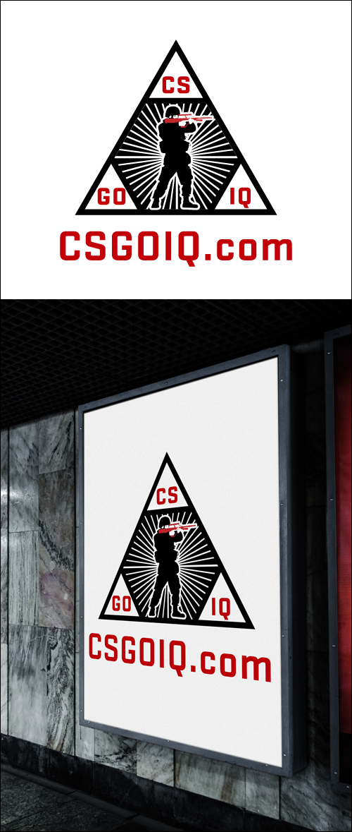
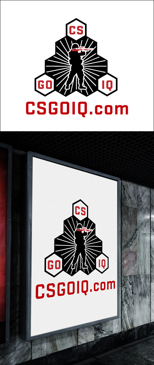
NEW INFO: We apologize for the confusion but the name will be "esportdeal.com".
We want to boost up the price to 80$ to compensate the winner if someone already started on some design for the old name csgoiq.com.
So to clear up:
Logo: esportdeal.com
Colors: black, white, red or blue.
Deadline: 2/26-2016
Size: Vector file
Price: 80$ for winner.
"esportdeal.com" is going to be a webshop that will sell gaming equipment for hardcore gamers that mainly play the games within the esport industry.
The logo has to be catchy and somehow has to appeal to gamers, if possible pro-gamers.
We want kind of a rough design, as it should appeal to gamers as something though and cool rather than nerdy.
So again the logo is "esportdeal.com", try to make it catchy, visualize how it would look on a billboard it should be a good fit there.
PS: It does not HAVE to be a heavy logo, you could also simply make a logo out of the text itself.
Logos that is made of the text itself is often lighter and better to use in marketing.
Thanks
Best regards
Jonathan
Last edited:


")


