ivey Top Member VIP ★★★★★★★★★★ Impact 4,931 100% 50 Feedback Feb 21, 2019 7K views 113 replies #1 closed Last edited: Mar 15, 2019 Click to expand...
ivey Top Member VIP ★★★★★★★★★★ Impact 4,931 100% 50 Feedback Feb 23, 2019 #26 kraman.157 said: Show attachment 110554 Show attachment 110555 Click to expand... That's nice, but it's a common design/template. Click to expand...
kraman.157 said: Show attachment 110554 Show attachment 110555 Click to expand... That's nice, but it's a common design/template.
ivey Top Member VIP ★★★★★★★★★★ Impact 4,931 100% 50 Feedback Feb 23, 2019 #27 galalogo said: The yellow thing is an illustration of mouth. Thanks Show attachment 110586 Click to expand... Creative, but I don't think it fits the theme of the site/brand. Click to expand...
galalogo said: The yellow thing is an illustration of mouth. Thanks Show attachment 110586 Click to expand... Creative, but I don't think it fits the theme of the site/brand.
ivey Top Member VIP ★★★★★★★★★★ Impact 4,931 100% 50 Feedback Feb 23, 2019 #28 Name Manager said: Show attachment 110557 Click to expand... Not strong enough for a brand. Click to expand...
ivey Top Member VIP ★★★★★★★★★★ Impact 4,931 100% 50 Feedback Feb 23, 2019 #29 Name Manager said: Show attachment 110558 Click to expand... You think outside the box with your designs which i what I'm looking for. However, I don't think these are the one's yet. Click to expand...
Name Manager said: Show attachment 110558 Click to expand... You think outside the box with your designs which i what I'm looking for. However, I don't think these are the one's yet.
ivey Top Member VIP ★★★★★★★★★★ Impact 4,931 100% 50 Feedback Feb 23, 2019 #30 logoexpert said: I have attached the png logo for testing the red backing to give it that supreme look Show attachment 110578 Click to expand... Clean design, but seems to have room to develop, like it's missing something. Maybe add a backing on it like the supreme logo? Or a new concept. Click to expand...
logoexpert said: I have attached the png logo for testing the red backing to give it that supreme look Show attachment 110578 Click to expand... Clean design, but seems to have room to develop, like it's missing something. Maybe add a backing on it like the supreme logo? Or a new concept.
ivey Top Member VIP ★★★★★★★★★★ Impact 4,931 100% 50 Feedback Feb 23, 2019 #32 kraman.157 said: Show attachment 110593 Show attachment 110594 Click to expand... Thanks, but Not feeling this one. It doesn't fit the vibes of the brand Click to expand...
kraman.157 said: Show attachment 110593 Show attachment 110594 Click to expand... Thanks, but Not feeling this one. It doesn't fit the vibes of the brand
ivey Top Member VIP ★★★★★★★★★★ Impact 4,931 100% 50 Feedback Feb 23, 2019 #33 Hope to find the one design that just works. Looks good, fits the brand and look and feel of the website. That's why i shared the the site to help with previewing the designs. I confident I'll find a gem!!! Click to expand...
Hope to find the one design that just works. Looks good, fits the brand and look and feel of the website. That's why i shared the the site to help with previewing the designs. I confident I'll find a gem!!!
galalogo Established Member Impact 335 100% 10 Feedback Feb 23, 2019 #35 Logo on site view. Click to expand...
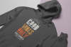
ivey Top Member VIP ★★★★★★★★★★ Impact 4,931 100% 50 Feedback Feb 23, 2019 #37 See the Tshirt on the website that says: good vibes only??? Can someone pull off the lettering/design for the word motivately??? Attachments mockup-of-a-hoodie-lying-over-a-surface-with-two-colors-24257.png 2.7 MB · Views: 63 Click to expand...
See the Tshirt on the website that says: good vibes only??? Can someone pull off the lettering/design for the word motivately???
ivey Top Member VIP ★★★★★★★★★★ Impact 4,931 100% 50 Feedback Feb 24, 2019 #39 galalogo said: Show attachment 110621 Click to expand... Cool, can you put color in 1-2 of the letters or more like how the good vibes logo has those colors Click to expand...
galalogo said: Show attachment 110621 Click to expand... Cool, can you put color in 1-2 of the letters or more like how the good vibes logo has those colors
galalogo Established Member Impact 335 100% 10 Feedback Feb 24, 2019 #40 Color variation. Thanks. Click to expand...
logoexpert Established Member Impact 435 100% 25 Feedback Feb 24, 2019 #41 I made more readable and simple than complex, hope you like it Click to expand...
ivey Top Member VIP ★★★★★★★★★★ Impact 4,931 100% 50 Feedback Feb 24, 2019 #42 galalogo said: Color variation. Thanks. Show attachment 110632 Click to expand... It's on the site, but it doesn't seem to fit right....thnx Click to expand...
galalogo said: Color variation. Thanks. Show attachment 110632 Click to expand... It's on the site, but it doesn't seem to fit right....thnx
jeproox Established Member Impact 25 100% 7 Feedback Feb 24, 2019 #44 deleted Last edited: Feb 24, 2019 Click to expand...
ivey Top Member VIP ★★★★★★★★★★ Impact 4,931 100% 50 Feedback Feb 24, 2019 #46 jeproox said: Show attachment 110642 Show attachment 110643 Show attachment 110644 Click to expand... Thank you! The mockup is on the site...you background is a bit different though. Your representation comes closest to that specific concept. I'd love to see if you have any ideas/concepts in mind that you think would complete this brand and website? Click to expand...
jeproox said: Show attachment 110642 Show attachment 110643 Show attachment 110644 Click to expand... Thank you! The mockup is on the site...you background is a bit different though. Your representation comes closest to that specific concept. I'd love to see if you have any ideas/concepts in mind that you think would complete this brand and website?
Softcreation Established Member ★★★★★★★★★★ Impact 146 100% 8 Feedback Feb 24, 2019 1 point #47 Pl wait for me..I am working on it... Click to expand...
Mylene Delis Established Member Impact 255 100% 14 Feedback Feb 24, 2019 1 point #48 Good day! Here's another try, with variations Click to expand...
jeproox Established Member Impact 25 100% 7 Feedback Feb 24, 2019 #49 thank you for your feedback, this is another concept, feedback appreciated, thanks Click to expand...
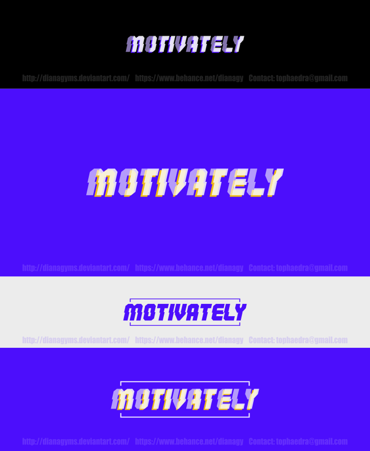
DianaGyms Established Member Impact 133 100% 2 Feedback Feb 24, 2019 1 point #50 Hello, Please, find my concept below.~ Click to expand...


")