


- Impact
- 32
Type of Contest: LOGO design
Prize: $40.00
Contest End Date & Time: May 13, 2017, 9:00 PM GMT
Size Requirements: Various sizes but must look good very small (1 inch x 1 inch) - see details below
Color Requirements: The logo will be used on a book - on the inside pages and on the spine of the book.
General Requirements: The logo is for a publishing company. It should include a graphic and nicely designed text with the name of the company.
Because it will be on the spine (i.e., the outward facing side) of the book, it ideally should be vertical (with the graphic image above and text below) and look good very small (1 inch x 1 inch, with the possibility it will be only 1/2 inch x 1/2 inch in some cases). It’s possible to make it slightly taller than wider (i.e., 1/2 inch wide and 3/4 inch tall).
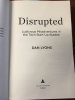
An image of several book spines is attached so you can see logos on them. The same logo will also be used at the bottom of the title page of the book. An example from the book “Disrupted” is attached.
Additional Information: The name of company to use is Blue Pepper Press. I’m thinking the graphic should be of a pepper (either a chili pepper or bell pepper is fine) colored blue, with text in a matching font below. If you choose a chili pepper, take care not to make the pepper look obscene!
Prize: $40.00
Contest End Date & Time: May 13, 2017, 9:00 PM GMT
Size Requirements: Various sizes but must look good very small (1 inch x 1 inch) - see details below
Color Requirements: The logo will be used on a book - on the inside pages and on the spine of the book.
General Requirements: The logo is for a publishing company. It should include a graphic and nicely designed text with the name of the company.
Because it will be on the spine (i.e., the outward facing side) of the book, it ideally should be vertical (with the graphic image above and text below) and look good very small (1 inch x 1 inch, with the possibility it will be only 1/2 inch x 1/2 inch in some cases). It’s possible to make it slightly taller than wider (i.e., 1/2 inch wide and 3/4 inch tall).
An image of several book spines is attached so you can see logos on them. The same logo will also be used at the bottom of the title page of the book. An example from the book “Disrupted” is attached.
Additional Information: The name of company to use is Blue Pepper Press. I’m thinking the graphic should be of a pepper (either a chili pepper or bell pepper is fine) colored blue, with text in a matching font below. If you choose a chili pepper, take care not to make the pepper look obscene!
Attachments

Last edited:


