IT.COM

Logo contest $50 paypal

Spaceship Spaceship
Watch
Status
Not open for further replies.
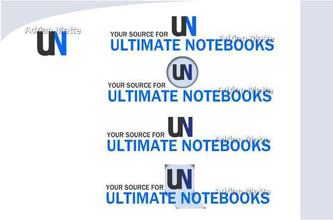
I need a logo for a site called "Ultimate Notebooks." The blue and grey you see on the site @ http://ultimatenotebooks.com would be fine. Size from 300px-650px by 100 to 200 px will be fine. Draw from whatever inspiration you 've got. Contest ends on the 22nd. No pms, just post your best shot here. I'll follow up with those I like. Thanks in advance.
 
0
•••
The views expressed on this page by users and staff are their own, not those of NamePros.
My try. Corporate, recogizeable. Yet vector. Gotta love it!

UN.jpg
 
0
•••
Hi Jeffy, I will be gone until this coming Saturday, August 25. So if you happen to choose my design as the winner, please be patient, as I will PM you as soon as possible if I am the winner!
 
0
•••
here's one for you
ae3d8fc492.jpg

feedback appreciated
 
0
•••
retzseo.... Your UN looks exactly the same as my idea to combine the two letters.
 
0
•••
Jeffy, are you gonna step in any time soon?
 
0
•••
AdrianMatte said:
retzseo.... Your UN looks exactly the same as my idea to combine the two letters.

usage of the "UN" (ALLCAPS) and "un" is crucial on this. If you think I COPIED your idea, well guess what, I didnt. I've been against blatant copying of ideas. Even the great coolwanz sees me in action (protecting contest participants @ DP). So dont think just because my account is new here, it doesnt mean it goes the same with my ethical & legal reasoning.

besides, the company initials couldn't be left avoided. It's a battle between how the "ARTIST" expresses it. Caps vs small? THE SAME? Font? SAME? Color combination. SAME?

You used the CAPITAL UN as your primary icon while I used a smaller variation which in CONCEPT & IDEA to show that un when reversed or flipped 180 it still projects "un" (see figure a)
72dec38b4f.jpg


I'll cut this short, dont want to hijack the thread from the contest holder.
you can check out my folio & some published works @ DP forums and deviant, then tell me if I need some lecturing on IDEAs & concepts. And can we have a look see on your folio too? :rolleyes:
 
0
•••
i will witness for retz, he is what he says, he wouldnt intentionally copy your idea
 
0
•••
Ok, fair enough. Just to clear things up I want to say that I wasn't attacking you or your logo in any way. I always try to clear things up before the end of the contest to prevent long flame threads. I do this even if It's not my logo. I'm not scared of losing or anything, lol. I just thought perhaps you didn't notice mine and I should be the first one to point it out so that nobody gets attacked.

And as a side note, your logo is MUCH better, much like mine would have looked like if I had been using Illustrator. But my HD died a few weeks ago and so Im now stuck using flash for a little while. I know my logo is garbage, lol.
 
0
•••
well in that case, I hope its clear. if i have offended you or anyone else here on this thread. my apologies.
sorry to hear about your HD. Same here I'm just using photoshop.

@simplyg123 - thanks, that's worth more than a hundred reps under my nick ;) highly appreciated
 
0
•••
Big thanks to all the entrants and for the time they put into my logo. I couldnt get online for a bit so my apologies to those who were waiting on me for feedback. Anyway, Ive chosen to go with coolwanz on this one. Sammyloski's i liked as well. i might buy that one as well, so keep hold of it for me. coolwanz, pm your paypal address; thanks.
 
0
•••
0
•••
Congratulations, coolwanz.
 
0
•••
Congrats coolwanz, Jeffy I can hold the design for you, just let me know if you need anything else...

Thanks,
Sammy
 
0
•••
wow, I didn't notice this...

Thank you for choosing my design Jeffy .-)

kudos to the equally excellent job by everyone.

thanks simplyg, ohgar, sammyloski.
 
0
•••
Status
Not open for further replies.
  • The sidebar remains visible by scrolling at a speed relative to the page’s height.
Back