Dynadot — .com Transfer

REQ-LOGO $50 USD paid to the best logo design

SpaceshipSpaceship
Watch
Status
Not open for further replies.

M3B2

Established Member
Impact
46
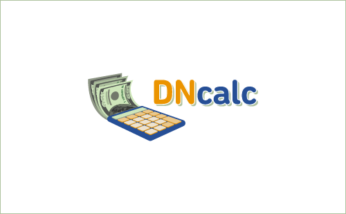
Type of Contest : LOGO Design
Prize : $50.00
Contest End Date & Time : 9.00PM MST : 7th February 2016
Size Requirements : 250px x 100px - Scalable vector and png
Color Requirements : I would like the design to be inline with the present site. View the site here: DNCalc.com - The background MUST be transparent and ideally the use of the colors on the home page and website data pages(orange, blue, green), however, I am open to other color formats.
General Requirements : The site is a website calculator. I would like to have a symbol or two that are relevant to each within the logo if possible. If shouldn’t however look crowded. Ideally it will be clean and corporate. The domain extension is not required within the design(but wouldn't be a downfall if you could include it and have it look nice and professional), but the name MUST be in it.
Additional Information : I will give feedback on every design submitted. Thank you very much for all the submissions ahead of time.
 
2
•••
The views expressed on this page by users and staff are their own, not those of NamePros.
AfternicAfternic
1.jpg

my try
 
2
•••
@shizuo
It is nice. I would have to say that it seems a bit plain. Not that a busy logo is what I am looking for but something a little less sterile would be good.
 
0
•••
Design Proposition:
-------------------------------------------------------------------

qZAUBGG.jpg
 
0
•••
All the best with your project. My offer is withdrawn.
 
Last edited:
0
•••
I was working on your logo for a little bit and came to the conclusion that your logo would look better without the calculator. I think the brand and website makes it obvious what the site is about, so I ditched the calculator completely and focused on custom font design. I made the "DN" orange, to add a little more color to your site (color suggestions welcome). Feedback appreciated, thanks.

Note: Higher resolution when you click the images.


DNC_v9ab.png


DNC_v9b.png


DNC_v9c.png
 
Last edited:
0
•••
@coolwanz
I like it. It seems a little plain though, maybe a different looking logo would work. Not really sure.
 
0
•••
@dotQuantum
I am unsure of this design.. I would have to ask for you to go back to the drawing board. I apologize.
 
0
•••
@NameFu
I really like it, you went your own way and it turned out quite nicely. Was there a reason you used a gradient on the DN?
 
0
•••
@NameFu
I really like it, you went your own way and it turned out quite nicely. Was there a reason you used a gradient on the DN?

Thank you M3B2. The gradient was just to add a little depth and pizazz. It can be removed or you could have 2 versions with and without it, for the freedom of choice if you like. Please let me know if you'd like to explore more colors or graphic modifications.
 
Last edited:
0
•••
Update Below
 
Last edited:
0
•••
DNCAL.png
 
Last edited:
0
•••
dncalc-ex.png


The symbol is a color-coded calculator emitting hundred dollar bills. This creates a direct association in the mind of the user between your website and the worth of their domain.

The type is professional and the round corners give it an informal and friendly aspect. I capitalised the 'DN' and set 'calc' in lowercase to prevent it reading as 'DNC' 'alc'.

The size is as specified: 250 x 100px but can be enlarged to any size. Feedback appreciated.
 
0
•••
My try:

dn logo.jpg

dn.png


Feedback appreciated, thank you!
 
0
•••
In this version, the "Calc" has a font that is in my opinion a little more consistent with the rest of the logo. I've also explored the color green with a website mock-up, that I've created just for this contest. Green is interesting, because it relates to money and site "worth", but I understand if you'd like to stick with blue.

Oh, and I've also dropped the gradient and shadow, so that you can see what this logo is looks like in a simpler form. Higher res on click. Feedback appreciated, thanks.

DNC_v12A.png


DNC_v12C.png


DNC_v12D.png
 
Last edited:
1
•••
0
•••
The symbol is a color-coded calculator emitting hundred dollar bills. This creates a direct association in the mind of the user between your website and the worth of their domain.

The type is professional and the round corners give it an informal and friendly aspect. I capitalised the 'DN' and set 'calc' in lowercase to prevent it reading as 'DNC' 'alc'.

The size is as specified: 250 x 100px but can be enlarged to any size. Feedback appreciated.

I like this one, it makes sense with the calculator and the dollar bills. It is a possibility, could you include the .com to see what it would look like?
 
0
•••
0
•••
In this version, the "Calc" has a font that is in my opinion a little more consistent with the rest of the logo. I've also explored the color green with a website mock-up, that I've created just for this contest. Green is interesting, because it relates to money and site "worth", but I understand if you'd like to stick with blue.

Oh, and I've also dropped the gradient and shadow, so that you can see what this logo is looks like in a simpler form. Higher res on click. Feedback appreciated, thanks.

Show attachment 23156

Show attachment 23157

Show attachment 23161

You have talent my friend. I like your ideas and design, it is surely a front runner.
 
0
•••
ukzjXDD.jpg
 
1
•••
Status
Not open for further replies.
Appraise.net

We're social

Escrow.com
Spaceship
Rexus Domain
CryptoExchange.com
Domain Recover
CatchDoms
DomainEasy — Zero Commission
DomDB
  • The sidebar remains visible by scrolling at a speed relative to the page’s height.
Back