Unstoppable Domains โ€” AI Assistant

[REQ-LOGO] Mixed martial arts themed website logo/banner

SpaceshipSpaceship
Watch
Status
Not open for further replies.

Duende

Account Closed
Impact
2
Type of Contest : Logo / Banner Design
Prize : $75
Contest End Date & Time : Sunday, February 21th, 6 PM PST
Size Requirements : Variable
Color Requirements : I would like the logo to look good on a plain white, grey, or black T-shirt, as this will primarily be a logo for T-Shirts, Business Cards, Letterheads, and so forth. The ability to use it as my banner/logo on my website MMA.BS - is a necessity. The site is being overhauled in two weeks so the logo will be used with the current theme, and a different color scheme to mesh with the logo colors.
General Requirements : Must be related to mixed martial arts and use our name/domain in the logo. Pretty wide-open rules, but I'd like the color scheme to be like you'd see on justhost.com, mmajunkie.com, or alltop.com - I'd like the colors to integrate that awesome blue, and maybe the right orange or red or black to distinguish the '.BS' part. I'm really open to any suggestions as I'd like it to be clean and memorable, and give a good idea that the site is about mixed martial arts 'bs' and chat and news and eventual products. Maybe a chat bubble around the .bs part, I don't know. You guys are the pros! Transparent background is required so I can use it on my website against solid color backgrounds, I suppose.

I will be working with a developer at changing the color scheme of the whole site to wrap it around the logo and make it all cohesive, so unless the current color scheme gives you a great idea, pay no attention to it!

Looking forward to seeing how clever some of you can be and working with you guys! If I left anything out, please let me know! Thanks a ton!

EDIT: We will be changing to the WPSN 2 theme tomorrow or Monday. That will be the theme that the logo will be appearing on. Colors might not change much but we can change colors if necessary for the right logo. Otherwise, if you can make your logo with that theme in mind, PERFECT. Thank you!

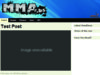
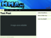
NEW EDIT: I have attached pictures of the theme and header lower in this post!
 
Last edited:
0
•••
The views expressed on this page by users and staff are their own, not those of NamePros.
AfternicAfternic
I'm sorry, no. All I have is this file here specifically of the masthead.
 

Attachments

  • masthead.jpg
    masthead.jpg
    72.8 KB · Views: 73
0
•••
I'll get the logos on the template tomorrow when its uploaded. For now here are 2 more versions, let me know what you think!

mma3.jpg


mma4t.jpg
 
0
•••
I like it, but not so much the placement of the BS. Anyway for the bubble to be coming out from behind the bs so it comes out in an even line and more same size or something?
 
0
•••
I like it, but not so much the placement of the BS. Anyway for the bubble to be coming out from behind the bs so it comes out in an even line and more same size or something?

Sorry, can you rephrase what you wanted done to the .bs bubble? I'm having a hard time trying to understand, sorry!
 
0
•••
Hm, not sure, more justhost.com ish I think. Or just larger, next to the MMA part more than above or below. Maybe a bit above if it works. I just don't like it directly above and that small.

I'm talking about the .bs part of course. I'm probably not being very clear, I'm multitasking! Haha. Thanks!

---------- Post added at 08:41 PM ---------- Previous post was at 08:39 PM ----------

Or if the bubble of the .bs could somehow be overlaid more at the end in a decent position..

---------- Post added at 08:42 PM ---------- Previous post was at 08:41 PM ----------

I am trying to find out but I'm not sure if the theme we upload tomorrow will have anything different, I think the WPSN2 logo will still be there. Not sure how we'll remove that or overlay the new logo, but that's why I'm hiring people to do everything, hah!

---------- Post added at 08:45 PM ---------- Previous post was at 08:42 PM ----------

And it definitely doesn't HAVE to be a bubble around it. A splatter, or something else to really make the .bs part pop, or whatever is clever and works! Just need to really tie it together.
 
0
•••
Heya Duende.

Here ya go:

mmacopy.jpg
 
0
•••
Well hey, you got talent, RU. I like that a lot. Kinda reminds me of Bullshido, who I'll be advertising with. Yours is much cleaner though. Hey I got some really exciting leads generated for this site, I'm glad you're interested.

That's not a total win for me, but it's real close in a cool different way. I'd say about tied really. I like the look, I wonder how it'd look with the PURE and NO positioned even with the left side of the letters they're resting on?

I want to stay away from being too busy, and initially that looked like a lot but picturing it on the theme it'd be recognizable and doesn't seem too overpowering. I'd love to see any variations on that you might have time to offer up, thanks for your time!

---------- Post added at 11:07 PM ---------- Previous post was at 11:04 PM ----------

Actually that's very nice and I like the toughness, I'm trying not to be too 'cute' with the chat bubbles, I just want to get an image that hits the '.bs' part in just the right way. I like that design direction you took.
 
0
•••
Here is a revisiona, with a more professional text style:), also the .bs strikes out

151316034b792cf36aaf2.png
 
0
•••
Okay, thanks to eFingerz on here and at HTMLwebHost.com the site is back up, loaded with the theme the logo will be displayed on.

---------- Post added at 03:55 AM ---------- Previous post was at 03:19 AM ----------

Oliv3r, I like the text on the lower right though the A is a little awkward. I'd like the dot to be placed with the BS, just to reinforce that and not get people typing in mmabs.com. I think having a short name like that, summing up what we're about, is unique and something that should be flaunted. It's a bit of a competitive advantage. I also really like the use of colors in a couple of the other examples.
 
Last edited:
0
•••
Here is another version Duende

151435594b793faf4eafa.png


151440444b7940cca0249.png


151503004b79460428add.png

Greetings
 
Last edited:
0
•••
3 more entries:

mma03e.jpg


mma04.jpg


mma05.jpg
 
0
•••
My Concept - 100% Vector - Feedback Appreciated

MMALogo.jpg
 
0
•••
Thanks for all the submissions.

oliv3r, I like the image in the lower left of yours the most. I'm really liking the use of colors by RU and Minneola in their presentations though - helps solidify the logo against the background. I do appreciate you putting it on the background it'll be going on, that helps a ton!

Minneola, I really like those, I'm not too into the effect being created around the letters though. The bottom one is the one I most like from your entries.

Something I am really like is a little use of colors from RU and Minneola. Especially in RU's entry I liked the white and black and blue and red. Minneola, I love that blue you're using and the silver. My only concern with the blues though I like them is how they'll show up on the background of the page where the logo will be.

Thanks for your entries guys, some real talent in what you can do! J-Man, I'm looking forward to seeing your post but it's not popping up for some reason?
 
0
•••
Ok I've attached it instead of coding it directly into the forum. Can you see it now?
 

Attachments

  • MMA Logo.jpg
    MMA Logo.jpg
    772.7 KB · Views: 49
0
•••
I can see it now. I like it. Not so much the spots on the first M, and I think maybe a little coloring, but that's a real good entry!
 
0
•••
My entry:
mma.png
 
0
•••
Hey loek, I really like the addition of the fist, thought the fist looks a little awkward and I'd like a little color, and a little more work on the font, like a texture or something. Something to give it more of a solid feel.

Thanks!
 
0
•••
Added some color and made some minor changes to the splatter on the first black M

MMALogo-1.jpg
 

Attachments

  • MMA Logo.jpg
    MMA Logo.jpg
    781.8 KB · Views: 43
0
•••
That looks real nice. Maybe the MMA more in white to pop out, something like that?
 
0
•••
My entry...

ogz1hw.jpg


---------- Post added at 12:23 AM ---------- Previous post was at 12:22 AM ----------

Ow sorry. I didnt see this one has a 2nd page. is this still running?
 
0
•••
Status
Not open for further replies.
Dynadot โ€” .com TransferDynadot โ€” .com Transfer
CatchedCatched
Escrow.com
Spaceship
Rexus Domain
CryptoExchange.com
Domain Recover
CatchDoms
DomainEasy โ€” Zero Commission
DomDB
  • The sidebar remains visible by scrolling at a speed relative to the pageโ€™s height.
Back