Unstoppable Domains

[REQ-LOGO] Free Web Host logo required

Spaceship Spaceship
Watch
Status
Not open for further replies.

racsuk

Established Member
Impact
3
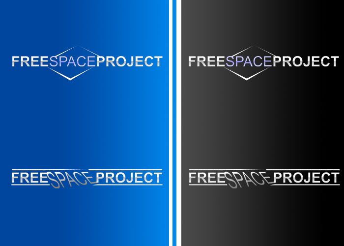
[REQ-LOGO] Web Host Logo - $40

Type of Contest : LOGO Design

Prize : $40.00 via paypal

Contest End Date & Time : 15th July 2011 11pm GMT

Size Requirements : Needs to fit in the red square on the 2 attached images. The height for the second one is 64px (http://community.invisionpower.com/public/style_images/master/logo.png)

Color Requirements : Must be able to fit in with the 2 attached locations, this could be a problem? If so, I may offer $20 more for a modification (2 versions of the same) that fits both. Leaving the color up to yourself.

General Requirements : Would like the logo to contain an image of sorts, or a graphic, with the text "Free Space Project"

Additional Information : No Additional Info. Any questions please ask! Will give feedback every 12 hours! PSD version would be great
 

Attachments

  • fsplogo1.jpg
    fsplogo1.jpg
    108.1 KB · Views: 67
  • fsplogo2.jpg
    fsplogo2.jpg
    141.7 KB · Views: 59
Last edited:
0
•••
The views expressed on this page by users and staff are their own, not those of NamePros.
GoDaddyGoDaddy
here's an idea...thx

fp-1.png
 
0
•••
My ideas:
FreespaceProject.jpg

Thanks
 
0
•••
Wow guys! Already some good ones!

umxca,

I like it, I really do, but I dont think it stands out enough? Integreating the graphic with the text (free graphic space graphic project) might make it stand out more (or it might look terrible, I have no designing bone in my body! :)

nguyen_huy_hai,

Love the first one very much! the integreated graphic I love - One alteration that might make it a little better, not too keen on the top "lines" touching the S and the P, think it would look better if it did not touch like the bottom.

Not too keen on the second logo tho.

Thanks guys! A really good start!
 
0
•••
Thankyou for feedback, here're my revision:
FreePlaceProject.jpg

Thanks!
 
1
•••
thx for the FB...i will work on integrating the graphic into the text. In the meantime here is another idea:

fp-2.png
 
0
•••
nguyen_huy_hai,

Love the second one! The green color is nice and I like the blue just as much :) It all seems to fit in nicely!

umxca,

Nice idea, however, dont really like the font on the "SPACE", and the "P" of project may need a border (slight) to help it seperate from the graphic?

Wow. First day in and already a few good designs! I must remember to use Namepros more often :D
 
0
•••
Hope you like it !

fspt.jpg
 
0
•••
Hello franchise9124,

Very retro! Unfortunately it does not really fit in with the flow of the places I need it. It needs more "flash" I suppose it would be called.
 
0
•••
Ahh how about this one ...

fsp2.jpg


fspi.jpg
 
0
•••
thx here's a revision:

fp-3.png
 
0
•••
Entry removed...
 
Last edited:
0
•••
Hello franchise9124,

The effect on the "Space" makes it look a little more modern, but it still does not seem fit the flow of the webdesigns I need to place the logo in (see the 2 screenshots I attached to my first post). The text (font) is a little too standard/basic, and there is far too much space (The space I imply from the logo, would be disk/web space), also I would very much like a graphic as well as the text.

---------- Post added at 12:27 AM ---------- Previous post was at 12:16 AM ----------

umxca,

Looks amazing on the black, well done indeed! But not as great when scaled down and on the blue, maybe make the bottom edge a little more noticible. But other than that, I think you and nguyen have really got the idea I had in my head! Oh, one other thing; I'm a sucker for making things align, and the fact that the graphic is quite a noticable difference under and above the "E" of "FREE" just bugs me slighly

Neonic,

I love the idea of number 1! Keeping it simple but effective! But it just needs something else to help it stand out a litle further.


EDIT:
I'm seriously impressed so far... If it continues like this I'm going to have a hard time deciding a winner :)
 
0
•••
thx for the FB...here's a revision:

fp-4.png
 
0
•••
Another ideas:
freespaceproject3.jpg

Thanks
 
0
•••
Entry removed...
 
Last edited:
0
•••
here some ideas :
5903799811_227187b51d_z.jpg
 
0
•••
umxca,

Yeah! Much better. I still think its a little higher (just by a few pixels) its more noticeable when scaled down - Sorry as I said, Sucker for alignment. Other than that, quite amazing. The blue stands out a lot more than the last!

nguyen_huy_hai,

The second one could work, but overall I like your last design a lot better :)

Neonic,

I like #4 :) But think the text is a little basic, the changes help it stand out some what, but not as much as I would like :(

dlight,

Top right hand side one looks nice but lacks a true graphic.
 
0
•••
Hi,

fsp.png


---------- Post added at 02:20 PM ---------- Previous post was at 02:01 PM ----------

fsp_01.png
 
0
•••
BlueOrange,

Looks good! Like the first one best. But I see a problem when I try to add that onto the black background in my first attached image :)
 
0
•••
Status
Not open for further replies.
Unstoppable Domains
Domain Recover
DomainEasy โ€” Payment Flexibility
  • The sidebar remains visible by scrolling at a speed relative to the pageโ€™s height.
Back