Unstoppable Domains โ€” Expired Auctions

Please help break the tie

SpaceshipSpaceship
SpaceshipSpaceship
Namecheap AuctionsNamecheap Auctions
Watch

Which logo do you prefer?

  • 1st

    Logo #1

    37 
    votes
    66.1%
  • 2nd

    None of the above

    11 
    votes
    19.6%
  • 3rd

    Logo #2

    votes
    14.3%

Rob Monster

Founder of EpikTop Member
:heavy_check_mark: Epik Founder
Impact
18,367
Need a quick help.

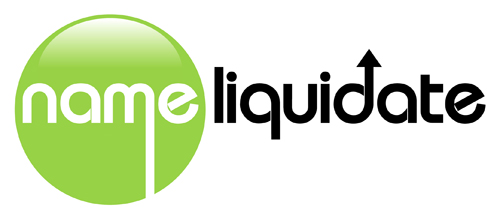
We have an internal dispute at Epik about logo selection for NameLiquidate.com. The boys can't seem to work out amongst themselves and so I get to break the tie with a 24 hour poll. Thanks!

Candidate #1:


NL-1.jpeg


Candidate #2:

NL-2.jpeg
 
•••
The views expressed on this page by users and staff are their own, not those of NamePros.
Unstoppable Domains โ€” AI StorefrontUnstoppable Domains โ€” AI Storefront
Show attachment 149680

Lets honour the heritage :). When I read NL all I think of is .nl :P

LOL.

Thanks for the creative inspiration!

For those not aware, NameDeck is Dutch, as am I.

The Dutch like to say things like:

"If it ain't Dutch, it ain't much".

OR

"God created earth but the Dutch created Holland".

:)

I don't say such things personally but I know the mindset!
 
5
•••
Number 1 is boring

Number 2 has better colors and is more lively.

I would pick Number 2 if the font was tweaked to a better font
 
2
•••
I prefer clean slick logos. Obviously it always depends on your target audience.

If you want to get away from a single letter logo for fear of not being unique enough, then add a little line at the bottom to get a NL effect. (Obviously clean up and resize my edit a bit if you keep it)


NameLiquidateLogo2.jpg
 
8
•••
I prefer clean slick logos. Obviously it always depends on your target audience.

If you want to get away from a single letter logo for fear of not being unique enough, then add a little line at the bottom to get a NL effect. (Obviously clean up and resize my edit a bit if you keep it)


Show attachment 149722

That's a cool tweak of the idea. @DanSanchez as the PM and @Ala Dadan should take note.
 
3
•••
my vote goes to no.1
 
3
•••
My vote goes to Durfers.. that is an amazing NL combination and the colors are rocking.. Did you design that tonight?

I thought #2 was appealing for NameLiquidate because:

a) the colors looked similar to GoDaddy.. what better way to celebrate converting their expiry gobbling into something that would benefit domainers.. their loss would become the domain industry's gain.. so colors for transmutation of that energy and redirection were ironic.

b) the plumbing Rob mentioned was clever... the name effectively having the dropping line while the liquidate had the symbol for escalation or raising.

c) Durfer rocks.
 
3
•••
I voted for number 1
 
3
•••
#1
 
3
•••
I prefer logo 1 it's simple and clean. Logo 2 has a little too much going on. IMO
 
4
•••
I said none of the two. I believe better logo can be designed than these two.
 
4
•••
Someone just bought a very good domain in .com which does effectively the same thing

I saw it in namebio a coulke of days ago

The domain is

Cash 4 url

Which looks like it migt be a a pawnbroker type service which would also liquidate domain names
 
2
•••
Glad I voted for #1 - Looks like that is the one that made it live :)
 
2
•••
My vote goes to Durfers.. that is an amazing NL combination and the colors are rocking.. Did you design that tonight?

I thought #2 was appealing for NameLiquidate because:

a) the colors looked similar to GoDaddy.. what better way to celebrate converting their expiry gobbling into something that would benefit domainers.. their loss would become the domain industry's gain.. so colors for transmutation of that energy and redirection were ironic.

b) the plumbing Rob mentioned was clever... the name effectively having the dropping line while the liquidate had the symbol for escalation or raising.

c) Durfer rocks.
no just an image i found, ty.
 
0
•••
#1
 
4
•••
Im too late to vote, but #1 is much better.
 
1
•••
Need a quick help.

We have an internal dispute at Epik about logo selection for NameLiquidate.com. The boys can't seem to work out amongst themselves and so I get to break the tie with a 24 hour poll. Thanks!
Sure thing! Happy to help.

In that case, why not gather everyone's input and preferences, and then set up a 24-hour poll to decide on the logo for NameLiquidate.com? This way, everyone gets a say, and the decision-making process becomes more inclusive. Good luck with the logo selection!
 
2
•••
Sure thing! Happy to help.

In that case, why not gather everyone's input and preferences, and then set up a 24-hour poll to decide on the logo for NameLiquidate.com? This way, everyone gets a say, and the decision-making process becomes more inclusive. Good luck with the logo selection!
You are 3 years late on your response :xf.laugh:
 
13
•••
Appraise.net
Escrow.com
Spaceship
Domain Recover
CryptoExchange.com
Catchy
URLs.com
NameFit
  • The sidebar remains visible by scrolling at a speed relative to the pageโ€™s height.
Back