Domain Empire

REQ-LOGO $100 Herbal Medicine Logo

NameSilo
Watch
Status
Not open for further replies.
Professional logo required for herbal medicine / alternative medicine / herbs information website. The logo may also be used for business cards. So I need something that looks simple but has an intelligent logo concept. :)

The main logo should read: Herb, H, or HERBsc (herb and sc as an abbreviation for "source", has to be clearly 2 separate bodies, for example the WebMD logo). Would love a custom icon that includes a leaf, or a small plant, or the Yin and Yang symbol.

The slogan at the moment is: The Herb Source or Herb Source or "Your Source for Everything HERB". You may or may not include any of this.

Colour requirement: I like green with grey, green gradient, burgundy, etc. But you're driving the car here so I will let you decide!

End time and date: 9th December, 2016 at 5pm (+8GMT)

Size Requirements: Wide. It will take up a space at the corner of the website but the files will need to be large enough and sized down.

File requirement after winning: please submit the winning design in .psd, .png (transparent bg)

Prize: 100 USD, payment via PayPal (may be able to offer other methods e.g. WU, Alipay, Wechat).

I don't know if I missed anything but feel free to ask me questions. I will come by often to check the thread and to revert with feedback.

Thank you all in advance for your participation!
 
Last edited:
2
•••
The views expressed on this page by users and staff are their own, not those of NamePros.
1HERBsc1.png
 
1
•••
Thanks for your submission. The lighter green is definitely the way to go in terms of green colour scheme, it has a modern look to it. I feel that the chosen font is a bit illegible, e.g. the "e" and the "s". But I like how the r somewhat connects to the b, the top of the b can even be transformed into a plant.

Good direction, but can be developed a bit more in terms of corporate identity.

Thanks!
 
2
•••
Will have an Anstey soon. good luck.
 
1
•••
Logo idea. Hope I'm on track. Good luck
herbsc.jpg
 
2
•••
1
•••
here's my revision. Hope you like it. Good luck
herbsc1.jpg
 
1
•••
2
•••
Hope you like my proposal. Thanks
HerbSC-01.png
 
2
•••
Thank you to everyone who have already submitted designs, I will wait for a few more until I submit more feedback.

I want to add that there should be emphasis placed on the logo concept more than anything else, I want the logo to be original and unique in a way that as soon as you see it, you can identify the brand or website.

Please do not design 100% according to my feedback and description with very little input from yourself. The concept should come from you, after all, that is why I need the help of a logo designer.

Additionally, anyone who wants to include a modified Yin and Yang inspired symbol, please note that the symbol requires half to be of the same colour as the small circle that is located on the other half. Part of the meaning is that they are opposites but they are intertwined. :)

Would love to see some of the other members' designs.

BTW as for the colors I mean green OR burgundy, not green AND burgundy, heheh...sorry I wasn't too clear on that before.
 
2
•••
HerbSC2-01.png
Here is my second proposal. Thanks
 
Last edited:
0
•••
1
•••
Logo Design Proposition:
------------------------------------------------------------------------
xDIhwg9.jpg
 
2
•••
1
•••
Very impressed with the designs guys, keep it up.
 
0
•••
Logo Design Proposition:
------------------------------------------------------------------------
xDIhwg9.jpg
Your logo captured the Yin and Yang symbol almost to the T, it looks really good. But I'm not too keen on the colour and fonts used.
 
0
•••
0
•••
0
•••
Revision / update:
---------------------------------------------------------------------------
iT4vWLO.jpg
 
1
•••
Here's another approach. Hope you like it. Good luck
herbsc5.jpg
herbsc4.jpg
her.jpg
 
Last edited:
0
•••
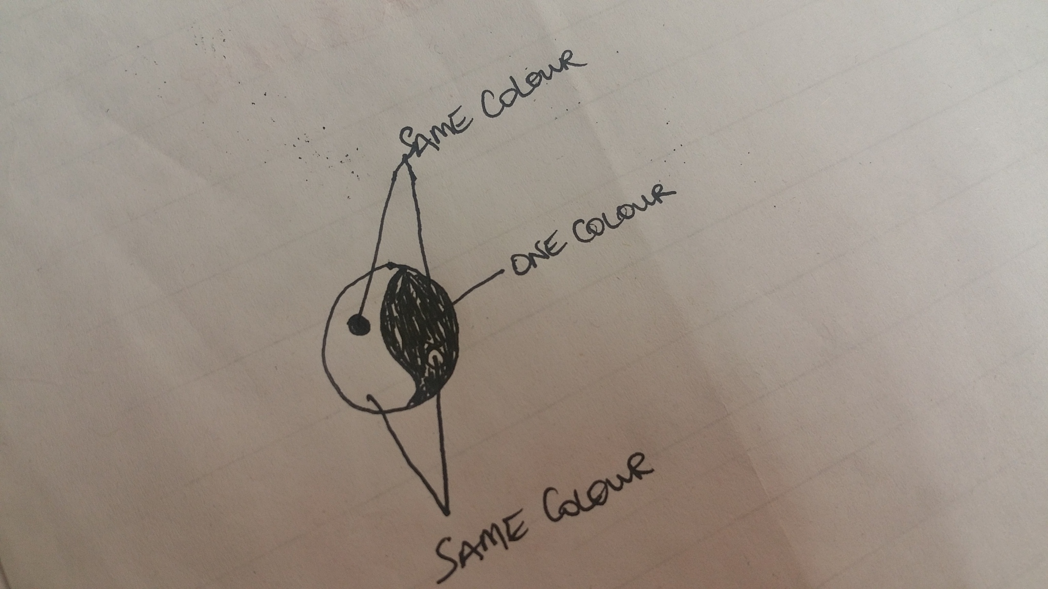
I am really impressed with the designs submitted so far. But those who have chosen to use the Yin and Yang route, I have attached a small diagram of what the colour distribution should be.

61506_90e25ce5c9f58151a0aff02485886e5b.jpg


Because the Yin and Yang explains a lot about balance, one of the small balls inside one half should be the fill-colour of the opposite half.

I'm sorry I had to add this, I don't mean to discourage anyone. I really love what I'm seeing it's already difficult for me to choose which one I love the most because they're all very impressive.

blairwitchii, love the designs.
 

Attachments

  • 20161202_143010.jpg
    20161202_143010.jpg
    651.7 KB · Views: 27
Last edited:
1
•••
Revision/update:
-------------------------------------------------------------------------
hfnTIbg.jpg
 
0
•••
Wait, I think you misunderstood me. I didn't say everything must be in the same uniform colour.

What I was trying to explain that for the Yin Yang symbol, there is the left side and the right side. Each side has a small circle inside.

The colour of the right side has to be the same colour as the small left circle, and the colour of the left side has to be the same colour as the small right circle.
 
2
•••
3
•••
Revision / update (3a):
--------------------------------------------------------------
GziVW3F.jpg
 
0
•••
Status
Not open for further replies.
  • The sidebar remains visible by scrolling at a speed relative to the page’s height.
Back