Dynadot

Review my site

Spaceship Spaceship
Watch
Impact
83
Hi Folks-

Please move this to it's appropriate spot if incorrectly created here.

So, after many years of pondering, I along with several dedicated IT professionals have decided to start our own Web Hosting Business. I would like to gain your feedback on our website.

Please review on the following:

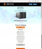
- Look and Feel of the website
- Service / Price Offerings
- The domain / company name chosen

Be honest, we will take your suggestions to heart and improve where necessary.

Thank you!

linked
 
•••
The views expressed on this page by users and staff are their own, not those of NamePros.
I had a quick look, the site is overall OK.
+1 for using a brandable.

But you have only one hosting plan @$2/month ? it's not going to be profitable for you. While it's cheap it doesn't sound like professional hosting. People know they will get what they pay for.
They would certainly like to have at least a few options to choose from.

2GB Disk Space is very tiny, the OS alone has to weigh nearly that.
20GB Bandwidth is not much, many sites have more traffic than that on a monthly basis, even when they are only visited by bots.

But here it is written:
You get 5GB SSD storage (Hardware RAID-10 w/BBU).
You get 50GB monthly bandwidth

I'm not sure we are talking about the same hosting plan, but there is a discrepancy between pages.
These days you can get a VPS with a least one dedicated IP address for little money.
 
2
•••
Thank you.
The reason for the single plan is to differentiate ourselves from other companies. Every company offer multiple plans. With our plan, you can stack on a plan when you need. No need to pay extra for something you don't need right now. That was the idea behind the single plan.

This is targeted at those that want to get a website up and running. Never had a website before. Want to run a blog or something similar and be able to do it at an affordable price.

Need to correct some typos, thanks.
 
1
•••
0
•••
Thank you everyone for the great comments. I'm making some drastic changes as we speak. So let's hope it's a better experience
 
0
•••
Clean and relevent, and I like the simple graphics. Not too flashy. The "order now" section clearly gives the different pricing. I like the way you've broken up the domain reg's page into little drop-down sections.

Just a note: when you click on either "order now" or "client area", you are stuck leave the sub-domain clients.anurva.com. For example, once there, if you try to click "home" or even your main logo, it stays on the sub-domain.

Overall, nice job!
 
0
•••
The site has been updated to reflected some suggestions.
 
0
•••
it looks terrible on my iphone. All is squished, help needed.lol
Above the fold is just header, then a group of people, that i dont see on laptop.
Is it mobile friendly ( responsive)?
 
0
•••
yes mobile friendly. please reload. strange.
you're seeing the old site for some reason.
 
0
•••
Looks pretty good. A few layout errors on my desktop, W 10 I.E. Edge. When I resize my browser, the page doesn't resize correctly. I've attached screen shots.

In your next iteration, you might add a message for your target audience.

"Easy, Secure Wordpress installation in One Click"
"Simple Secure application hosting for Entrepreneurs"

Quotes from happy customers or a statement about your commitment to support would help.

I hope your venture is a success!
 

Attachments

  • snip1.jpg
    snip1.jpg
    144.4 KB · Views: 30
  • snip2.jpg
    snip2.jpg
    243.5 KB · Views: 34
Last edited:
0
•••
Snip1, i don't know how you're getting that on your desktop. That's a mobile/tablet view.
 
0
•••
0
•••
0
•••
I was going to suggest offer 3 plans, but I see your doing that. Also I think these days it would make sense to offer hosting that includes a wysiwyg site builder.
At a glance Site looks nice on mobile imo.
 
Last edited:
0
•••
I see the same appearence problems that mr-x mentionned when I use IE or Firefox. It only looks good on Chrome.
 
0
•••
0
•••
I.E. Edge, full screen and resized.
 

Attachments

  • snip1.jpg
    snip1.jpg
    290.9 KB · Views: 34
  • snip2.jpg
    snip2.jpg
    102 KB · Views: 31
0
•••
I see the issue in IE. Strange. let me take a look.
 
0
•••
Mr-x snip2 is fine, correct?
 
0
•••
0
•••
1
•••
Looks awesome on mobile
Good job
 
0
•••
The Header Nav is atrocious, the Logo and Company Font is fine. The following Nav links are barley legible and those god aweful rectangle buttons should be Ghost Butons with round corners. The sky blue bground is atrocious. There are pipes 'I' misising, the Header Nav Menu should read like this;

Home I About Us I Features I Contact Us

Regards.matt
 
0
•••
  • The sidebar remains visible by scrolling at a speed relative to the page’s height.
Back