IT.COM

[REQ-LOGO] adEx - Stands for "advertisement express" [ $25 ]

Spaceship Spaceship
Watch
Status
Not open for further replies.
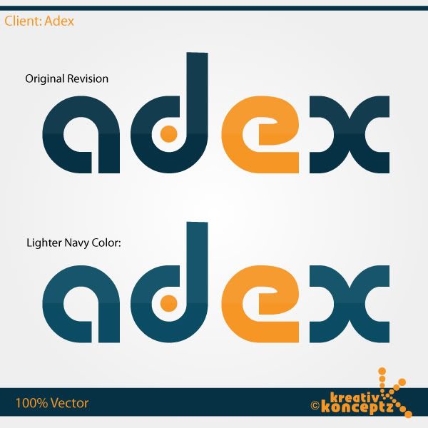
Name: adEx / adEx.net
Type of Contest: Logo Design
Prize: $25
Contest End Date & Time: 18:00 (PST) 27th October 2010
Size Requirements: Vector Logo
Color Requirements: Prefer Orange + Gray / but open to other colors as well

General Requirements : This logo will be for an advertising site. Looking for something google, ebay like in resemblance, but has to be unique and not a copycat!

Other Requirements / Bonus: Will pay additional $5 if you redesign my own original logo in Vector size

Payment Method: via PayPal

Original logo Provided below! Created in MS Paint :)

cheers,

adex02.png
 
0
•••
The views expressed on this page by users and staff are their own, not those of NamePros.
Important Notice

Even though the Design Contest is over and a winner has been announced and paid already; my partner wants to purchase a design by J-MAN.

The debate has been going on for a few hours now between my partner and I; over which design we will be using.

So therefore we decided to buy 2 designs, so we can figure this out in due time:

1. dlight / original winner of the competition
2. J-MAN / after the design is fixed to my partners liking

----- J-MAN Details Redesign log Instructions -----

We need you to design 2 of the same Design as seen below, but with these following changes:

1. Change the top of the letter "d" ((exactly as shown in the below logo)
2. Change the tail of the letter "e" (exactly as shown in the below logo)
3. Make the letter "x", equal in sides(exactly as shown in the below logo)

the 2nd logo is all the same as above, except a little change in color.

*make the Navy color a little brighter but with the same 2 color combo effect as your original!

Will pay $30 Canadian for both designs in Vector Format.

note: same design as the Redesign below


cheers,

adex-logo-navy-details.png
 
0
•••
0
•••
J-MAN

The Original Revision looks good; except the top of the letter "d"; you need to smooth it out!

The lighter Navy color design is no good in my opinion; looks more like dark blue too me.

Try to use the upper color part of the Original Revision for the bottom of the second design, and use a few shades lighter color for the top half (no bluish look please).

I do not know exactly how designs work. We are going to use the design on a white site, so I was wondering if this design is transparent; if not then the background has to be white and not grey.

Talk to you soon and keep up the good work!


cheers,
 
0
•••
The Original Revision looks good; except the top of the letter "d"; you need to smooth it out!

My apologies, that was an oversight on my part.

The background is transparent, I just put it on a faint background to give it a bit of a different look. As you can see, I've eliminated the background element.

Let me know what you think of it now!
Thanks

Concept3_1-1.jpg
 
Last edited:
0
•••
Hi J-MAN

Looks good now, pm me your paypal info so I can send your funds.

I am not very computer savvy guys, but I know a little about photoshop and ms paint / lol

Could you tell me what the best Vector Format is; if I wanna be able to play around with it in Photoshop myself?

Please have both designs in Vector Format; which is under thread / comment #29.

After you receive your funds you can send me a pm and I will reply and include my email address.

I might have to take out the dot in the letter "d", if it is going to be an issue with the British Columbia Lottery Corporation. Need to ask our Trademark agent regarding that.

My Partner and I are still debating over which design to be using on our site / lol.

He and I appreciate your help and would like to thank you for your effort on this design.

cheers,

---------- Post added at 06:05 AM ---------- Previous post was at 05:01 AM ----------

dlight

I received all the files and left you a feedback!

Thanks for going out of your way!

Will definitely work with you again!


cheers,
 
Last edited:
0
•••
J-MAN

Payment has been made!

You'll be also recommended!

You and dlight will get more business from us down the road.

All the best to you guys, and good luck in your other contests.

I will leave J-MAN a feedback; once I receive the files today!

P.s please do the same for me


cheers,
 
1
•••
Design has been received and feedback has been made.

cheers,
 
0
•••
Payment received, files sent, positive feedback left! Great CH thanks :tu:
 
0
•••
Status
Not open for further replies.
  • The sidebar remains visible by scrolling at a speed relative to the page’s height.
Back