IT.COM

Logo Design for DJ and Producer $40

Spaceship Spaceship
Watch
Status
Not open for further replies.

KeyMethod

New Member
Impact
2
Hi,
I'm an up and coming House Music producer, and DJ from San Francisco, California. I just recently changed my name so I need a new logo for my Facebook page, pictures and future releases of my songs, and also for party promoters to put on flyers. Logo is really critical for my job.
I have $40 price in mind that I will paypall the winner.
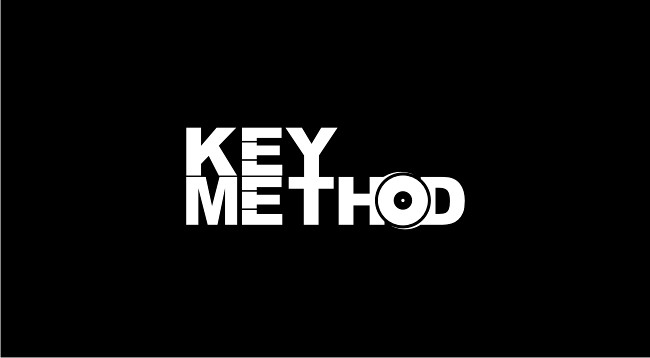
My name is Key Method as Key for piano keys not actual keys for locks, so that's something to keep in mind. If you're gonna use piano keys in the design please don't just write Key Method and put a bunch of piano keys on the top. In the case of using piano keys I'd really appreciate a genius incorporation of them.

I want it in a dark color scheme, maybe white and black but I'd also need a light color scheme since some flyers have dark backgrounds and black logo won't work on them. But for me the logo itself and the sign used in it is the important part since I'm not a website like Yahoo that has a color theme.

To get an idea about logo designs in my industry you can google logos of artists such as Tiesto, Zedd, and Wolfgang Gartner. I really like their logos.
Private message me if you need a link to my music, if you think that'll help you.

Please make it really amazing, than you!
 
0
•••
The views expressed on this page by users and staff are their own, not those of NamePros.
Please update your thread with a contest end date within 10 days of the start date as per the rules.

Thanks,

Eric lyon
 
0
•••
kindly include contest end date.

---------- Post added at 12:09 PM ---------- Previous post was at 12:00 PM ----------

just an initial try
dj_2_copy.jpg
 
0
•••
Please update your thread with a contest end date within 10 days of the start date as per the rules.

Thanks,

Eric lyon

December 22
 
1
•••
feedback on my design please
 
0
•••
Amin Khatiri: Nice work. I don't really like the font that much. I'm more fan of skinny, and a little funky letters, but not too skinny and funky. Also, the logo signs such as the equalizer you used which was a wise move should be incorporated within the writing itself so they'd be in one line, both the design and the writing part of the logo. For example, the equalizer could be in the back instead of being a separate entity, but don't feel like it must be in the back. Front, corner, anything that you think works better as long as they are one entity, not separated from each other. I understand this was an initial entry though.

---------- Post added at 10:54 AM ---------- Previous post was at 10:52 AM ----------

one thing I forgot to mention for the future entries, please don't use cliche DJ symbols like the headphone or the turntables, also the hanging wire. Thanks in advance.
 
0
•••
incorporated equalizer into text..
dj_2_copy.jpg


---------- Post added at 12:56 AM ---------- Previous post was at 12:35 AM ----------

key_copy.jpg
 
0
•••
Amin, I like the last one in terms of font and colors, but i'm not so sure about the puzzle piece. But we're getting close. :)
 
0
•••
0
•••
my idea with
any feedback will be great :D thanks

8270190745_a05051af61_b.jpg
 
0
•••
Amin, This is great. Can you make it a regular circle without the small triangles and bring a KM in the circle with the piano keys?
The piano keys are great, but there's one thing. In piano there's a patter of the the black keys. There's 2 then a space then 3 black keys, then a space and then again 2 keys and the patter just repeats itself. It'll be great if you make it like that. if you google a picture of a piano you'll get what I'm saying with the keys.
and the keys will stay where they are but the KM will go under it, so parts the left part of the M will be covered by the keys but it'll still be obvious that it's an M

---------- Post added at 03:51 PM ---------- Previous post was at 03:48 PM ----------

Namanda, I like your Idea with E's and the piano keys. Very Clever.
It'll be really hard to choose.
 
0
•••
0
•••
Namanda, again, the design with the vinyl and piano is super clever and on point. Do you think it'd work with a different font? Something more exclusive? Doesn't have to be anything super crazy.
 
0
•••
Design Proposition Key Method:

keymethod.jpg


Kindest Regards..
 
1
•••
0
•••
Amazing work guys. Super Amazing.
I'm loving both Amin, and Namanda's designs.
Namanda's concept is amazing very representative, and Amin worked really had to make it what I wanted out of his concept.
It's really hard for me to choose between them. And I want both of you guys to be paid, and again I'm loving both of them.
So I wanna propose an option: If you guys, Amin and Namanda both agree, I want to choose both of you as winners and pay each of you $20 for the both of the logos.
But you guys have to both agree on it. Otherwise, I will be forced to choose between you guys and only one of you guys will be paid.
So, if you agree with splitting the price just simply reply agree, if you don't agree then still tell me that you don't. In that case I will choose one winner.

Thanks again guys. :)
 
0
•••
1
•••
Unfortunately I can't do the split one anymore. My manager is insisting that I choose coolwanz's design.
Namanda: very nice concept, too bad it didn't work out.
Amin: Thanks for your effort man! I will paypal you a small amount of money just for the time you spend on this today. please message me your paypal information.
The winner is Coolwanz. Please private message, there're some small revisions I need you to make and then we'll be all set for the transfer.
 
1
•••
Congrats on the win Coolwanz
-------------------------------------

Please remember to update this thread once files / payment have been confirmed so that we can close the contest thread.

Thanks,

Eric Lyon
 
0
•••
Thanks KM.
this was unexpected..

Kudos to amin and namanda.

Thanks Eric.
I'll certainly update the thread.
 
Last edited:
0
•••
0
•••
Kudos - an expression of appreciation and commendation. :)
 
1
•••
Payment Received.
Files Sent.
Kindest Regards..
 
2
•••
Status
Not open for further replies.
  • The sidebar remains visible by scrolling at a speed relative to the page’s height.
Back