Dynadot

[req-header]

Spaceship Spaceship
Watch
Status
Not open for further replies.
[req-header] Boxing site

Type of Contest : Header
Prize : $40 via paypal
Contest End Date & Time : Oct. 30th at 10pm EST
Size Requirements : Vector preferred, 880x150
Color Requirements : Forum colors are black/grey, so nothing that would clash.

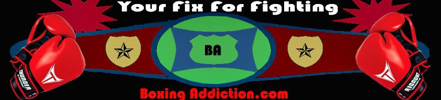
General Requirements : Looking for each end of the header to be flanked with a boxing glove (red) & the center to be a title belt. On the belt if you can use the initials “BA” that would be nice. The background of the header should be black. I'm looking for a real pictures of a belt & gloves in the header.


Additional Information : Boxing<<>> Addiction (dot) com should be in the header with the tag line, “Your fix for fighting”

You can integrate any related images into the background (but please keep them from being the focal point, i.e background shadows etc.) Source file will be needed.
 
Last edited:
0
•••
The views expressed on this page by users and staff are their own, not those of NamePros.
here my entry.....

BoxingAddiction.jpg


FeedBack..please..!!
 
1
•••
@ logoholik I'm looking for an actual belt in the center, not a representation of one. The logos on the gloves & the namebrand need to be removed. The site name should be at the top & in a a different font if possible. Overall I'm not feeling this one as of yet. Thanks for the submission.
 
0
•••
revised
 
Last edited:
1
•••
@J-man Yes I'm looking for a real belt in the center. I'd like to have the site name in the top center maybe in an arc over the center of the title belt. The gloves are a little small.
The title belt does not have to be stretched out, I'd rather see it closed & just showing the front of the belt.
 
0
•••
here's a lil something let me know if you want any changes before i continue
boxingoz5.png
 
1
•••
@crimeproductions I'm looking for a real title belt in the center & I'm not a big fan of the cartoon arms/gloves. It's difficult to read the title of the site & the tag line is missing.

I'm looking for more photorealistic quality in a design.
 
0
•••
1
•••
0
•••
Very nice ohgar that looks cool.
 
0
•••
@Poter Nice! The font is a bit boring, & I don't really care for the reflection, if you could switch the gloves (as the left & right are on the opposite sides). Also with the "BA" in the center it stands out as there is no highlight on the letters. could you make the letters look like they were diamonds or outlined in diamonds?

@Ohgar boy Very Nice! Could you shrink the font a little to show a bit more of the belt? Also move the tag line below the site name (drop the comma). If you could put a pair of gloves on the left side like they are hanging from a hook?

These both are definitely the top two contenders
 
0
•••
my try !

here is:
boxcw8.png

svg format
:hi:
edit:
here is the ver2 !! :)
boxv2xn9.png


update:oo sorry !
[i don't like work with real-photos, ohgar_boy rocks on that !!! ]
 
Last edited:
1
•••
@wmcode I'm looking for more of a photo realistic quality, an actual belt & gloves in the header.
 
0
•••
Quite a bit of a revision...

boxaddict2lz5.jpg
 
0
•••
0
•••
revised
 
Last edited:
0
•••
@ohgar I'm diggin the revision, is there a possibility of making the gloves a bit more distinguishable?

@Poter the big reflection/highlight in the belt still makes it look like the "BA" is just slapped over it, can it be blended to look like it's part of the belt. Font color is better not a fan of it slanted text on each side.

@J-man Not digging the font, nice touch with the ring in the back right. the letters "BA" don't look like they are part of the belt.

Just a kudos to all thus far there has been some great work submitted!
 
0
•••
0
•••
revised
 
Last edited:
0
•••
@Poter I'm still not diggin that big reflection on the center of the belt.

@j-man the second of your submissions today is better, I don't like the explosion, you can drop the exclamation on the tag line, the font color is not working for me. the "BA" is better
 
0
•••
Revised entry, not sure what colors you like, if you still don't like them, jus let me know!

boxingaddiction3xc7.jpg


boxingaddiction3bk4.jpg
 
Last edited:
0
•••
Slight Revision:
boxingaddictionrevisionmo5.jpg


In comparison to the old one:

boxaddict2lz5.jpg
 
Last edited:
0
•••
...Thanks...

Thanks For The Feedback!
I am currently at work right now and not really looking like I will have
a chance to get a revision in before the contest closes...All the best
to the rest of the entrants...!

Thanks,
- tysonjb -
 
Last edited:
0
•••
@Ohgar Clearly in the lead with the revision

@tyson good effort, I think I could knock out that boxer on the right, I like the site font/design/colors. The gloves on the ground on the left are not knocking me out.
 
0
•••
~removed
 
Last edited:
0
•••
Status
Not open for further replies.
  • The sidebar remains visible by scrolling at a speed relative to the page’s height.
Back