- Impact
- 1
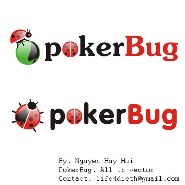
Type of Contest : LOGO Design
Prize : $25.00 paid via PayPal - note that there are additional optional/preferred requirements for the winner that I'd like to offer a combination of domains (discussed below)
Contest End Date & Time : Monday, Feb. 14, 2011 5pm EPT (Noon GMT)
Size Requirements : To be used on: Website, Business Cards, Website Banners, Printed Posters, etc
Color Requirements :Open, but I would prefer it blend well if the site is "Poker Felt Green or that Maroon felt sometimes used" background. Needs to go well on White cardstock as well so prefer to be transparent background
General Requirements :
Additional Information : I would like at least the jpg and png. Also, I didn't see it in the DC forum thread rules, but I need to retain all rights to the image and copyrights - please don't submit if you don't agree.
Now let's see what you can come up with!
Thanks,
Clay
Prize : $25.00 paid via PayPal - note that there are additional optional/preferred requirements for the winner that I'd like to offer a combination of domains (discussed below)
Contest End Date & Time : Monday, Feb. 14, 2011 5pm EPT (Noon GMT)
Size Requirements : To be used on: Website, Business Cards, Website Banners, Printed Posters, etc
Color Requirements :Open, but I would prefer it blend well if the site is "Poker Felt Green or that Maroon felt sometimes used" background. Needs to go well on White cardstock as well so prefer to be transparent background
General Requirements :
- As the name suggests it is going to be for Poker (catch the poker bug or something like that) so it needs to have a gambling/betting feel - can incorporate cards, chips(possibly on the O,G or dot com), etc - no people.
- I am not set on this, but I think I want the Poker and Bug and .com included with maybe different colors or possibly same colors for poker and com.
- Here is the optional part mentioned above in the payment... If possible, I would REALLY like for the words to have little "poker bugs" crawling on/around them - the poker bugs would be the 4 suits (Clubs, Diamonds, Hearts, Spades) made to look like little poker bugs (maybe legs/eyes or whatever you can come up with, but they need to be fairly small. NOTE-these may be hard to create and not look like you are ripping each other off so if you want to submit those separately we'll have to ask the mod if that is ok. If anyone can come up with an acceptable version of these that are also stand alone(one for each suit) and transparent so I can use them for buttons and other stuff on the site I will also offer these 30 domains (all have about 5 months left):
CANCER-DOCTOR.COM
CARCINOMASKINCANCER.COM
CANCERSKIN.US
LEUKEMIACANCER.US
LYMPHNODECANCER.US
SPINECANCER.US
BASALCELLSKINCANCER.INFO
BASALSKINCANCER.INFO
CANCERDOCTORS.INFO
CANCERRADIATION.INFO
CARCINOMACANCER.INFO
CARCINOMASKINCANCER.INFO
CHILDRENCANCER.INFO
DERMATOLOGYDOCTORS.INFO
DERMATOLOGYSCHOOLS.INFO
FREESKINCANCERSCREENING.INFO
MELANOMARESEARCH.INFO
MELANOMASYMPTOMS.INFO
SARCOMACANCER.INFO
SKINCANCERPREVENTION.INFO
SKINCANCERRESEARCH.INFO
SKINCANCERTREATMENTS.INFO
SKINCANCERTYPES.INFO
SKINDERMATOLOGIST.INFO
SKINMELANOMA.INFO
SMALLCELLCANCER.INFO
SPINALCANCER.INFO
Additional Information : I would like at least the jpg and png. Also, I didn't see it in the DC forum thread rules, but I need to retain all rights to the image and copyrights - please don't submit if you don't agree.
Now let's see what you can come up with!
Thanks,
Clay

")