Dynadot

$30 Logo/T-Shirt Contest

Spaceship Spaceship
Watch
Status
Not open for further replies.
I held this exact same contest over six years ago on this same site.

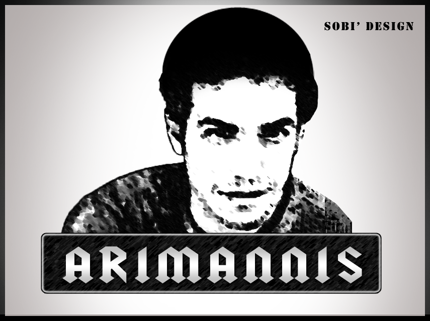
I now want an updated better logo of myself. This image will be used on my website, my business card, and on shirts. It needs to be Vector.

If you would like to find pictures of me go to my facebook

Understand, this is supposed to be funny, as I try to think that my site is funny, but also understand I want to look good and profesional, you can put me with the fro, short hair, or both, which ever is easier or looks best. I will critique your submissions. Contest Winner will be payed via paypal and if he or she wishes, I will put credit for the t-shirt on my site.

Contest will end in 10 days 10/12/2012

Let me know if you have any questions...
 
0
•••
The views expressed on this page by users and staff are their own, not those of NamePros.
Upping the winnings to $35
 
0
•••
Here is my entry. 100% vector.
The colors can be changed.
Hope this is what you are looking for. :)

Feedback is appreciated.

 
0
•••
Hey onlinedomainers,

Looks awesome! The one thing I would tell you is to make it more defined, maybe thinner lines... its tough to explain, I like it however it seems clunky almost maybe with thinner more complete black lines it would be easier to see.

Thanks
 
0
•••
I plan on entering this weekend.
 
0
•••
Cool SK1990 look forward to your entry.
 
Last edited:
0
•••
Revised design as per your feedback.
Please tell me if you would like any more changes.


0
•••
Looks good onlinedomainers,

Few changes, now its almost to little, kinda like when you brighten a photo too much, some shadow is ok and the left eyebrow is a little thin..

Also I just noticed I have no ears.
 
0
•••
Looks good onlinedomainers,

Few changes, now its almost to little, kinda like when you brighten a photo too much, some shadow is ok and the left eyebrow is a little thin..

Also I just noticed I have no ears.

Thanks for the feedback.
And about your ear..don't worry i will get it back! :D
Will try to post the revisions soon.
 
0
•••
0
•••
0
•••
Greek version :D
33lnvv7.jpg
 
0
•••
Hey Nod,

Cool concept, I'll just be blunt, that looks nothing like me.. Also this is gonna go on my business card and website.... so id prefer the base to not look like a statue. Very cool drawing though, would love to see another go.

Thanks,
Ari
 
0
•••
Ok it looks a bit like Antony Burdain, but Looks Nothing like you? c'mon!
533904_1720156557789_1974645857_n.jpg


My approach was "It's funny cause it tries to be serious", also I didn't want to give you a simple no-effort quicktraced image so decided to draw.
Give it a try, show it in facebook what if ppl love it? that's my advice ;)
 
0
•••
I liked your approach in terms of drawing it, but yea it really looks nothing like me.
 
0
•••
0
•••
Amin, I would just say try again, I could have done that.
 
0
•••
Revised logo with better eyebrows and ears! :)

 
0
•••
Design Proposition for * ARI * MANNIS *:

arimannislogo.png


Kindest Regards..
 
0
•••
here's my try: 100% Vector
ioRBvTXVQCB29.jpg


feedback is appreciated. :)
 
0
•••
Coolwanz - I would say the hair is a tad bit to curly and the chin is too big.

Blairwichii - It just looks like my picture with the color taken out, I want it a tad more artistic.

Thanks guys would love to see some more.
 
0
•••
0
•••
whats with the hair sobi?
 
0
•••
Thanks for the feedback Ari. :)
I'll amend those elements.

Kindest Regards..
 
0
•••
Hey Ari,
Any feedback on my design?
Any more changes you would like to have?
 
0
•••
Status
Not open for further replies.
  • The sidebar remains visible by scrolling at a speed relative to the page’s height.
Back