IT.COM

What do you think of this new landing page concept?

Spaceship Spaceship
Watch

akos

Top Member
Impact
1,265
Made a new mockup landing page today. I know that there are countless threads on NP about them, I just wanted to add my own take and see what you guys think.

I'm not really looking for feedback on the textual content of the page (just wrote up something quickly). Much more looking forward to your opinions on the whole 'storytelling' concept and the animations/visuals.

What do you think? Is it worth loading and animating the elements one-by-one to give the whole thing a modern feel? Or would it result in end users closing the page instantly? I personally think that it would keep them engaged longer and possibly raise the chance of an offer. I assume that most of you prefer very simple landing pages, but I would love to hear what you think.

Here is the GIF:
(The page is not actually live yet)
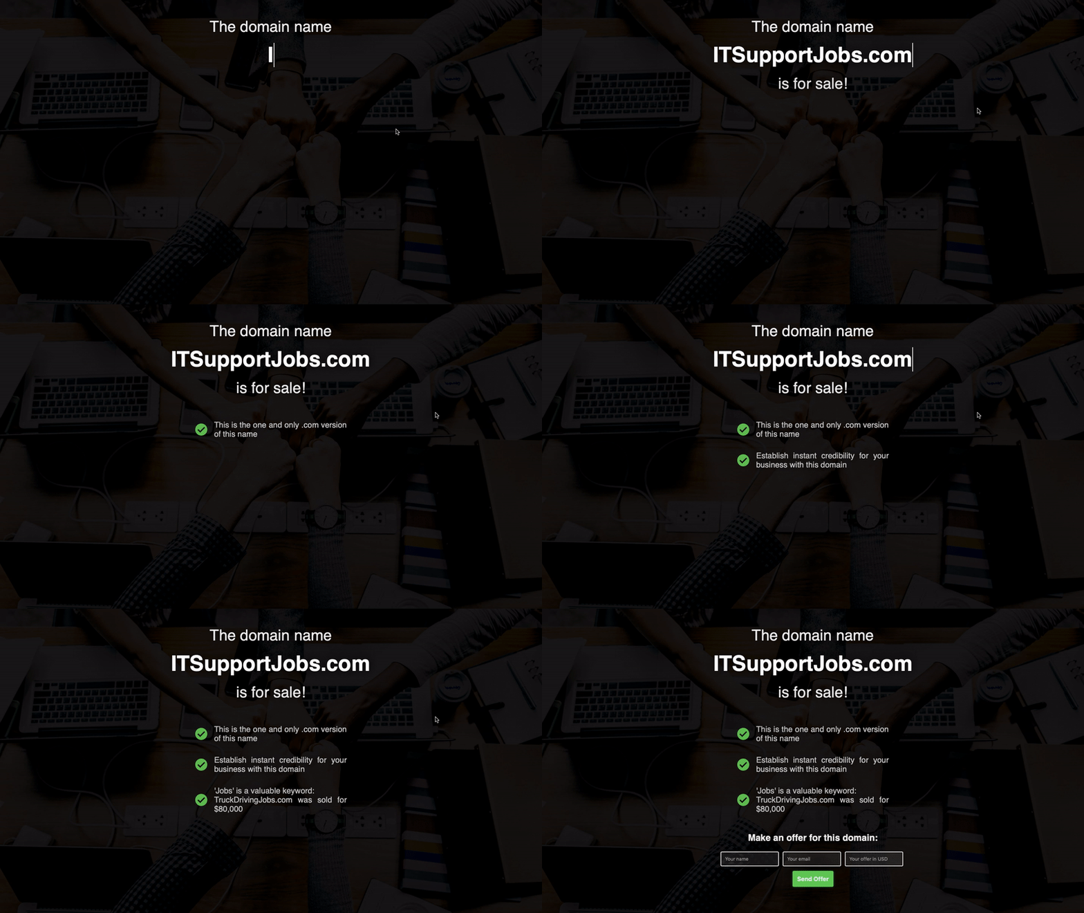
landingpage1.gif


Thanks and cheers.
 
•••
The views expressed on this page by users and staff are their own, not those of NamePros.
I think it worth a try, I will defenitly stay more timeto read the message through..even further, I think for people like me only hold 20 around domain name for sale, then, people better develop a uniqure page/logo for each domain..let the visitor understand this is name is for sale, and why this is a beatiful name....
 
0
•••
If you have a domain with enough traffic to test, it probably wouldn't matter which page you use :)

I like it though.
 
0
•••
I think it worth a try, I will defenitly stay more timeto read the message through..even further, I think for people like me only hold 20 around domain name for sale, then, people better develop a uniqure page/logo for each domain..let the visitor understand this is name is for sale, and why this is a beatiful name....

Thanks for your reply.

Yeah, if you have a small portfolio size then it's logical to have a unique logo and page for each domain. It gives it a professional feel in my opinion. Do you do it this way?


If you have a domain with enough traffic to test, it probably wouldn't matter which page you use :)

I like it though.

Thanks for replying.
I agree totally.

I'm going to set this landing page type up for a couple of my domains and analyze the results. What I'm really curious about is the time the users will spend on this page type vs a regular landing page. I'll be interesting to monitor the stats.
 
0
•••
Looking for more opinions. Anyone?
 
0
•••
Not bad, would love to see it live soon.
 
0
•••
Its look good & modern which going to surely keep the person engaged but the question is how fast the page gets loaded & finish rendering all the elements.
 
1
•••
content is looking good
i think you should change and use some attractive background
 
1
•••
Makes it exciting, I like it. It's like, "What's going to happen next?". Looks simple, yet professional. The colors work well. I think you're right, an engaging lander is more inviting to offers. Keep it up.
 
0
•••
That's a gif? I suppose it depends on what code you use and how fast it loads on the real page. I assume you're not just going to load a gif for the real page.

I mean obviously flash is not a good option these days, but I am sure you're not going to use flash either.

Javascript, then?
 
Last edited:
2
•••
I think that's a very good landing page. I personally would be curious to check what you have written exactly as the black background makes it perfectly good and more engaging. A voice in the background explaining the same would complete the total process.
 
0
•••
The idea is good.
But the visitors may hit the big X at the top right corner before the green button show up.:dead:
 
0
•••
Hi Akos, I would test this version and another one to see how they both perform.

You can get testing scripts which can test 2 version side by side and see which one gets you more inquires. Then you can go with that one.
 
0
•••
I imagine that is a generally excellent point of arrival. I for one would be interested to check what you have composed precisely as the dark foundation makes it impeccably great and all the more captivating. A voice out of sight clarifying the equivalent would finish the complete procedure.
 
0
•••
As someone with hci/uiux knowledge, here's my 2 cents.

It's well known that longer content load times result it a huge customer drop-off rate, however, the animations in your displaying of new points somewhat offset this as they are visually attention grabbing. So to that I say, it's ok. Perhaps if you want to tweak, I'd play with the speed of display/typing.

One key change I could suggest would be to switch the positions of your form and those info pointers. Your Call To Action (CTA) is the most important aspect of your page. Currently it is also displayed last and is the smallest block on your page.
 
2
•••
Cool template. Only concern: animated gif are easily blocked by ad blockers, if installed. Consider using frame <iframe>your content </iframe>
Lastly, no landing page converts better than the one that reads: 70% OFF
regular price + Limited Time !. You must give something to gain something.
 
Last edited:
1
•••
Made a new mockup landing page today. I know that there are countless threads on NP about them, I just wanted to add my own take and see what you guys think.

I'm not really looking for feedback on the textual content of the page (just wrote up something quickly). Much more looking forward to your opinions on the whole 'storytelling' concept and the animations/visuals.

What do you think? Is it worth loading and animating the elements one-by-one to give the whole thing a modern feel? Or would it result in end users closing the page instantly? I personally think that it would keep them engaged longer and possibly raise the chance of an offer. I assume that most of you prefer very simple landing pages, but I would love to hear what you think.

Here is the GIF:
(The page is not actually live yet)

Show attachment 101789

Thanks and cheers.


I think it’s innovative.

I like what i see, will always say you 1st do it

bookmarked thread; how much look in concept
 
Last edited:
1
•••
Just be sure to keep file size same across all domains so you can calculate analyse bandwidth.
 
0
•••
why not create a live site to demo?

Cheers
Corey
 
0
•••
CTA buttons are most crucial elements of a selling page and I have to wait too long to see them
 
Last edited:
0
•••
I like it.
i would put instead of three fields for the offer, only one field. which is the amount to offer. this will make it seem easier for the user to take action on this.
once submitted you will show a page asking for email address and name.
 
1
•••
I like it! It looks modern and clean.
 
0
•••
Back