Dynadot

[REQ-LOGO] - Logo for Dental Clinic Required ($85 for contest winner)

Spaceship Spaceship
Watch
Status
Not open for further replies.
Type of Contest : LOGO Design

Prize : $85.00

Contest End Date & Time : Monday 11/2/2011 23:59 GMT

Size Requirements : Unsure of suitable size, but this logo is required for use on everything from the physical signs for the clinic, to office stationary, to the clinic website. (to be established)

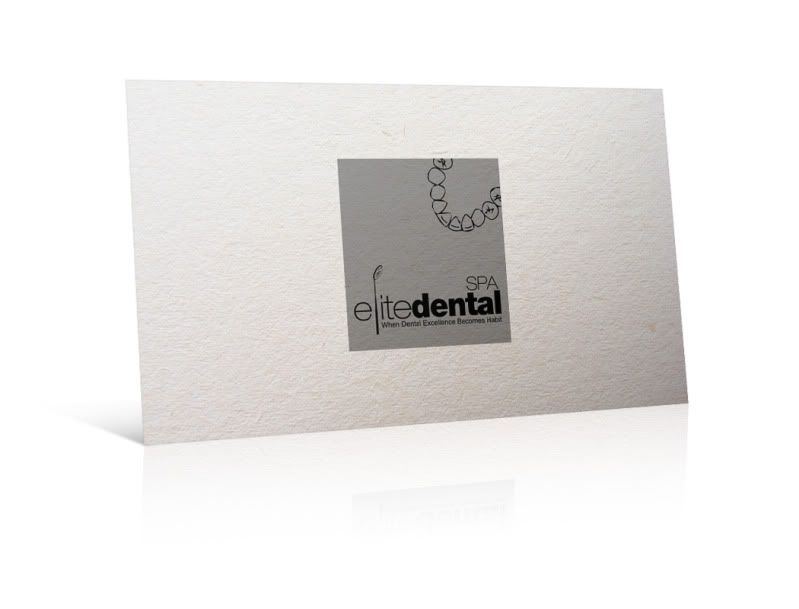
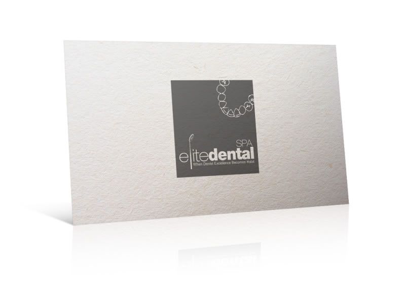
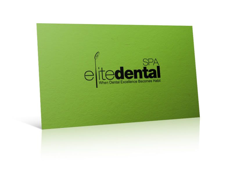
Color Requirements : Ideally, should be three grades of color, that is aesthetic in both, gray-scale, and colored. Open to different colors.

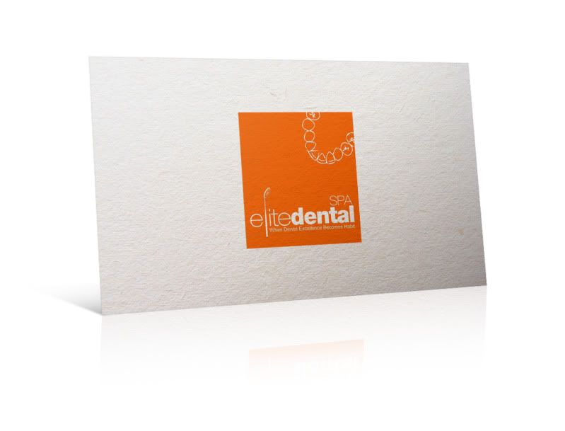
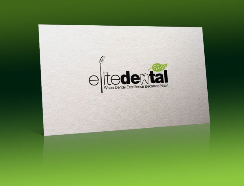
General Requirements : This logo is for a dental spa by the name of "Elite Dental Spa". The name MUST be incorporated in the design in the logo. Adding the slogan "When Dental Excellence Becomes Habit" is a plus, but is not a requirement. Looking for a clean, uncluttered design, that is unique enough to be an "attention-grabber". Incorporating the shape of a tooth, or molar, is preferable, but not an absolute requirement.

Additional Information : Good luck, and may the best design win.
 
Last edited by a moderator:
0
•••
The views expressed on this page by users and staff are their own, not those of NamePros.
as requested :)

bcopy.jpg

c.jpg

d.jpg

my personal pref
a-1.jpg


---------- Post added at 10:40 AM ---------- Previous post was at 10:20 AM ----------

some revison on the logo itself
4.jpg
 
0
•••
Quick question to both finalists. Are the logos vector?
 
0
•••
Hi yes logo is completely vector.

All files needed are included (ai,eps,psd etc etc} from web to print!
 
0
•••
jtoms, i apologize for the short notice, but i need the leaf design changed. Please change the design to a rectangle surrounding the word spa, or an abstract design, as the leaf seems a bit distracting as to the nature of dental work. Perhaps also a slight increase in size of the tooth/letter "n".

---------- Post added at 11:05 PM ---------- Previous post was at 11:03 PM ----------

Thank you UMXCA for your prompt reply.

---------- Post added 10-31-2011 at 12:50 AM ---------- Previous post was 10-30-2011 at 11:05 PM ----------

Update:

Since we like both submissions very much, we have decided to add a runner up prize of $15, and first prize remains as is; $85.

We are willing to extend the contest 24 hours, to allow for further modification.

Modifications required:

UMXCA, if possible, an you make the design look more dental related, while remaining just as incredibly classy? We really like the "E" looking like a tooth, but it might not be immediately recognizable for the passer by when viewing a banner or sign.

JTOMS, please modify as requested above.

Promptness to making modifications might also be taken into consideration, when deciding on the final ranking.

I apologize if this thread has become too demanding.
 
Last edited:
0
•••
yes it 100% vector.. just got online.. will modify

---------- Post added at 10:00 AM ---------- Previous post was at 09:17 AM ----------

i can do revision until the logo is satisfied
logo06.jpg
 
0
•••
hi here's one revision with more of a dental identity while retaining the same style:

elite-5.png
 
0
•••
First of all, I would like to thank both finalists for all of their hardwork. Without making this any longer than it should be, we have decided that the ranking is as follows:

1st Prize: JTOMS
Runner UP: UMXCA

---------- Post added at 11:28 PM ---------- Previous post was at 10:07 PM ----------

Please PM me the details required for the prize transfer. :)
 
0
•••
Congrats JTOMS... Nice Work :)

Also thx CH for runnerup prize!

PM sent!
 
0
•••
Congrats on the win(s) jtoms and umxca
---------------------------------------

Please remember to update this thread once you all confirm files / payments so we can close the contest.

Thanks,

Eric Lyon
Member Services
 
0
•••
thank you very much.. will pm now
 
0
•••
payment received, files sent, ratings given

thank you very much
 
0
•••
Excellent. Files received. Rating given as well. Thank YOU!

Thread may be closed now :)
 
0
•••
Status
Not open for further replies.
  • The sidebar remains visible by scrolling at a speed relative to the page’s height.
Back